Info
Info widget is a component only for data viewing.
Basics
How does it look?
How to add?
Example
Step1 Create file .widget.json.
- name - static (unique within the project)
- title - (optional)
- type = "Info" (required)
- bc - (required)
- fields- (required) see field types
- options
{
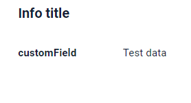
"name": "MyExampleInfo",
"title": "Info title",
"type": "Info",
"bc": "myExampleBc",
"fields": [
{
"blockId": "1",
"name": "General Information",
"fields": [
{
"label": "customField",
"key": "customField",
"type": "input"
}
]
}
],
"options": {
"layout": {
"rows": [
{
"cols": [
{
"fieldKey": "customField",
"span": 12
}
]
}
]
}
}
}
{
  "name": "myexampleinfo",
  "title": "My Example Info",
  "template": "DashboardView",
  "url": "/screen/myexample/view/myexampleinfo",
  "widgets": [
    {
      "widgetName": "MyExampleInfoTextInfo",
      "position": 20,
      "gridWidth": 12
    },
    {
      "widgetName": "MyExampleInfo",
      "position": 30,
      "gridWidth": 12
    }
  ],
  "rolesAllowed": [
    "CXBOX_USER"
  ]
}
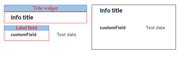
Main visual parts
Title, fields block in grid, actions block
Title
Title - (optional)
There are types of:
constant title: shows constant text.constant title empty: if you want to visually connect widgets by them to be placed one under anothercalculated title: shows value provided in hidden text field, e.g. it can be calculated based on business logic of application
How does it look?

How to add?
Example
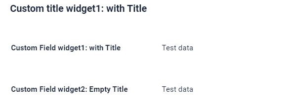
Step1 Add name for title to .widget.json.
{
  "name": "MyExampleInfo",
  "title": "",
  "type": "Info",
  "bc": "myExampleBc",
  "fields": [
    {
      "blockId": "1",
      "name": "General Information",
      "fields": [
        {
          "label": "Custom Field",
          "key": "customField",
          "type": "input"
        }
      ]
    }
  ],
  "options": {
    "layout": {
      "rows": [
        {
          "cols": [
            {
              "fieldKey": "customField",
              "span": 12
            }
          ]
        }
      ]
    }
  }
}
Step1 Delete parameter title to .widget.json.
{
  "name": "MyExampleEmptyTitle",
  "type": "Info",
  "bc": "myExampleBc",
  "fields": [
    {
      "blockId": "1",
      "name": "General Information",
      "fields": [
        {
          "label": "Custom Field widget: Empty Title",
          "key": "customField",
          "type": "input"
        }
      ]
    }
  ],
  "options": {
    "layout": {
      "rows": [
        {
          "cols": [
            {
              "fieldKey": "customField",
              "span": 24
            }
          ]
        }
      ]
    }
  }
}
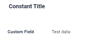
Step1 Add ${customField} for title to .widget.json.
{
  "name": "MyExampleCustomTitle",
  "title": "Custom Title - value field 'Custom Field' : ${customField}",
  "type": "Info",
  "bc": "myExampleBc",
  "fields": [
    {
      "blockId": "1",
      "name": "General Information",
      "fields": [
        {
          "label": "Custom Field",
          "key": "customField",
          "type": "input"
        }
      ]
    }
  ],
  "options": {
    "layout": {
      "rows": [
        {
          "cols": [
            {
              "fieldKey": "customField",
              "span": 12
            }
          ]
        }
      ]
    }
  }
}
Fields layout
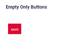
single column layout - recommended: shows each field on new row. Each field can have width from 1 to 24.multi column layout: shows fields in grid. Grid can contain any number of rows. Each row can contain any number of fields, until sum of fields widths in row is less than 24. Each field can have width from 1 to 24.empty: only title and actions are shown. Usually used when standard buttons position needs to be changed (for example we want to show buttons under widget). One can hide buttons on widget with data. Create separate widget only with buttons and place it anywhere on view
Tip
It is recommended to use single column layout when possible, because dynamic fields hiding (add link) always works correctly in this case.
Info
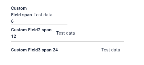
The line has a size of 24 span, if you define fields on one line with a field width sum exceeding 24 span in total,that field and any subsequent fields will be moved to a new line . This means that each line will accommodate fields until the total width reaches 24 span, and any excess width will continue on the next line.
For example, you have three fields with widths of 12, 8, and 10 characters, respectively. In this case, the first field and two field will fit completely on the first line as it is within the 24-character limit. However, the thirt field's width contributes to the totat.It has finally become more 24. As a result, the third field will be moved to the next line.
How does it look?
How to add?
Example
Step1 Create "options": {"layout": {}}.
Step2 Add fields to "options": {"layout": {}}
Forming rows:
- Open
cols: "cols": [ - Add All fields(customField,customField2,customField3) with span from 1 to 24.
- Close
cols: ]
{
  "name": "MyExampleInfo",
  "title": "Info title",
  "type": "Info",
  "bc": "myExampleBc",
  "fields": [
    {
      "blockId": "1",
      "name": "General Information",
      "fields": [
        {
          "label": "Custom Field span 6",
          "key": "customField",
          "type": "input"
        },
        {
          "label": "Custom Field span 12",
          "key": "customField",
          "type": "input"
        },
        {
          "label": "Custom Field span 24",
          "key": "customField",
          "type": "input"
        }
      ]
    }
  ],
  "options": {
    "layout": {
      "rows": [
        {
          "cols": [
            {
              "fieldKey": "customField",
              "span": 6
            }
          ]
        },
        {
          "cols": [
            {
              "fieldKey": "customField",
              "span": 12
            }
          ]
        },
        {
          "cols": [
            {
              "fieldKey": "customField",
              "span": 24
            }
          ]
        }
      ]
    }
  }
}
Step1 Create "options": {"layout": {}}.
Step2 Add fields to "options": {"layout": {}}.
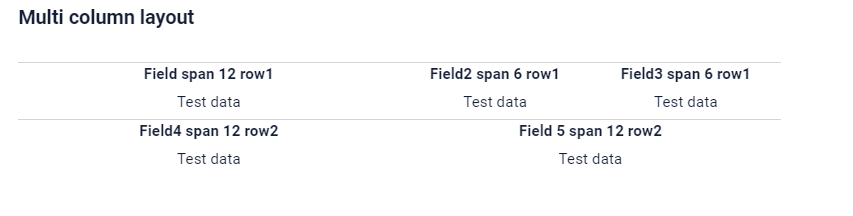
Forming row1 :
- Open
cols: "cols": [ - Add all feild : customField,customField2,customField3
- Check sum span <= 24: customField (span = 12),customField2 = 6, customField3 = 6 : sum 24)
- Close
cols: ]
Forming a row2 :
- Open 'cols' : "cols": [
- Add All filed(customField4)
- Check sum span <= 24 (customField4 span = 12 : sum 12)
- Close 'cols' : ]
{
  "name": "MyExampleMultiColumn",
  "title": "Multi column layout",
  "type": "Info",
  "bc": "myExampleBc",
  "fields": [
    {
      "blockId": "1",
      "name": "General Information",
      "fields": [
        {
          "label": "Field 5 span 12 row",
          "key": "customField",
          "type": "input"
        },
        {
          "label": "Field span 12 row",
          "key": "customField",
          "type": "input"
        },
        {
          "label": "Field  span 12 row",
          "key": "customField",
          "type": "input"
        },
        {
          "label": "Field  span 6 row",
          "key": "customField",
          "type": "input"
        },
        {
          "label": "Field  span 6 row",
          "key": "customField",
          "type": "input"
        }
      ]
    }
  ],
  "options": {
    "layout": {
      "rows": [
        {
          "cols": [
            {
              "fieldKey": "customField",
              "span": 12
            },
            {
              "fieldKey": "customField",
              "span": 6
            },
            {
              "fieldKey": "customField",
              "span": 6
            }
          ]
        },
        {
          "cols": [
            {
              "fieldKey": "customField",
              "span": 12
            },
            {
              "fieldKey": "customField",
              "span": 12
            }
          ]
        }
      ]
    }
  }
}
Step1 Create "options": {"layout": {}}.
Button "Create" - On default
{
  "name": "MyExampleEmptyOnlyButtons",
  "title": "Empty Only Buttons",
  "type": "Info",
  "bc": "myExampleBc",
  "fields": [
    {
      "blockId": "1",
      "name": "General Information",
      "fields": [
        {
          "label": "",
          "key": "ONLY_BUTTONS_TEXT",
          "type": "hint",
          "showLength": 100
        }
      ]
    }
  ],
  "options": {
    "layout": {
      "rows": [
        {
          "cols": [
            {
              "fieldKey": "ONLY_BUTTONS_TEXT",
              "span": 24
            }
          ]
        }
      ]
    }
  }
}
Show condition
no show condition - recommended: widget always visible
show condition by current entity: condition can include boolean expression depending on current entity fields. Field updates will trigger condition recalculation only on save or if field is force active
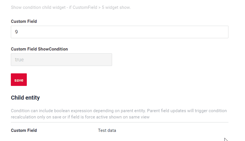
show condition by parent entity: condition can include boolean expression depending on parent entity. Parent field updates will trigger condition recalculation only on save or if field is force active shown on same view
Tip
It is recommended not to use Show condition when possible, because wide usage of this feature makes application hard to support.
How does it look?
How to add?
Example
- key - static
- sequence -
- bcName - (required)
- params { fieldKey } - (required) name field with show condition
- params { value } - (required) show condition
see Basics
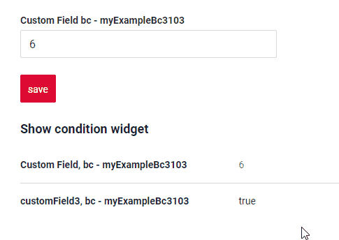
Step1 Add showCondition to .widget.json.
{
  "name": "MyExample",
  "title": "Show condition widget",
  "type": "Info",
  "bc": "myExampleBc",
  "showCondition": {
    "bcName": "myExampleBc",
    "key": "myExampleBcShowCondition",
    "params": {
      "fieldKey": "customFieldShowCond",
      "value": "true"
    }
  },
  "fields": [
    {
      "blockId": "1",
      "name": "General Information",
      "fields": [
        {
          "label": "Custom Field, bc - myExampleBc",
          "key": "customField",
          "type": "number"
        },
        {
          "label": "customFieldShowCond, bc - myExampleBc",
          "key": "customFieldShowCond",
          "type": "input"
        }
      ]
    }
  ],
  "options": {
    "actionGroups": {
      "include": [
        "create"
      ]
    },
    "layout": {
      "rows": [
        {
          "cols": [
            {
              "fieldKey": "customField",
              "span": 24
            }
          ]
        },
        {
          "cols": [
            {
              "fieldKey": "customFieldShowCond",
              "span": 24
            }
          ]
        }
      ]
    }
  }
}
Step1 Add showCondition to .widget.json.
{
  "name": "MyExample",
  "title": "Child Entity",
  "type": "Info",
  "bc": "myExampleBc",
  "showCondition": {
    "bcName": "myExampleBc",
    "key": "myExampleBcShowCondition",
    "params": {
      "fieldKey": "customFieldShowCondition",
      "value": true
    }
  },
  "fields": [
    {
      "blockId": "1",
      "name": "General Information",
      "fields": [
        {
          "label": "Custom Field",
          "key": "customField",
          "type": "input"
        }
      ]
    }
  ],
  "options": {
    "layout": {
      "rows": [
        {
          "cols": [
            {
              "fieldKey": "customField",
              "span": 24
            }
          ]
        }
      ]
    }
  }
}
Actions
Actions show available actions as separate buttons
see Actions