Time
Time is a component for time editing. It can be used for editing and displaying time.
Basics
The time type supports various formats for representing and manipulating time values.
Info
The format of this field is designed to support business scenarios in which the same field is used in different contexts: as date and time , as time only.
This approach allows for consistent data storage while providing flexible representation and usage across different parts of the system.
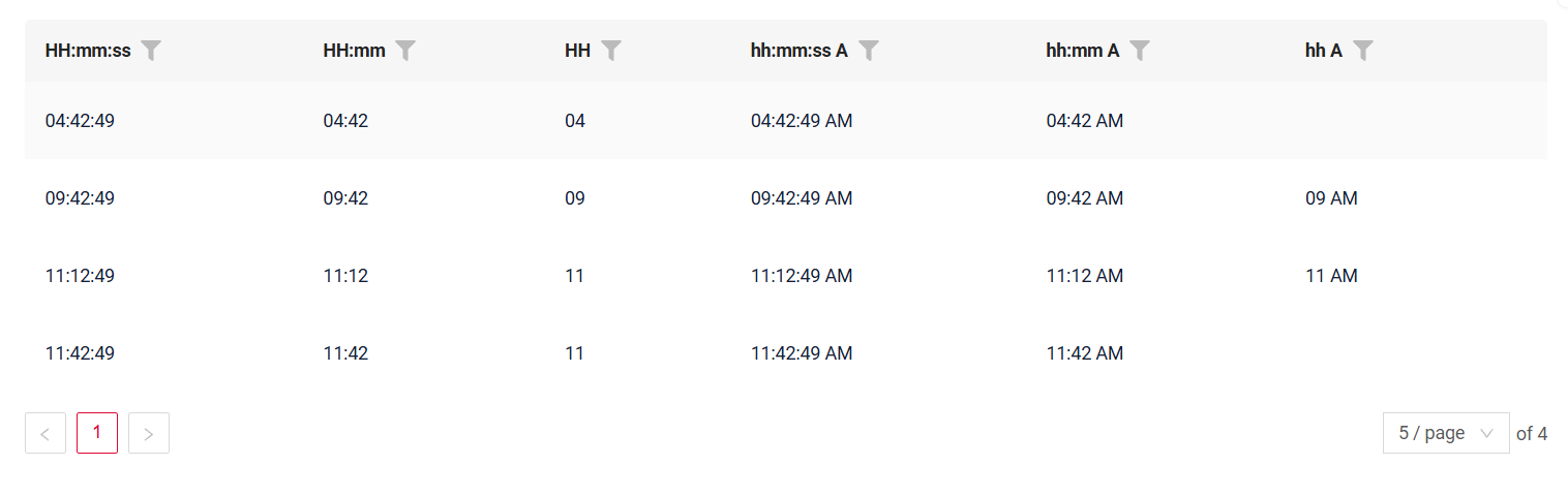
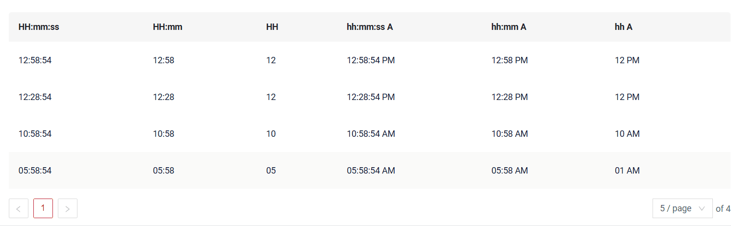
Supported Formats:
| Format | Value range | Example |
|---|---|---|
| default | 00–23 : 00–59 : 00–59 | 15:45:28 |
HH:mm:ss |
00–23 : 00–59 : 00–59 | 15:45:28 |
HH:mm |
00–23 : 00–59 | 15:28 |
HH |
00–23 | 15 |
hh:mm:ss A |
01–12 : 00–59 : 00–59 | 03:45:28 PM |
hh:mm A |
01–12 : 00–59 | 03:28 PM |
hh A |
01–12 | 03 PM |
NOT supported formats
| Format | Value range | Example |
|---|---|---|
mm:ss |
00–59 : 00–59 | 45:28 |
mm |
00–59 | 15 |
ss |
00–59 | 28 |
How does it look?


How to add?
Example
We recommend using the LocalDateTime type, as the format of this field is designed to support business scenarios in which the same field is used in different contexts:
- in some cases, it is treated as date and time (for example, when creating a meeting);
- in other cases, the same field is displayed as time only, without a date.
This approach ensures consistent data modeling while allowing flexible representation of the field across different parts of the system.
Step1 Add field LocalDateTime to corresponding BaseEntity.
@Entity
@Getter
@Setter
@NoArgsConstructor
public class MyEntity extends BaseEntity {

    @Column
    private LocalDateTime customField;
    @Column
    private LocalDateTime customFieldhmm;
    @Column
    private LocalDateTime customFieldh;
    @Column
    private LocalDateTime customFieldhmmA;
    @Column
    private LocalDateTime customFieldhmmssA;
    @Column
    private LocalDateTime customFieldmm;
    @Column
    private LocalDateTime customFieldmmss;
    @Column
    private LocalDateTime customFieldss;
    @Column
    private LocalDateTime customFieldhA;
}
Step2 Add field LocalDateTime to corresponding DataResponseDTO.
@Getter
@Setter
@NoArgsConstructor
public class MyExampleDTO extends DataResponseDTO {

    @SearchParameter(name = "customField", provider = TimeValueProvider.class)
    private LocalDateTime customField;
    @SearchParameter(name = "customFieldhmm", provider = TimeValueProvider.class)
    private LocalDateTime customFieldhmm;
    @SearchParameter(name = "customFieldh", provider = TimeValueProvider.class)
    private LocalDateTime customFieldh;
    @SearchParameter(name = "customFieldhmmA", provider = TimeValueProvider.class)
    private LocalDateTime customFieldhmmA;
    @SearchParameter(name = "customFieldhmmssA", provider = TimeValueProvider.class)
    private LocalDateTime customFieldhmmssA;
    @SearchParameter(name = "customFieldmm", provider = TimeValueProvider.class)
    private LocalDateTime customFieldmm;
    @SearchParameter(name = "customFieldmmss", provider = TimeValueProvider.class)
    private LocalDateTime customFieldmmss;
    @SearchParameter(name = "customFieldss", provider = TimeValueProvider.class)
    private LocalDateTime customFieldss;
    @SearchParameter(name = "customFieldhA", provider = TimeValueProvider.class)
    private LocalDateTime customFieldhA;

    public MyExampleDTO(MyEntity entity) {
        this.id = entity.getId().toString();
        this.customField = entity.getCustomField();
        this.customFieldhmm = entity.getCustomFieldhmm();
        this.customFieldh = entity.getCustomFieldh();
        this.customFieldhmmA = entity.getCustomFieldhmmA();
        this.customFieldhmmssA = entity.getCustomFieldhmmssA();
        this.customFieldmm = entity.getCustomFieldmm();
        this.customFieldmmss = entity.getCustomFieldmmss();
        this.customFieldss = entity.getCustomFieldss();
        this.customFieldhA = entity.getCustomFieldhA();
    }
}
Step3 Add to .widget.json.
To set the format, add "format".
By default, there will be a standard format applied: "HH : mm:ss"
{
  "name": "MyExampleList",
  "title": "List title",
  "type": "List",
  "bc": "myExampleBc",
  "fields": [
    {
      "title": "HH:mm:ss",
      "key": "customField",
      "type": "time",
      "format": "HH:mm:ss"
    },
    {
      "title": "HH:mm",
      "key": "customFieldhmm",
      "type": "time",
      "format": "HH:mm"
    },
    {
      "title": "HH",
      "key": "customFieldh",
      "type": "time",
      "format": "HH"
    },
    {
      "title": "hh:mm:ss A",
      "key": "customFieldhmmssA",
      "type": "time",
      "format": "hh:mm:ss A"
    },
    {
      "title": "hh:mm A",
      "key": "customFieldhmmA",
      "type": "time",
      "format": "hh:mm A"
    },
    {
      "title": "hh A",
      "key": "customFieldhA",
      "type": "time",
      "format": "hh A"
    }
  ]
}
Step3 Add to .widget.json.
{
  "name": "MyExampleInfo",
  "title": "Info title",
  "type": "Info",
  "bc": "myExampleBc",
  "fields": [
    {
      "label": "HH:mm:ss",
      "key": "customField",
      "type": "time",
      "format": "HH:mm:ss"
    },
    {
      "label": "HH:mm",
      "key": "customFieldhmm",
      "type": "time",
      "format": "HH:mm"
    },
    {
      "label": "HH",
      "key": "customFieldh",
      "type": "time",
      "format": "HH"
    },
    {
      "label": "hh:mm:ss A",
      "key": "customFieldhmmssA",
      "type": "time",
      "format": "hh:mm:ss A"
    },
    {
      "label": "hh:mm A",
      "key": "customFieldhmmA",
      "type": "time",
      "format": "hh:mm A"
    },
    {
      "label": "hh A",
      "key": "customFieldhA",
      "type": "time",
      "format": "hh A"
    }
  ],
  "options": {
    "layout": {
      "rows": [
        {
          "cols": [
            {
              "fieldKey": "customField",
              "span": 12
            }
          ]
        },
        {
          "cols": [
            {
              "fieldKey": "customFieldh",
              "span": 12
            }
          ]
        },
        {
          "cols": [
            {
              "fieldKey": "customFieldhmm",
              "span": 12
            }
          ]
        },
        {
          "cols": [
            {
              "fieldKey": "customFieldhmmA",
              "span": 12
            }
          ]
        },
        {
          "cols": [
            {
              "fieldKey": "customFieldhmmssA",
              "span": 12
            }
          ]
        },
        {
          "cols": [
            {
              "fieldKey": "customFieldhA",
              "span": 12
            }
          ]
        }
      ]
    }
  }
}
Step3 Add to .widget.json.
{
  "name": "MyExampleForm",
  "title": "Form title",
  "type": "Form",
  "bc": "myExampleBc",
  "fields": [
    {
      "label": "HH:mm:ss",
      "key": "customField",
      "type": "time",
      "format": "HH:mm:ss"
    },
    {
      "label": "HH:mm",
      "key": "customFieldhmm",
      "type": "time",
      "format": "HH:mm"
    },
    {
      "label": "HH",
      "key": "customFieldh",
      "type": "time",
      "format": "HH"
    },
    {
      "label": "hh:mm:ss A",
      "key": "customFieldhmmssA",
      "type": "time",
      "format": "hh:mm:ss A"
    },
    {
      "label": "hh:mm A",
      "key": "customFieldhmmA",
      "type": "time",
      "format": "hh:mm A"
    },
    {
      "label": "hh A",
      "key": "customFieldhA",
      "type": "time",
      "format": "hh A"
    }
  ],
  "options": {
    "layout": {
      "rows": [
        {
          "cols": [
            {
              "fieldKey": "customField",
              "span": 12
            }
          ]
        },
        {
          "cols": [
            {
              "fieldKey": "customFieldh",
              "span": 12
            }
          ]
        },
        {
          "cols": [
            {
              "fieldKey": "customFieldhmm",
              "span": 12
            }
          ]
        },
        {
          "cols": [
            {
              "fieldKey": "customFieldhmmA",
              "span": 12
            }
          ]
        },
        {
          "cols": [
            {
              "fieldKey": "customFieldhmmssA",
              "span": 12
            }
          ]
        },
        {
          "cols": [
            {
              "fieldKey": "customFieldhA",
              "span": 12
            }
          ]
        }
      ]
    }
  }
}
Step1 Add field LocalTime to corresponding BaseEntity.
@Entity
@Getter
@Setter
@NoArgsConstructor
public class MyEntity extends BaseEntity {
    @Column
    private LocalTime customField;
    @Column
    private LocalTime customFieldhA;
    @Column
    private LocalTime customFieldhmmA;
    @Column
    private LocalTime customFieldhmmssA;
    @Column
    private LocalTime customFieldh;
    @Column
    private LocalTime customFieldhmm;
}
Step2 Add field LocalTime to corresponding DataResponseDTO. Add @JsonSerialize(using = LocalTimeWithDateSerializer.class). Add @JsonDeserialize(using = LocalTimeWithDateDeserializer.class).
@Getter
@Setter
@NoArgsConstructor
public class MyExampleDTO extends DataResponseDTO {
    @JsonSerialize(using = LocalTimeWithDateSerializer.class)
    @JsonDeserialize(using = LocalTimeWithDateDeserializer.class)
    @SearchParameter(name = "customField", provider = TimeValueProvider.class)
    private LocalTime customField;

    @JsonSerialize(using = LocalTimeWithDateSerializer.class)
    @JsonDeserialize(using = LocalTimeWithDateDeserializer.class)
    @SearchParameter(name = "customFieldhA", provider = TimeValueProvider.class)
    private LocalTime customFieldhA;

    @JsonSerialize(using = LocalTimeWithDateSerializer.class)
    @JsonDeserialize(using = LocalTimeWithDateDeserializer.class)
    @SearchParameter(name = "customFieldhmmA", provider = TimeValueProvider.class)
    private LocalTime customFieldhmmA;

    @JsonSerialize(using = LocalTimeWithDateSerializer.class)
    @JsonDeserialize(using = LocalTimeWithDateDeserializer.class)
    @SearchParameter(name = "customFieldhmmssA", provider = TimeValueProvider.class)
    private LocalTime customFieldhmmssA;

    @JsonSerialize(using = LocalTimeWithDateSerializer.class)
    @JsonDeserialize(using = LocalTimeWithDateDeserializer.class)
    @SearchParameter(name = "customFieldh", provider = TimeValueProvider.class)
    private LocalTime customFieldh;

    @JsonSerialize(using = LocalTimeWithDateSerializer.class)
    @JsonDeserialize(using = LocalTimeWithDateDeserializer.class)
    @SearchParameter(name = "customFieldhmm", provider = TimeValueProvider.class)
    private LocalTime customFieldhmm;

    public MyExampleDTO(MyEntity entity) {
        this.id = entity.getId().toString();
        this.customField = entity.getCustomField();
        this.customFieldhA = entity.getCustomFieldhA();
        this.customFieldhmmA = entity.getCustomFieldhmmA();
        this.customFieldhmmssA = entity.getCustomFieldhmmssA();
        this.customFieldh = entity.getCustomFieldh();
        this.customFieldhmm = entity.getCustomFieldhmm();
    }
}
Step3 Add to .widget.json.
To set the format, add "format".
By default, there will be a standard format applied: "HH : mm:ss"
{
  "name": "MyExampleList",
  "title": "List",
  "type": "List",
  "bc": "myexample",
  "fields": [
    {
      "title": "Custom Field HH:mm:ss",
      "key": "customField",
      "type": "time",
      "format": "HH:mm:ss"
    },
    {
      "title": "Custom Field h:mm",
      "key": "customFieldhmm",
      "type": "time",
      "format": "HH:mm"
    },
    {
      "title": "Custom Field h",
      "key": "customFieldh",
      "type": "time",
      "format": "HH"
    },
    {
      "title": "Custom Field hh:mm:ss A",
      "key": "customFieldhmmssA",
      "type": "time",
      "format": "hh:mm:ss A"
    },
    {
      "title": "Custom Field h:mm A",
      "key": "customFieldhmmA",
      "type": "time",
      "format": "hh:mm A"
    },
    {
      "title": "Custom Field h",
      "key": "customFieldhA",
      "type": "time",
      "format": "hh A"
    }
  ]
}
Step3 Add to .widget.json.
{
  "name": "MyExampleInfo",
  "title": "Info",
  "type": "Info",
  "bc": "myexample",
  "fields": [
    {
      "label": "Custom Field HH:mm:ss",
      "key": "customField",
      "type": "time",
      "format": "HH:mm:ss"
    },
    {
      "label": "Custom Field h:mm",
      "key": "customFieldhmm",
      "type": "time",
      "format": "HH:mm"
    },
    {
      "label": "Custom Field h",
      "key": "customFieldh",
      "type": "time",
      "format": "HH"
    },
    {
      "label": "Custom Field hh:mm:ss A",
      "key": "customFieldhmmssA",
      "type": "time",
      "format": "hh:mm:ss A"
    },
    {
      "label": "Custom Field h:mm A",
      "key": "customFieldhmmA",
      "type": "time",
      "format": "hh:mm A"
    },
    {
      "label": "Custom Field h",
      "key": "customFieldhA",
      "type": "time",
      "format": "hh A"
    }
  ],
  "options": {
    "layout": {
      "rows": [
        {
          "cols": [
            {
              "fieldKey": "customField",
              "span": 12
            }
          ]
        },
        {
          "cols": [
            {
              "fieldKey": "customFieldh",
              "span": 12
            }
          ]
        },
        {
          "cols": [
            {
              "fieldKey": "customFieldhmm",
              "span": 12
            }
          ]
        },
        {
          "cols": [
            {
              "fieldKey": "customFieldhmmA",
              "span": 12
            }
          ]
        },
        {
          "cols": [
            {
              "fieldKey": "customFieldhmmssA",
              "span": 12
            }
          ]
        },
        {
          "cols": [
            {
              "fieldKey": "customFieldhA",
              "span": 12
            }
          ]
        }
      ]
    }
  }
}
Step3 Add to .widget.json.
{
  "name": "MyExampleForm",
  "title": "Form",
  "type": "Form",
  "bc": "myexample",
  "fields": [
    {
      "label": "Custom Field HH:mm:ss",
      "key": "customField",
      "type": "time",
      "format": "HH:mm:ss"
    },
    {
      "label": "Custom Field h:mm",
      "key": "customFieldhmm",
      "type": "time",
      "format": "HH:mm"
    },
    {
      "label": "Custom Field h",
      "key": "customFieldh",
      "type": "time",
      "format": "HH"
    },
    {
      "label": "Custom Field hh:mm:ss A",
      "key": "customFieldhmmssA",
      "type": "time",
      "format": "hh:mm:ss A"
    },
    {
      "label": "Custom Field h:mm A",
      "key": "customFieldhmmA",
      "type": "time",
      "format": "hh:mm A"
    },
    {
      "label": "Custom Field h",
      "key": "customFieldhA",
      "type": "time",
      "format": "hh A"
    }
  ],
  "options": {
    "layout": {
      "rows": [
        {
          "cols": [
            {
              "fieldKey": "customField",
              "span": 12
            }
          ]
        },
        {
          "cols": [
            {
              "fieldKey": "customFieldh",
              "span": 12
            }
          ]
        },
        {
          "cols": [
            {
              "fieldKey": "customFieldhmm",
              "span": 12
            }
          ]
        },
        {
          "cols": [
            {
              "fieldKey": "customFieldhmmA",
              "span": 12
            }
          ]
        },
        {
          "cols": [
            {
              "fieldKey": "customFieldhmmssA",
              "span": 12
            }
          ]
        },
        {
          "cols": [
            {
              "fieldKey": "customFieldhA",
              "span": 12
            }
          ]
        }
      ]
    }
  }
}
Placeholder
Placeholder allows you to provide a concise hint, guiding users on the expected value. This hint is displayed before any user input. It can be calculated based on business logic of application.
How does it look?

not applicable

How to add?
Example
Add fields.setPlaceholder to corresponding FieldMetaBuilder.
    @Override
    public void buildRowDependentMeta(RowDependentFieldsMeta<MyExampleDTO> fields, InnerBcDescription bcDescription,
                                      Long id, Long parentId) {
        fields.setEnabled(MyExampleDTO_.customField);
        fields.setPlaceholder(MyExampleDTO_.customField, "11:25:58");
    }
Works for List.
not applicable
Works for Form.
Color
Color allows you to specify a field color. It can be calculated based on business logic of application
Calculated color
Constant color
How does it look?


not applicable
How to add?
Example
Step 1 Add custom field for color to corresponding DataResponseDTO. The field can contain a HEX color or be null.
@Getter
@Setter
@NoArgsConstructor
public class MyExampleDTO extends DataResponseDTO {

    @SearchParameter(name = "customField", provider = TimeValueProvider.class)
    private LocalDateTime customField;

    private String customFieldColor;

    public MyExampleDTO(MyEntity entity) {
        this.id = entity.getId().toString();
        this.customField = entity.getCustomField();
        this.customFieldColor = "#edaa";
    }
}
Step 2 Add "bgColorKey" : custom field for color to .widget.json.
Step 2 Add "bgColorKey" : custom field for color to .widget.json.
{
  "name": "MyExampleInfo",
  "title": "Info title",
  "type": "Info",
  "bc": "myExampleBc",
  "fields": [
    {
      "label": "Custom Field",
      "key": "customField",
      "type": "time",
      "bgColorKey": "customFieldColor"
    }
  ],
  "options": {
    "layout": {
      "rows": [
        {
          "cols": [
            {
              "fieldKey": "customField",
              "span": 12
            }
          ]
        }
      ]
    }
  }
}
not applicable
Add "bgColor" : HEX color to .widget.json.
Add "bgColor" : HEX color to .widget.json.
not applicable
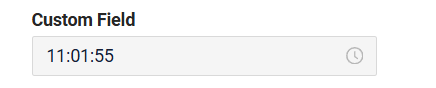
Readonly/Editable
Readonly/Editable indicates whether the field can be edited or not. It can be calculated based on business logic of application
Editable
Live Sample ·
GitHub
Readonly
Live Sample ·
GitHub
How does it look?

How to add?
Example
Step1 Add mapping DTO->entity to corresponding VersionAwareResponseService.
    @Override
    protected ActionResultDTO<MyExampleDTO> doUpdateEntity(MyEntity entity, MyExampleDTO data, BusinessComponent bc) {
        setIfChanged(data, MyExampleDTO_.customFieldhA, entity::setCustomFieldhA);

        setIfChanged(data, MyExampleDTO_.customField, entity::setCustomField);
        setIfChanged(data, MyExampleDTO_.customFieldh, entity::setCustomFieldh);
        setIfChanged(data, MyExampleDTO_.customFieldhmm, entity::setCustomFieldhmm);
        setIfChanged(data, MyExampleDTO_.customFieldhmmA, entity::setCustomFieldhmmA);
        setIfChanged(data, MyExampleDTO_.customFieldhmmssA, entity::setCustomFieldhmmssA);
        setIfChanged(data, MyExampleDTO_.customFieldmm, entity::setCustomFieldmm);
        setIfChanged(data, MyExampleDTO_.customFieldmmss, entity::setCustomFieldmmss);
        setIfChanged(data, MyExampleDTO_.customFieldss, entity::setCustomFieldss);

        return new ActionResultDTO<>(entityToDto(bc, entity));
    }
Step2 Add fields.setEnabled to corresponding FieldMetaBuilder.
    @Override
    public void buildRowDependentMeta(RowDependentFieldsMeta<MyExampleDTO> fields, InnerBcDescription bcDescription,
                                      Long id, Long parentId) {
        fields.setEnabled(MyExampleDTO_.customFieldhA);
        fields.setEnabled(MyExampleDTO_.customField);
        fields.setEnabled(MyExampleDTO_.customFieldh);
        fields.setEnabled(MyExampleDTO_.customFieldhmm);
        fields.setEnabled(MyExampleDTO_.customFieldhmmA);
        fields.setEnabled(MyExampleDTO_.customFieldhmmssA);
        fields.setEnabled(MyExampleDTO_.customFieldmm);
        fields.setEnabled(MyExampleDTO_.customFieldmmss);
        fields.setEnabled(MyExampleDTO_.customFieldss);
    }
Works for List.
not applicable
Works for Form.
Option 1 Enabled by default.
    @Override
    public void buildRowDependentMeta(RowDependentFieldsMeta<MyExampleDTO> fields, InnerBcDescription bcDescription,
                                      Long id, Long parentId) {
    }
Option 2 Not recommended. Property fields.setDisabled() overrides the enabled field if you use after property fields.setEnabled.
Works for List.
Works for Info.
Works for Form.
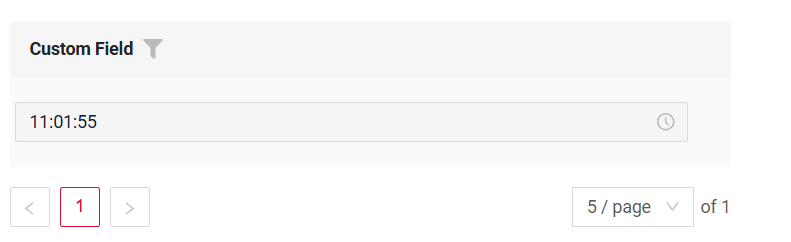
Filtering
Filtering allows you to search data based on criteria.
Search uses (HH:MM:SS):
greaterOrEqualThan(>=)andlessThan(<)operators. When the time is first set in the filter field, the time values will either be 00:00:00 or 23:59:59.equals (=)operator.Search is carried out between 00:00:00 and 23:59:59.
How does it look?
not applicable
not applicable
How to add?
Example
Info
By default, filtration is carried out by range. If you want to turn it off, indicate cxbox.widget.fields.filter-by-range-enabled-default: false in meta.
see more
Step 1 Add @SearchParameter to corresponding DataResponseDTO. (Advanced customization SearchParameter)
@Getter
@Setter
@NoArgsConstructor
public class MyExampleDTO extends DataResponseDTO {

    @SearchParameter(name = "customField", provider = TimeValueProvider.class)
    private LocalDateTime customField;
    @SearchParameter(name = "customFieldhmm", provider = TimeValueProvider.class)
    private LocalDateTime customFieldhmm;
    @SearchParameter(name = "customFieldh", provider = TimeValueProvider.class)
    private LocalDateTime customFieldh;
    @SearchParameter(name = "customFieldhmmA", provider = TimeValueProvider.class)
    private LocalDateTime customFieldhmmA;
    @SearchParameter(name = "customFieldhmmssA", provider = TimeValueProvider.class)
    private LocalDateTime customFieldhmmssA;
    @SearchParameter(name = "customFieldmm", provider = TimeValueProvider.class)
    private LocalDateTime customFieldmm;
    @SearchParameter(name = "customFieldmmss", provider = TimeValueProvider.class)
    private LocalDateTime customFieldmmss;
    @SearchParameter(name = "customFieldss", provider = TimeValueProvider.class)
    private LocalDateTime customFieldss;
    @SearchParameter(name = "customFieldhA", provider = TimeValueProvider.class)
    private LocalDateTime customFieldhA;

    public MyExampleDTO(MyEntity entity) {
        this.id = entity.getId().toString();
        this.customField = entity.getCustomField();
        this.customFieldhmm = entity.getCustomFieldhmm();
        this.customFieldh = entity.getCustomFieldh();
        this.customFieldhmmA = entity.getCustomFieldhmmA();
        this.customFieldhmmssA = entity.getCustomFieldhmmssA();
        this.customFieldmm = entity.getCustomFieldmm();
        this.customFieldmmss = entity.getCustomFieldmmss();
        this.customFieldss = entity.getCustomFieldss();
        this.customFieldhA = entity.getCustomFieldhA();
    }
}
    @Override
    public void buildIndependentMeta(FieldsMeta<MyExampleDTO> fields, InnerBcDescription bcDescription, Long parentId) {
        fields.enableFilter(MyExampleDTO_.customField);
        fields.enableFilter(MyExampleDTO_.customFieldhA);
        fields.enableFilter(MyExampleDTO_.customFieldh);
        fields.enableFilter(MyExampleDTO_.customFieldmm);
        fields.enableFilter(MyExampleDTO_.customFieldhmm);
        fields.enableFilter(MyExampleDTO_.customFieldhmmA);
        fields.enableFilter(MyExampleDTO_.customFieldhmmssA);
        fields.enableFilter(MyExampleDTO_.customFieldss);
        fields.enableFilter(MyExampleDTO_.customFieldmmss);

        fields.enableSort(MyExampleDTO_.customField);
        fields.enableSort(MyExampleDTO_.customFieldhA);
        fields.enableSort(MyExampleDTO_.customFieldh);
        fields.enableSort(MyExampleDTO_.customFieldmm);
        fields.enableSort(MyExampleDTO_.customFieldhmm);
        fields.enableSort(MyExampleDTO_.customFieldhmmA);
        fields.enableSort(MyExampleDTO_.customFieldhmmssA);
        fields.enableSort(MyExampleDTO_.customFieldss);
        fields.enableSort(MyExampleDTO_.customFieldmmss);

    }
Info
With a large number of rows in the database, a significant performance degradation may occur; therefore, we recommend adding appropriate indexes.
postgres - CREATE INDEX idx_apple_created_date_time_filtr ON my_entity (cast(custom_field as time(6)));
not applicable
not applicable
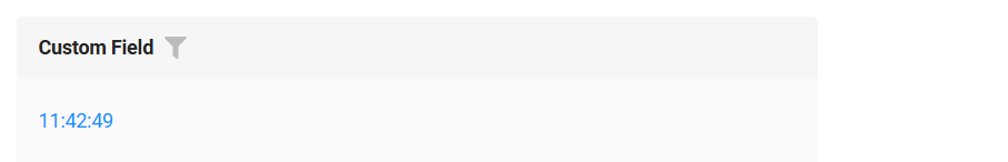
Drilldown
DrillDown allows you to navigate to another view by simply tapping on it. Target view and other drill-down parts can be calculated based on business logic of application
Also, it optionally allows you to filter data on target view before it will be opened see more DrillDown
How does it look?

not applicable
How to add?
Example
Option 1
Step 1 Add fields.setDrilldown to corresponding FieldMetaBuilder.
    @Override
    public void buildRowDependentMeta(RowDependentFieldsMeta<MyExampleDTO> fields, InnerBcDescription bcDescription,
                                      Long id, Long parentId) {
        fields.setEnabled(MyExampleDTO_.customField);
        fields.setDrilldown(
                MyExampleDTO_.customField,
                DrillDownType.INNER,
                "/screen/myexample/view/myexampleform/" + PlatformMyExampleController.myExampleBc + "/" + id
        );
    }
Step 2 Add "drillDown": "true" to .widget.json.
{
  "name": "MyExampleList",
  "title": "List title",
  "type": "List",
  "bc": "myExampleBc",
  "fields": [
    {
      "title": "Custom Field",
      "key": "customField",
      "type": "time",
      "drillDown": "true"
    }
  ]
}
custom field to .widget.json. See more Drilldown
Step 2 Add "drillDown": "true" to .widget.json.
{
  "name": "MyExampleInfo",
  "title": "Info title",
  "type": "Info",
  "bc": "myExampleBc",
  "fields": [
    {
      "label": "Custom Field",
      "key": "customField",
      "type": "time",
      "drillDown": "true"
    }
  ],
  "options": {
    "layout": {
      "rows": [
        {
          "cols": [
            {
              "fieldKey": "customField",
              "span": 12
            }
          ]
        }
      ]
    }
  }
}
custom field to .widget.json. See more Drilldown
not applicable
Validation
Validation allows you to check any business rules for user-entered value. There are types of validation:
1) Exception:Displays a message to notify users about technical or business errors.
Business Exception:
Live Sample ·
GitHub
Runtime Exception:
Live Sample ·
GitHub
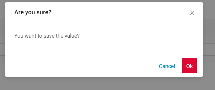
2) Confirm: Presents a dialog with an optional message, requiring user confirmation or cancellation before proceeding.
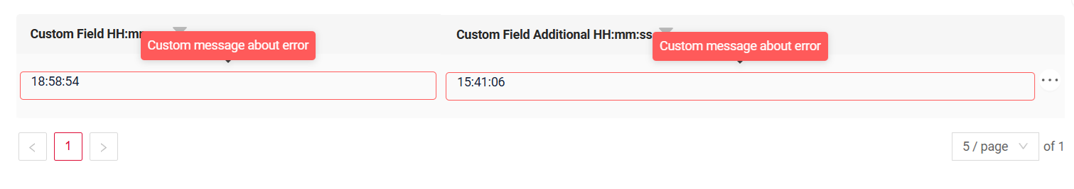
3) Field level validation: shows error next to all fields, that validation failed for
How does it look?
not applicable
How to add?
Example
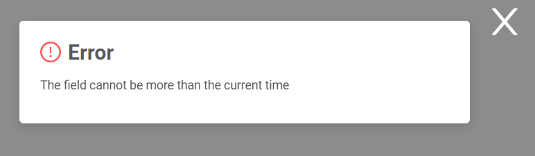
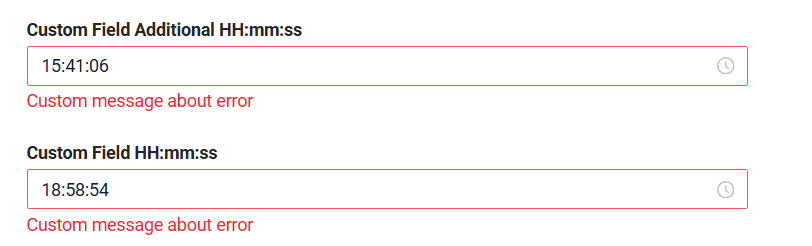
BusinessException describes an error within a business process.
Add BusinessException to corresponding VersionAwareResponseService.
    @Override
    protected ActionResultDTO<MyExampleDTO> doUpdateEntity(MyEntity entity, MyExampleDTO data, BusinessComponent bc) {
        if (data.isFieldChanged(MyExampleDTO_.customField)) {
            LocalTime fieldTime = data.getCustomField()
                    .atZone(ZoneId.systemDefault())
                    .toLocalTime();

            LocalTime currentTime = LocalTime.now();

            if (currentTime.isBefore(fieldTime)) {
                throw new BusinessException().addPopup(MORE_CURRENT_TIME);
            }
            entity.setCustomField(data.getCustomField());
        }
        return new ActionResultDTO<>(entityToDto(bc, entity));
    }
Works for List.
not applicable
Works for Form.
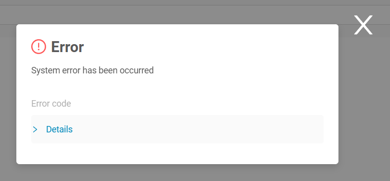
RuntimeException describes technical error within a business process.
Add RuntimeException to corresponding VersionAwareResponseService.
    @Override
    protected ActionResultDTO<MyExampleDTO> doUpdateEntity(MyEntity entity, MyExampleDTO data, BusinessComponent bc) {

        if (data.isFieldChanged(MyExampleDTO_.customField)) {
            try {
                //call custom function
                throw new Exception("Error");
            } catch (Exception e) {
                throw new RuntimeException("An unexpected error has occurred.");
            }
        }
        return new ActionResultDTO<>(entityToDto(bc, entity));
    }
Works for List.
not applicable
Works for Form.
Add PreAction.confirm to corresponding VersionAwareResponseService.
    @Override
    public Actions<MyExampleDTO> getActions() {
        return Actions.<MyExampleDTO>builder()
                .action(act -> act
                        .action("save", "save")
                        .withPreAction(PreAction.confirm(cf -> cf
                                .text("You want to save the value?")
                        )))
                .build();
    }
Works for List.
not applicable
Works for Form.
Sorting
Sorting allows you to sort data in ascending or descending order.
How does it look?
not applicable
not applicable
How to add?
Example
see more Sorting
Step 1 Add fields.enableSort to corresponding FieldMetaBuilder.
    @Override
    public void buildIndependentMeta(FieldsMeta<MyExampleDTO> fields, InnerBcDescription bcDescription, Long parentId) {
        fields.enableSort(MyExampleDTO_.customField);
        fields.enableSort(MyExampleDTO_.customFieldhA);
        fields.enableSort(MyExampleDTO_.customFieldh);
        fields.enableSort(MyExampleDTO_.customFieldmm);
        fields.enableSort(MyExampleDTO_.customFieldhmm);
        fields.enableSort(MyExampleDTO_.customFieldhmmA);
        fields.enableSort(MyExampleDTO_.customFieldhmmssA);
        fields.enableSort(MyExampleDTO_.customFieldss);
        fields.enableSort(MyExampleDTO_.customFieldmmss);
    }
Info
With a large number of rows in the database, a significant performance degradation may occur; therefore, we recommend adding appropriate indexes.
postgres
- CREATE INDEX idx_apple_created_date_time_desc ON my_entity (cast(custom_field as time(6)) desc,id desc);
- CREATE INDEX idx_apple_created_date_time_asc ON my_entity (cast(custom_field as time(6)) asc,id desc);
not applicable
not applicable
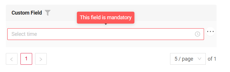
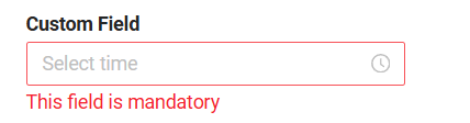
Required
Required allows you to denote, that this field must have a value provided.
How does it look?
not applicable
How to add?
Example
Add fields.setRequired to corresponding FieldMetaBuilder.
    @Override
    public void buildRowDependentMeta(RowDependentFieldsMeta<MyExampleDTO> fields, InnerBcDescription bcDescription,
                                      Long id, Long parentId) {
        fields.setEnabled(MyExampleDTO_.customField);
        fields.setRequired(MyExampleDTO_.customField);
    }
Works for List.
not applicable
Works for Form.