Form
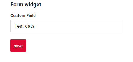
Form widget is a component for data viewing and editing. Usually it shows multiple fields. Also, it can show available actions.
Basics
How does it look?
How to add?
Example
Step1 Create file .widget.json. with type = "Form" Add existing field to a form widget. see more Fields
   {
     "name": "MyExampleForm",
     "title": "Form widget",
     "type": "Form",
     "bc": "myExampleBc",
     "fields": [
       {
         "label": "Custom Field",
         "key": "customField",
         "type": "input"
       }
     ],
     "options": {
       "layout": {
         "rows": [
           {
             "cols": [
               {
                 "fieldKey": "customField",
                 "span": 12
               }
             ]
           }
         ]
       }
     }
   }
Step2 Add widget to corresponding *.view.json* .
    {
      "name": "myexampleform",
      "title": "My Example Form",
      "template": "DashboardView",
      "url": "/screen/myexample/view/myexampleform",
      "widgets": [
        {
          "widgetName": "SecondLevelMenu",
          "position": 19,
          "gridWidth": 24
        },
        {
          "widgetName": "MyExampleFormInfoText",
          "position": 20,
          "gridWidth": 12
        },
        {
          "widgetName": "MyExampleForm",
          "position": 30,
          "gridWidth": 12
        }
      ],
      "rolesAllowed": [
        "CXBOX_USER"
      ]
    }
Title
Title Basic
Title for widget - (optional)
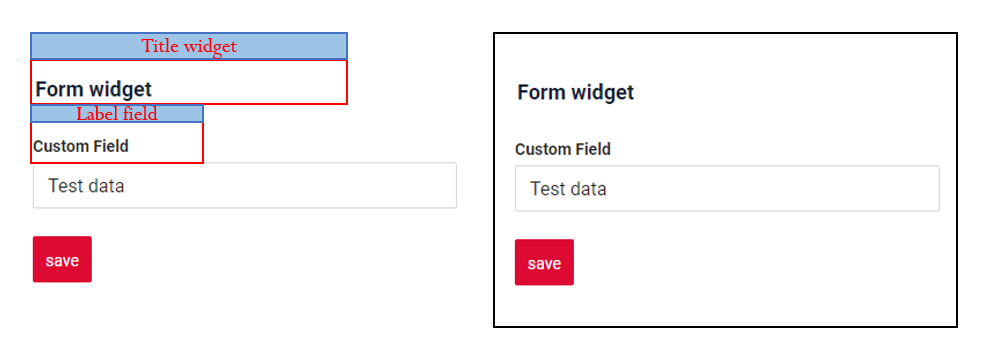
There are types of:
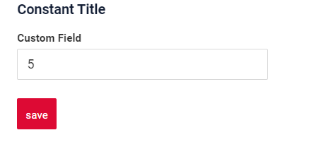
constant title: shows constant text.constant title empty: if you want to visually connect widgets by them to be placed one under anothercalculated title: shows value provided in hidden text field, e.g. it can be calculated based on business logic of application
How does it look?
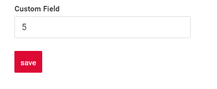

How to add?
Example
Step1 Add name for title to .widget.json.
{
  "name": "MyExampleForm",
  "title": "Constant Title",
  "type": "Form",
  "bc": "myExampleBc",
  "fields": [
    {
      "label": "Custom Field",
      "key": "customField",
      "type": "input"
    }
  ],
  "options": {
    "layout": {
      "rows": [
        {
          "cols": [
            {
              "fieldKey": "customField",
              "span": 12
            }
          ]
        }
      ]
    }
  }
}
Step1 Delete parameter title to .widget.json.
{
  "name": "MyExampleEmptyTitleForm",
  "type": "Form",
  "bc": "myExampleBc",
  "fields": [
    {
      "label": "Custom Field widget: Empty Title",
      "key": "customField",
      "type": "input"
    }
  ],
  "options": {
    "layout": {
      "rows": [
        {
          "cols": [
            {
              "fieldKey": "customField",
              "span": 12
            }
          ]
        }
      ]
    }
  }
}
Step1 Add ${customField} for title to .widget.json.
{
  "name": "MyExampleFormCustomTitle",
  "title": "Custom Title - value field 'Custom Field' : ${customField}",
  "type": "Form",
  "bc": "myExampleBc",
  "fields": [
    {
      "label": "Custom Field",
      "key": "customField",
      "type": "input"
    }
  ],
  "options": {
    "layout": {
      "rows": [
        {
          "cols": [
            {
              "fieldKey": "customField",
              "span": 12
            }
          ]
        }
      ]
    }
  }
}
Title Color
Title Color allows you to specify a color for a title. It can be constant or calculated.
Constant color*is a fixed color that doesn't change. It remains the same regardless of any factors in the application.
Calculated colorcan be used to change a title color dynamically. It changes depending on business logic or data in the application.
Info
Title colorization is applicable to the following fields: date, dateTime, dateTimeWithSeconds, number, money, percent, time, input, text, dictionary, radio, checkbox, multivalue, multivalueHover.
How does it look?

How to add?
Example
Step 1 Add custom field for color to corresponding DataResponseDTO. The field can contain a HEX color or be null.
    public MyExampleDTO(MyEntity entity) {
        this.id = entity.getId().toString();
        this.customFieldColor = "#edaa";
        this.customFieldTextColor = "#aeda";
        this.customFieldText = entity.getCustomFieldText();
Step 2 Add "bgColorKey" : custom field for color and to .widget.json.
Add in title field with ${customField}
{
  "name": "MyExampledynamic",
  "title": "customField: ${customField},  customFieldText: ${customFieldText}",
  "type": "Form",
  "bc": "myexample",
  "fields": [
    {
      "label": "Custom Field Color",
      "key": "customField",
      "type": "input",
      "bgColorKey": "customFieldColor"
    },
    {
      "label": "Custom Field",
      "key": "customFieldText",
      "type": "input",
      "bgColorKey": "customFieldTextColor"
    }
  ],
  "options": {
    "layout": {
      "rows": [
        {
          "cols": [
            {
              "fieldKey": "customField",
              "span": 12
            }
          ]
        },
        {
          "cols": [
            {
              "fieldKey": "customFieldText",
              "span": 12
            }
          ]
        }
      ]
    }
  }
}
Add "bgColor" : HEX color to .widget.json.
Add in title field with ${customField}
{
  "name": "MyExampleconst",
  "title": "customField: ${customField},  customFieldText: ${customFieldText}",
  "type": "Form",
  "bc": "myexample",
  "fields": [
    {
      "label": "Custom Field Color",
      "key": "customField",
      "type": "input",
      "bgColor": "#edaa"
    },
    {
      "label": "Custom Field",
      "key": "customFieldText",
      "type": "input",
      "bgColor": "#aeda"
    }
  ],
  "options": {
    "layout": {
      "rows": [
        {
          "cols": [
            {
              "fieldKey": "customField",
              "span": 12
            }
          ]
        },
        {
          "cols": [
            {
              "fieldKey": "customFieldText",
              "span": 12
            }
          ]
        }
      ]
    }
  }
}
Show condition
see more showCondition
no show condition - recommended: widget always visible
show condition by current entity: condition can include boolean expression depending on current entity fields. Field updates will trigger condition recalculation only on save or if field is force active
show condition by parent entity: condition can include boolean expression depending on parent entity. Parent field updates will trigger condition recalculation only on save or if field is force active shown on same view
Tips
It is recommended not to use Show condition when possible, because wide usage of this feature makes application hard to support.
How does it look?

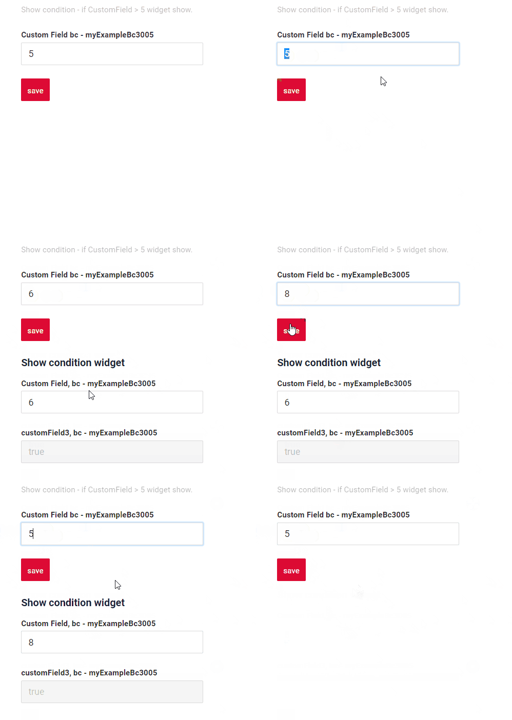
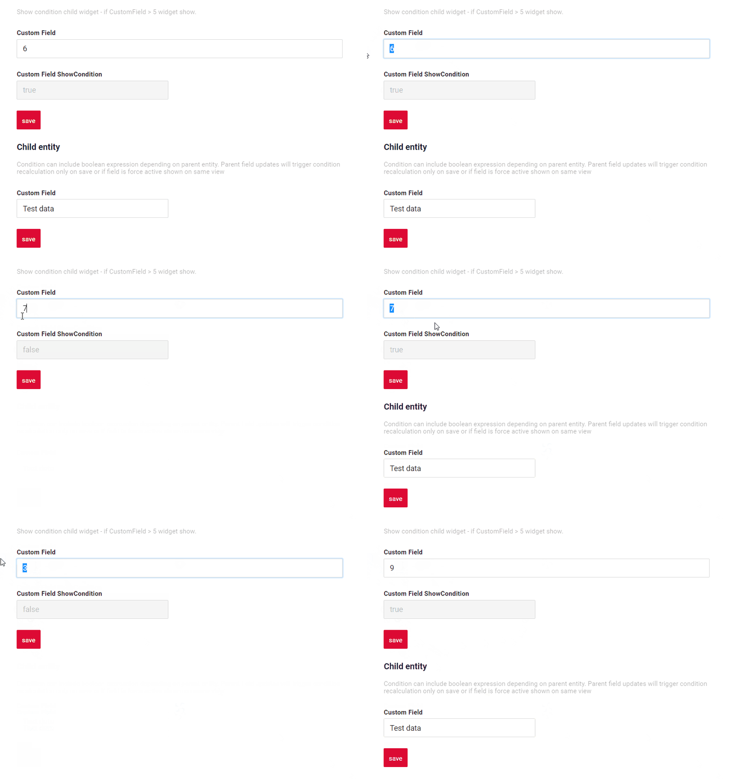
How to add?
Example
see Basic Live Sample · GitHub
Step1 Add showCondition to .widget.json. see more showCondition
{
  "name": "MyExampleForm",
  "title": "Show condition widget",
  "type": "Form",
  "bc": "myExampleBc",
  "showCondition": {
    "bcName": "myExampleBc",
    "params": {
      "fieldKey": "customFieldShowCondition",
      "value": true
    }
  },
  "fields": [
    {
      "label": "Custom Field, bc - myExampleBc",
      "key": "customField",
      "type": "input"
    }
  ],
  "options": {
    "actionGroups": {
      "include": [
        "create"
      ]
    },
    "layout": {
      "rows": [
        {
          "cols": [
            {
              "fieldKey": "customField",
              "span": 12
            }
          ]
        }
      ]
    }
  }
}
Step1 Add showCondition to .widget.json. see more showCondition
{
  "name": "MyExampleForm",
  "title": "",
  "type": "Form",
  "bc": "myExampleBc",
  "showCondition": {
    "bcName": "myExampleBc",
    "params": {
      "fieldKey": "customFieldShowCondition",
      "value": true
    }
  },
  "fields": [
    {
      "label": "Custom Field",
      "key": "customField",
      "type": "input"
    }
  ],
  "options": {
    "actionGroups": {
      "include": [
        "create"
      ]
    },
    "layout": {
      "rows": [
        {
          "cols": [
            {
              "fieldKey": "customField",
              "span": 12
            }
          ]
        }
      ]
    }
  }
}
Business component
This specifies the business component (BC) to which this form belongs. A business component represents a specific part of a system that handles a particular business logic or data.
see more Business component
Fields
Fields Configuration. The fields array defines the individual fields present within the form.
- "label"
Description: Field Title.
Type: String(optional).
- "key"
Description: Name field to corresponding DataResponseDTO.
Type: String(required).
- "type"
Description: Field types
Type: String(required).
How to add?
Example
Step 1 Download plugin download Intellij Plugin
Step 2 Add existing field to an existing form widget
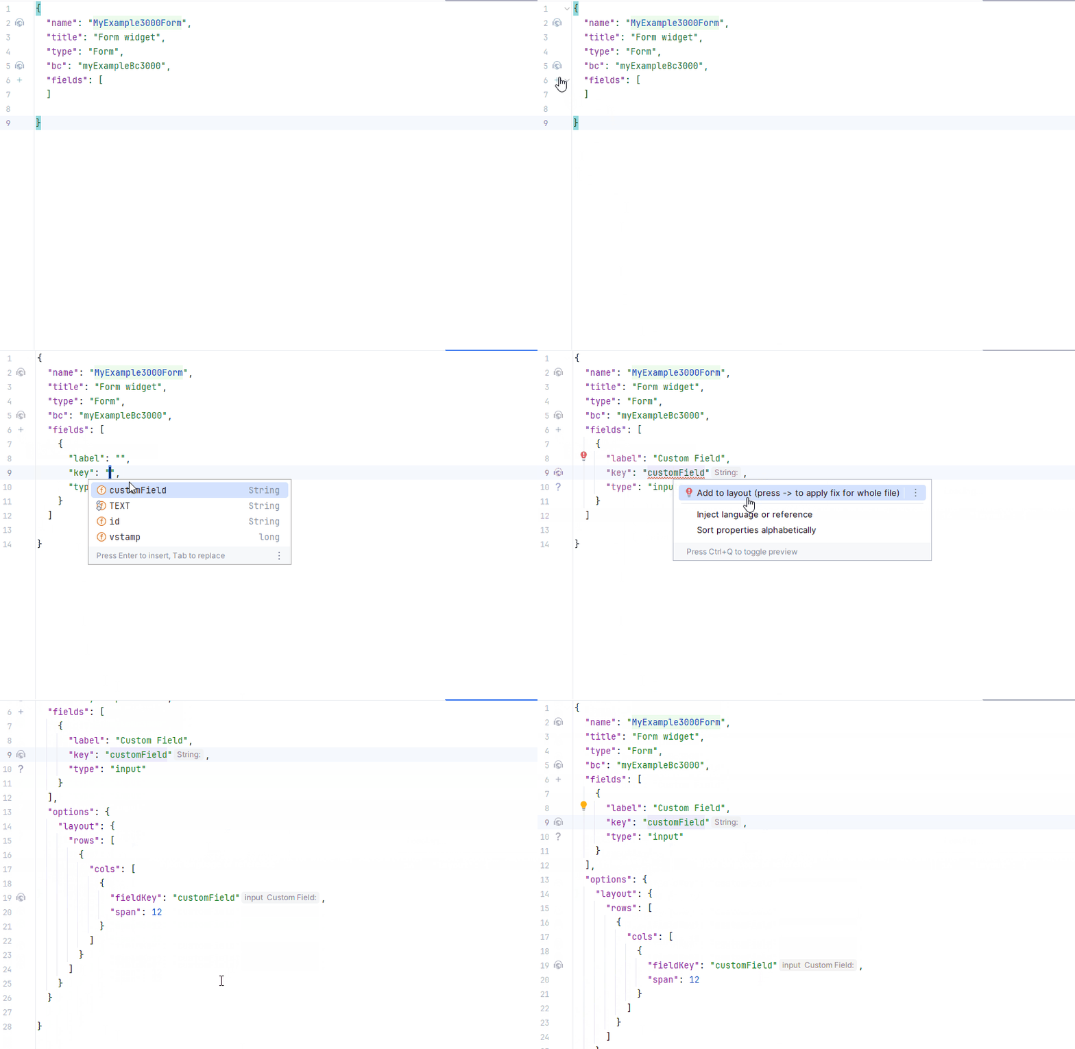
see more Fields
Options
The options object provides layout details for the widget.
Options layout
Defines the structure of the widget using rows and columns.
single column layout - recommended: shows each field on new row. Each field can have width from 1 to 24.
Tips
Use single column layout when fields are frequently hidden or rearranged. This avoids layout issues and ensures the best user experience.
multi column layout: shows fields in grid. Grid can contain any number of rows. Each row can contain any number of fields, until sum of fields widths in row is less than 24. Each field can have width from 1 to 24.empty: only title and actions are shown. Usually used when standard buttons position needs to be changed (for example we want to show buttons under widget). One can hide buttons on widget with data. Create separate widget only with buttons and place it anywhere on view
Tips
It is recommended to use single column layout when possible, because dynamic fields hiding (add link) always works correctly in this case.
Info
The line has a size of 24 span, if you define fields on one line with a field width sum exceeding 24 span in total,that field and any subsequent fields will be moved to a new line . This means that each line will accommodate fields until the total width reaches 24 span, and any excess width will continue on the next line.
For example, you have three fields with widths of 12, 8, and 10 characters, respectively. In this case, the first field and two field will fit completely on the first line as it is within the 24-character limit. However, the thirt field's width contributes to the totat.It has finally become more 24. As a result, the third field will be moved to the next line.
How does it look?
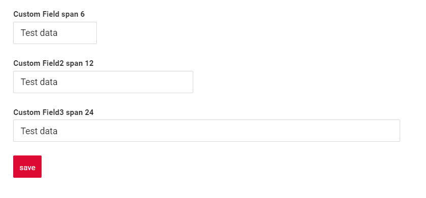

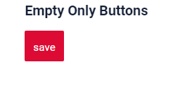
How to add?
Example
Step1 Create "options": {"layout": {}}.
Step2 Add fields to "options": {"layout": {}}
Forming rows:
- Open
cols: "cols": [ - Add All fields(customField,customField2,customField3) with span from 1 to 24.
- Close
cols: ]
{
"name": "MyExampleForm",
"title": "Single column layout - recommended",
"type": "Form",
"bc": "myExampleBc",
"fields": [
{
"label": "Custom Field span 6",
"key": "customField",
"type": "input"
},
{
"label": "Custom Field span 12",
"key": "customField",
"type": "input"
},
{
"label": "Custom Field span 24",
"key": "customField",
"type": "input"
}
],
"options": {
"layout": {
"rows": [
{
"cols": [
{
"fieldKey": "customField",
"span": 6
}
]
},
{
"cols": [
{
"fieldKey": "customField",
"span": 12
}
]
},
{
"cols": [
{
"fieldKey": "customField",
"span": 24
}
]
}
]
}
}
}
Step1 Create "options": {"layout": {}}.
Step2 Add fields to "options": {"layout": {}}.
Forming row1 :
- Open
cols: "cols": [ - Add all feild : customField,customField2,customField3
- Check sum span <= 24: customField (span = 12),customField2 = 6, customField3 = 6 : sum 24)
- Close
cols: ]
Forming a row2 :
- Open 'cols' : "cols": [
- Add All filed(customField4)
- Check sum span <= 24 (customField4 span = 12 : sum 12)
- Close 'cols' : ]
Step1 Create "options": {"layout": {}}.
Button "Create" - On default
{
"name": "MyExampleEmptyOnlyButtonsForm",
"title": "Empty Only Buttons",
"type": "Form",
"bc": "myExampleBc",
"fields": [
{
"label": "",
"key": "ONLY_BUTTONS_TEXT",
"type": "hint",
"showLength": 100
}
],
"options": {
"layout": {
"rows": [
{
"cols": [
{
"fieldKey": "ONLY_BUTTONS_TEXT",
"span": 24
}
]
}
]
}
}
}
Live Sample · [:fontawesome-brands-gith
Standard Actions
Actions show available actions as separate buttons see more Actions.
Standard Actions:
Create: Action to initialize the process of creating a new recordDelete: Remove an existing recordEdit: Users to update or correct informationSave: Action to store the data entered or modifiedCancel-create: Action to abort the creation of a new record, discarding any input without saving
Create
Create button enables you to create a new value by clicking the Add button.
Tips
We advise against creating entries in the form widget.
There are two methods to create a record:
-
Basic: You can add data using a standard button create without leaving your current view.
-
With view: You can create a record by navigating to a view.
Basic
How does it look?

How to add?
Example
Step1 Add button create to corresponding VersionAwareResponseService.
@Override
public Actions<MyExampleDTO> getActions() {
return Actions.<MyExampleDTO>builder()
.create(crt -> crt.text("Add").available(bc -> true))
.save(sv -> sv.text("Save").available(bc -> true))
.cancelCreate(ccr -> ccr.text("Cancel").available(bc -> true))
.delete(dlt -> dlt)
.build();
}
create to corresponding .widget.json.
{
"name": "MyExampleForm",
"type": "Form",
"bc": "myexample",
"fields": [
{
"label": "customField",
"key": "customField",
"type": "input"
}
],
"options": {
"actionGroups": {
"include": [
"save",
"create",
"delete",
"cancel-create"
]
},
"layout": {
"rows": [
{
"cols": [
{
"fieldKey": "customField",
"span": 12
}
]
}
]
}
}
}
With view
With Create with view, clicking the "Add" button opens a separate view that displays only the data entry form. After completing the form and saving, the system returns to the form of entities with the new row added.
How does it look?
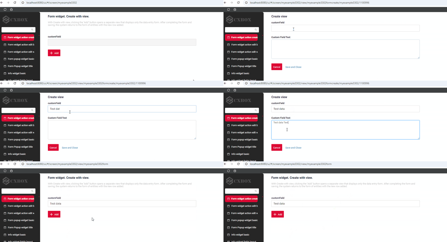
How to add?
Example
Step1 Add button create to corresponding VersionAwareResponseService.
@Override
public Actions<MyExampleDTO> getActions() {
return Actions.<MyExampleDTO>builder()
.create(crt -> crt.text("Add"))
.action(act -> act
.action("cancel", "Cancel")
.invoker((bc, dto) -> {
return new ActionResultDTO<MyExampleDTO>().setAction(
PostAction.drillDown(
DrillDownType.INNER,
"/screen/myexample/view/myexampleform"
));
})
.withoutAutoSaveBefore()
)
.action(act -> act
.action("finish", "Save and Close")
.invoker((bc, data) -> {
MyEntity myEntity = repository.getReferenceById(bc.getIdAsLong());
repository.save(myEntity);
return new ActionResultDTO<MyExampleDTO>().setAction(
PostAction.drillDown(
DrillDownType.INNER,
"/screen/myexample/view/myexampleform"
));
}
))
.cancelCreate(ccr -> ccr.text("Cancel").available(bc -> true))
.delete(dlt -> dlt.text("Delete"))
.build();
}
@Override
protected CreateResult<MyExampleDTO> doCreateEntity(MyEntity entity, BusinessComponent bc) {
repository.save(entity);
return new CreateResult<>(entityToDto(bc, entity))
.setAction(PostAction.drillDown(
DrillDownType.INNER,
"/screen/myexample/view/myexampleformcreate/"
+ CxboxMyExampleController.myexample + "/"
+ entity.getId()));
}
create to corresponding .widget.json.
Delete
Delete remove an existing record.
How does it look?
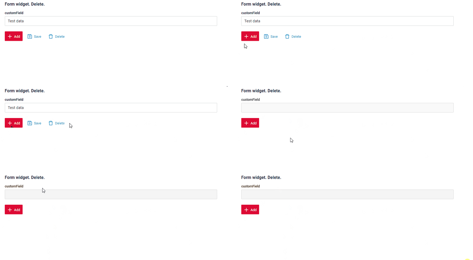
How to add?
Example
Step1 Add action delete to corresponding VersionAwareResponseService.
By default, the access button is available when a record exist.
@Override
public Actions<MyExampleDTO> getActions() {
return Actions.<MyExampleDTO>builder()
.create(crt -> crt.text("Add"))
.save(sv -> sv.text("Save"))
.delete(dlt -> dlt.text("Delete"))
.build();
}
Step2 Add button ot group button to corresponding .widget.json.
{
"name": "MyExampleForm",
"title": "Form widget. Delete.",
"type": "Form",
"bc": "myexample",
"fields": [
{
"label": "customField",
"key": "customField",
"type": "input"
}
],
"options": {
"actionGroups": {
"include": [
"save",
"create",
"delete"
]
},
"layout": {
"rows": [
{
"cols": [
{
"fieldKey": "customField",
"span": 12
}
]
}
]
}
}
}
For to implement a custom handler for deleting an entity, you must override deleteEntity method to corresponding VersionAwareResponseService.
Edit enables you to change the field value.
Edit
There are two methods to edit a record:
-
Basic: You can edit data in your current widget.
-
With view: You can edit a record by navigating to a view.
Base edit
Edit Inline implies inline-edit. Click twice on the value you want to change.
How does it look?
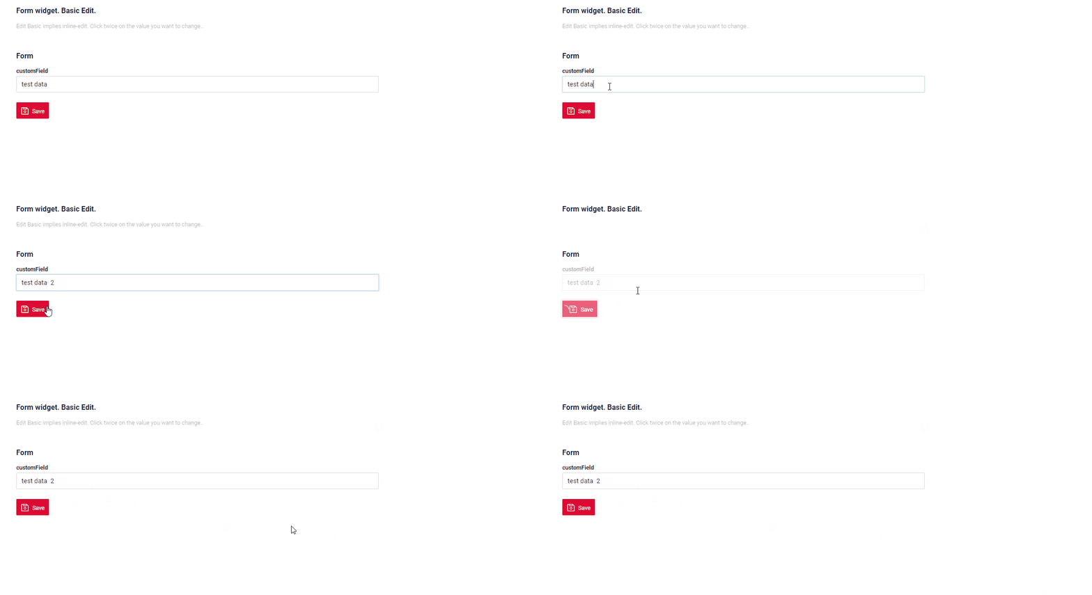
How to add?
Example
Step1 Add fields.setEnabled to corresponding FieldMetaBuilder.
With view
With Edit with view, you can edit the entity from a separate view that displays only the data entry form. Click on the "Edit" option.
How does it look?
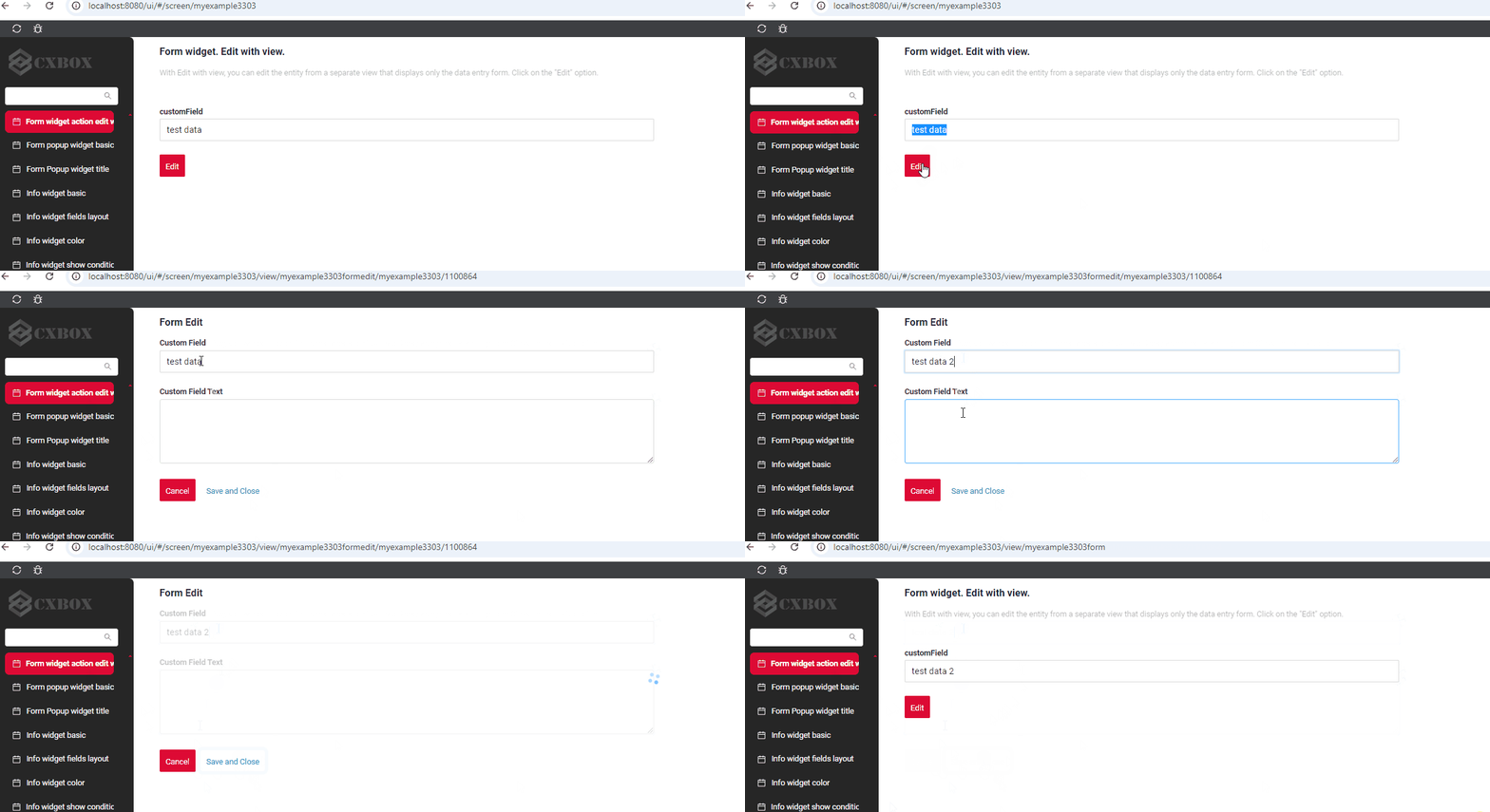
How to add?
Example
Step1 Add action edit to corresponding VersionAwareResponseService.
Add PostAction.drillDown to method edit
@Override
public Actions<MyExampleDTO> getActions() {
return Actions.<MyExampleDTO>builder()
.save(sv -> sv.text("Save"))
.action(act -> act
.action("cancel", "Cancel")
.invoker((bc, dto) -> {
return new ActionResultDTO<MyExampleDTO>().setAction(
PostAction.drillDown(
DrillDownType.INNER,
"/screen/myexample/view/myexampleform"
));
})
.withoutAutoSaveBefore()
)
.action(act -> act
.scope(ActionScope.RECORD)
.withAutoSaveBefore()
.action("edit", "Edit")
.invoker((bc, data) -> new ActionResultDTO<MyExampleDTO>()
.setAction(PostAction.drillDown(
DrillDownType.INNER,
"/screen/myexample/view/myexampleformedit/"
+ CxboxMyExampleController.myexample + "/"
+ bc.getId()
))))
.action(act -> act
.action("finish", "Save and Close")
.invoker((bc, data) -> {
MyEntity myEntity = repository.getReferenceById(bc.getIdAsLong());
repository.save(myEntity);
return new ActionResultDTO<MyExampleDTO>().setAction(
PostAction.drillDown(
DrillDownType.INNER,
"/screen/myexample/view/myexampleform"
));
}
))
.build();
}
Save
Save to store the data entered or modified. see information on autosave
How does it look?
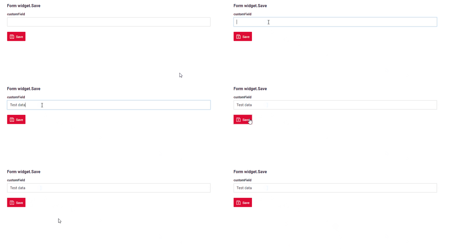
How to add?
Example
Step1 Add action save to corresponding VersionAwareResponseService.
@Override
public Actions<MyExampleDTO> getActions() {
return Actions.<MyExampleDTO>builder()
.save(sv -> sv.text("Save"))
.build();
}
{
"name": "MyExampleForm",
"title": "Form widget.Save",
"type": "Form",
"bc": "myexample",
"fields": [
{
"label": "customField",
"key": "customField",
"type": "input"
}
],
"options": {
"actionGroups": {
"include": [
"save"
]
},
"layout": {
"rows": [
{
"cols": [
{
"fieldKey": "customField",
"span": 12
}
]
}
]
}
}
}
Cancel-create
Cancel-create abort the creation of a new record, discarding any input without saving
How does it look?
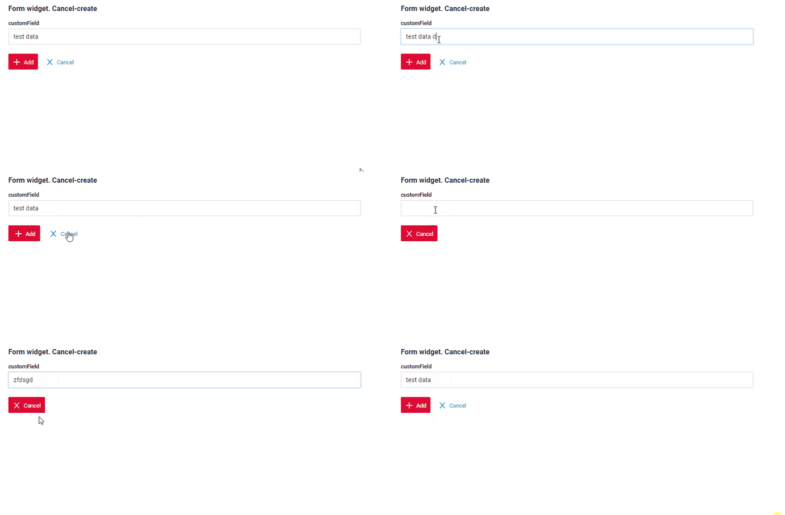
How to add?
Example
Step1 Add standart action cancelCreate to corresponding VersionAwareResponseService. The interface displays "cancelCreate" as the default option.
@Override
public Actions<MyExampleDTO> getActions() {
return Actions.<MyExampleDTO>builder()
.create(crt -> crt.text("Add"))
.cancelCreate(ccr -> ccr.text("Cancel").available(bc -> true))
.build();
}
Step1 Add action cancel to corresponding VersionAwareResponseService with postAction.
@Override
public Actions<MyExampleDTO> getActions() {
return Actions.<MyExampleDTO>builder()
.create(crt -> crt.text("Add"))
.save(sv -> sv.text("Save"))
.action(act -> act
.action("cancel", "Cancel")
.invoker((bc, dto) -> {
return new ActionResultDTO<MyExampleDTO>().setAction(
PostAction.drillDown(
DrillDownType.INNER,
"/screen/myexample"
));
})
.withoutAutoSaveBefore()
)
.delete(dlt -> dlt.text("Delete"))
.action(act -> act
.action("finish", "Save and Close")
.invoker((bc, data) -> {
MyEntity myEntity = repository.getReferenceById(bc.getIdAsLong());
repository.save(myEntity);
return new ActionResultDTO<MyExampleDTO>().setAction(
PostAction.drillDown(
DrillDownType.INNER,
"/screen/myexample/view/myexampleform"
));
}
))
.build();
}
Step2 Add button ot group button to corresponding .widget.json.
{
"name": "MyExampleFormCreate",
"title": "Form",
"type": "Form",
"bc": "myexample",
"fields": [
{
"label": "Custom Field",
"key": "customFieldText",
"type": "text"
},
{
"label": "customField",
"key": "customField",
"type": "input"
}
],
"options": {
"actionGroups": {
"include": [
"finish",
"cancel"
]
},
"layout": {
"rows": [
{
"cols": [
{
"fieldKey": "customField",
"span": 12
}
]
},
{
"cols": [
{
"fieldKey": "customFieldText",
"span": 12
}
]
}
]
}
}
}
Info
Only for Inner Business Component see more Business Component
Step1 Add standart action cancelCreate to corresponding VersionAwareResponseService.
@Override
public Actions<MyExampleDTO> getActions() {
return Actions.<MyExampleDTO>builder()
.create(crt -> crt.text("Add"))
.save(sv -> sv.text("Save"))
.cancelCreate(ccr -> ccr.text("Cancel").available(bc -> true))
.delete(dlt -> dlt.text("Delete"))
.action(act -> act
.action("finish", "Save and Close")
.invoker((bc, data) -> {
MyEntity myEntity = repository.getReferenceById(bc.getIdAsLong());
repository.save(myEntity);
return new ActionResultDTO<MyExampleDTO>().setAction(
PostAction.drillDown(
DrillDownType.INNER,
"/screen/myexample/view/myexampleform"
));
}
))
.build();
}
@Override
public ActionResultDTO onCancel(BusinessComponent bc) {
return new ActionResultDTO<>().setAction(PostAction.drillDown(
DrillDownType.INNER,
"/screen/myexample/"
));
}
{
"name": "MyExampleFormCreate",
"title": "Form Create",
"type": "Form",
"bc": "myexample",
"fields": [
{
    "label": "Custom Field",
    "key": "customField",
    "type": "input"
},
{
"label": "Custom Field Text",
"key": "customFieldText",
"type": "text"
}
],
"options": {
"actionGroups": {
"include": [
"finish",
"cancel-create"
]
},
"layout": {
"rows": [
{
"cols": [
{
"fieldKey": "customFieldText",
"span": 12
}
]
},
{
"cols": [
{
"fieldKey": "customField",
"span": 12
}
]
}
]
}
}
}
Additional properties
Field hidden
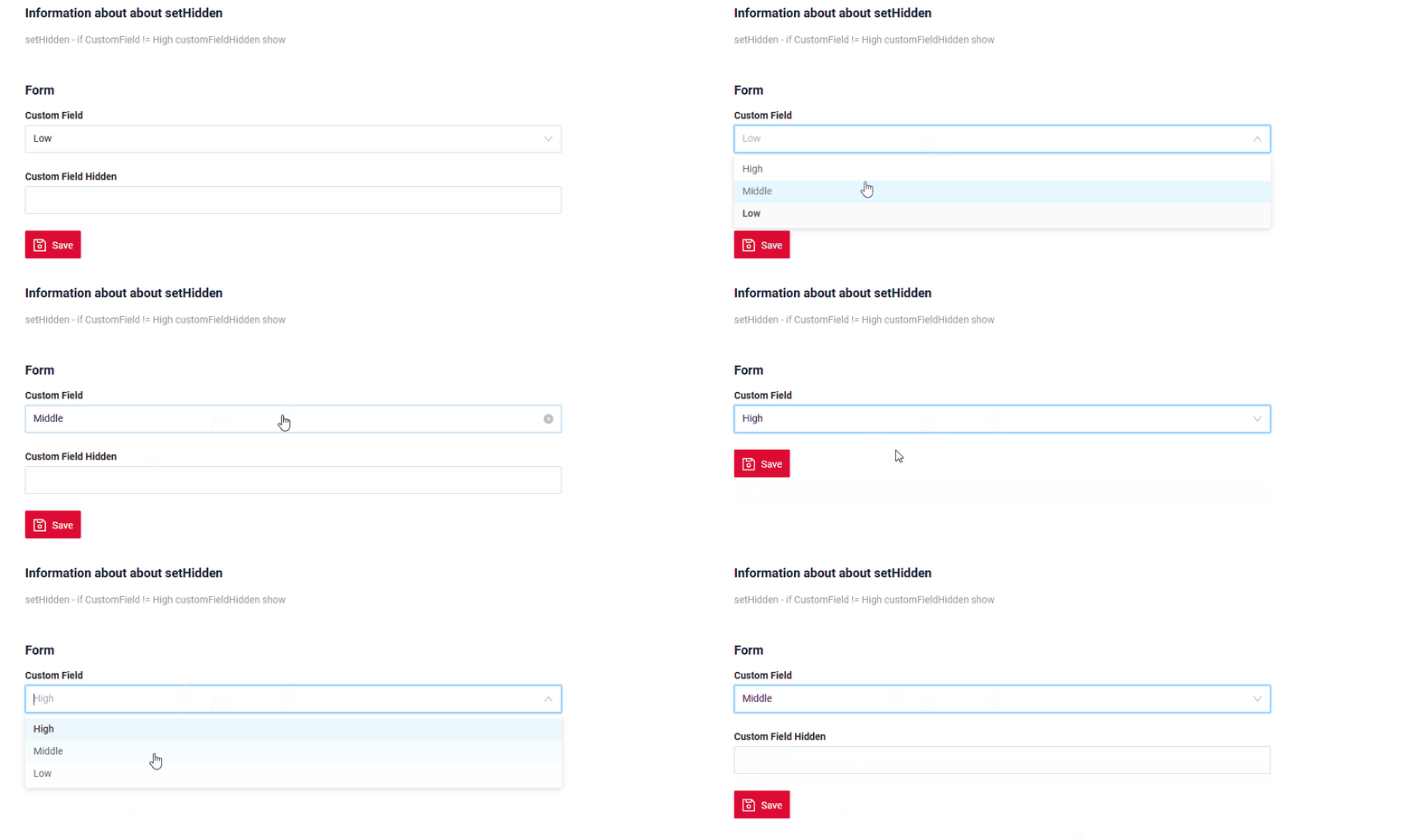
If you need to hide certain fields based on the values of other fields, you can use the hidden and forceActive properties.
When the value of a related field changes, the current field will automatically:
- hide and become unavailable, or
- show and become visible,
depending on the configured logic.
How does it look?
