PickListPopup
PickListPopup is a component that allows the user to select a value from a Popup list of entities.
Basics
How does it look?
Example
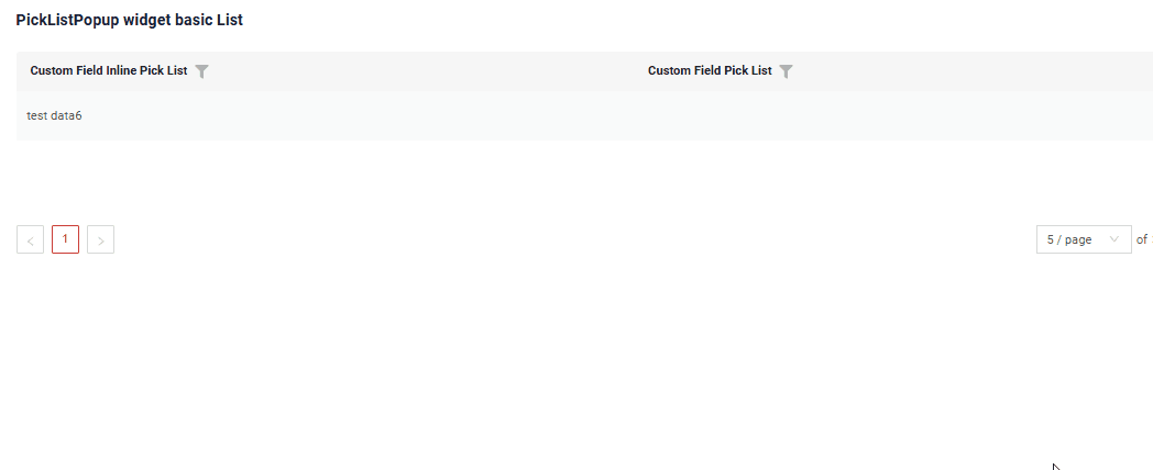
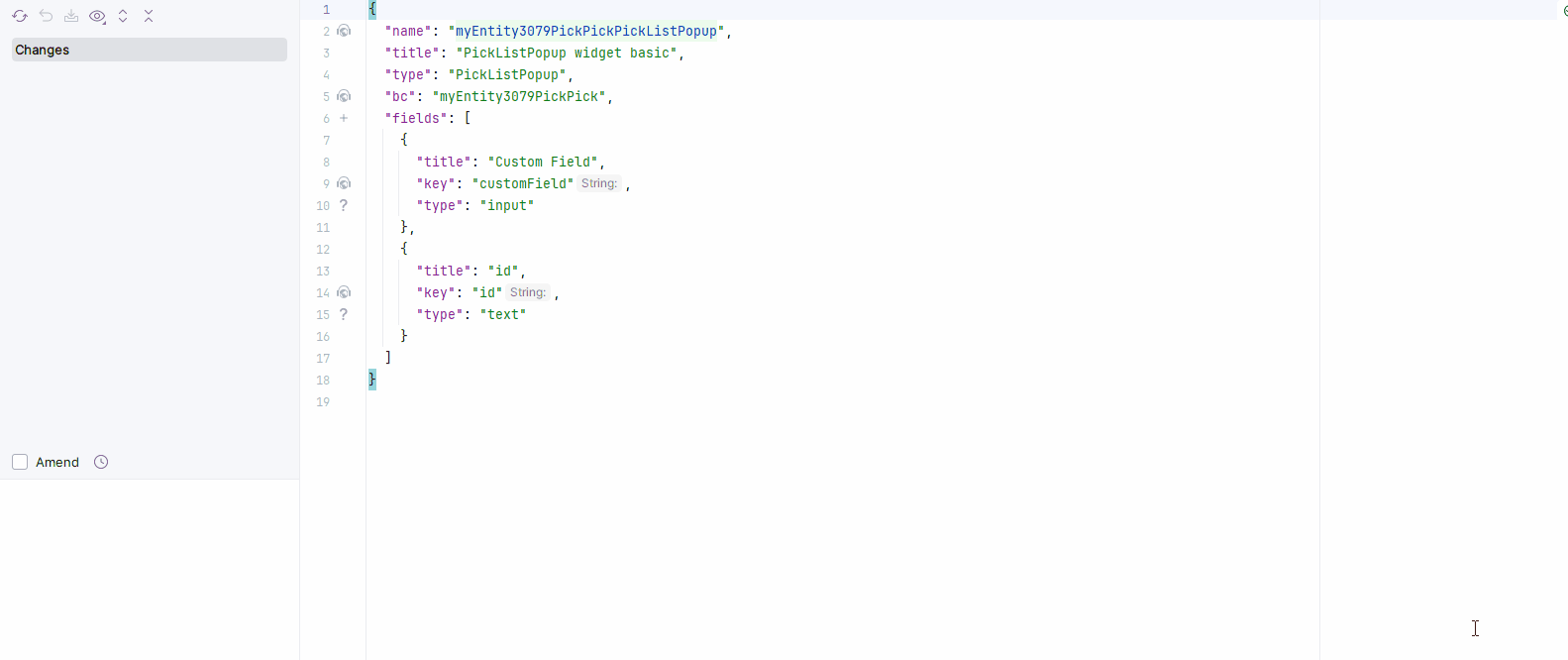
Step1 Add field with type pickList or type inline-pickList see more Fields
{
  "name": "MyExampleList",
  "title": "PickListPopup widget basic List",
  "type": "List",
  "bc": "myexample",
  "fields": [
    {
      "title": "Custom Field Inline Pick List",
      "key": "customFieldInlinePickList",
      "type": "inline-pickList",
      "popupBcName": "myEntityPickPick",
      "pickMap": {
        "customFieldInlinePickList": "customField",
        "customFieldInlinePickListId": "id"
      }
    },
    {
      "title": "Custom Field Pick List",
      "key": "customFieldPickList",
      "type": "pickList",
      "popupBcName": "myEntityPickPick",
      "pickMap": {
        "customFieldPickListId": "id",
        "customFieldPickList": "customField"
      }
    }
  ],
  "options": {
    "actionGroups": {
      "include": [
        "save"
      ]
    }
  }
}
Step2 Add widget and popup widget to corresponding *.view.json* .
{
  "name": "myexamplelist",
  "title": "MyExample List",
  "template": "DashboardView",
  "url": "/screen/myexample/view/myexamplelist",
  "widgets": [
    {
      "widgetName": "myEntityPickPickPickListPopup",
      "position": 2,
      "gridWidth": 24
    },
    {
      "widgetName": "myEntityPickPickPickListPopup",
      "position": 2,
      "gridWidth": 24
    },
    {
      "widgetName": "SecondLevelMenu",
      "position": 10,
      "gridWidth": 12
    },
    {
      "widgetName": "MyExampleList",
      "position": 20,
      "gridWidth": 24
    }
  ],
  "rolesAllowed": [
    "CXBOX_USER"
  ]
}
Title
Title Basic
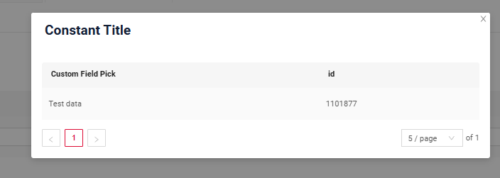
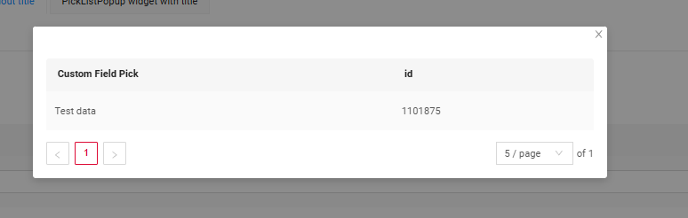
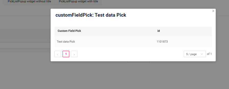
There are 3 types of titles for a Picklist Popup:
constant title: displays a fixed piece of text which cannot be changed.constant title empty: shows no text.calculated title: displays a dynamic piece of text, meaning it can change based on business logic or data in the application.
How does it look?
How to add?
Example
Step1 Add name for title to .widget.json.
Step1 Delete parameter title to .widget.json.
Step1 Add ${customField} for title to .widget.json.
{
  "title": "customFieldPick: ${customFieldPick}",
  "name": "myEntityPickPickListPopup",
  "type": "PickListPopup",
  "bc": "myEntityPickPickListPopup",
  "fields": [
    {
      "title": "Custom Field Pick",
      "key": "customFieldPick",
      "type": "input"
    },
    {
      "title": "id",
      "key": "id",
      "type": "text"
    }
  ],
  "options": {
    "actionGroups": {
      "include": [
        "save"
      ]
    }
  }
}
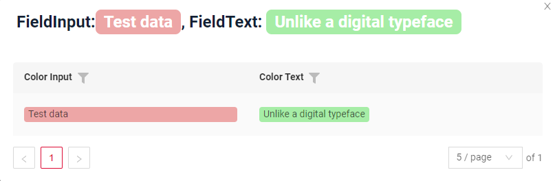
Title Color
Title Color allows you to specify a color for a title. It can be constant or calculated.
Constant color
Constant color is a fixed color that doesn't change. It remains the same regardless of any factors in the application. Calculated color
Calculated color can be used to change a title color dynamically. It changes depending on business logic or data in the application.
Info
Title colorization is applicable to the following fields: date, dateTime, dateTimeWithSeconds, number, money, percent, time, input, text, dictionary, radio, checkbox, multivalue, multivalueHover.
How does it look?
How to add?
Example
Step 1 Add custom field for color to corresponding DataResponseDTO. The field can contain a HEX color or be null.
    public MyEntityPickDTO(MyEntity entity) {
        this.id = entity.getId().toString();
        this.customField = entity.getCustomField();
        this.customFieldColor = "#edaa";
        this.customFieldColorFieldText = "#aeda";
Step 2 Add "bgColorKey" : custom field for color and to .widget.json.
Add in title field with ${customField}
{
  "name": "myEntityPickListPopupColorConst",
  "title": "FieldInput:${customFieldColorInputConst}, FieldText: ${customFieldColorTextConst}",
  "type": "PickListPopup",
  "bc": "myEntityPickListPopupColorConst",
  "fields": [
    {
      "title": "Color Input",
      "key": "customFieldColorInputConst",
      "type": "input",
      "bgColor": "#edaa"
    },
    {
      "title": "Color Text",
      "key": "customFieldColorTextConst",
      "type": "text",
      "bgColor": "#aeda"
    }
  ]
}
Add "bgColor" : HEX color to .widget.json.
Add in title field with ${customField}
{
  "name": "myEntityPickListPopupColorConst",
  "title": "FieldInput:${customFieldColorInputConst}, FieldText: ${customFieldColorTextConst}",
  "type": "PickListPopup",
  "bc": "myEntityPickListPopupColorConst",
  "fields": [
    {
      "title": "Color Input",
      "key": "customFieldColorInputConst",
      "type": "input",
      "bgColor": "#edaa"
    },
    {
      "title": "Color Text",
      "key": "customFieldColorTextConst",
      "type": "text",
      "bgColor": "#aeda"
    }
  ]
}
Business component
This specifies the business component (BC) to which this form belongs. A business component represents a specific part of a system that handles a particular business logic or data.
see more Business component
Show condition
Fields
Fields Configuration. The fields array defines the individual fields present within the form.
- "title"
Description: Field Title.
Type: String(optional).
- "key"
Description: Name field to corresponding DataResponseDTO.
Type: String(required).
- "type"
Description: Field types
Type: String(required).
How to add?
Example
Step 1 Download plugin download Intellij Plugin
Step 2 Add existing field to an existing form widget
Options layout
options.layout - no use in this type.
Standard Actions
Actions show available actions as separate buttons see more Actions.
Standard Actions:
Create: Action to initialize the process of creating a new recordDelete- not applicableEdit- not applicableSave: Action to store the data entered or modifiedCancel-create: Action to abort the creation of a new record, discarding any input without saving
Create
Create button enables you to create a new value by clicking the Add button. This action can be performed in three different ways, feel free to choose any, depending on your logic of application:
There are three methods to create a record:
- Inline: You can add a line directly.
Info
Pagination won't function until the page is refreshed after adding records.
-
Inline-form: You can add data using a form widget without leaving your current view.
-
With view: not applicable.
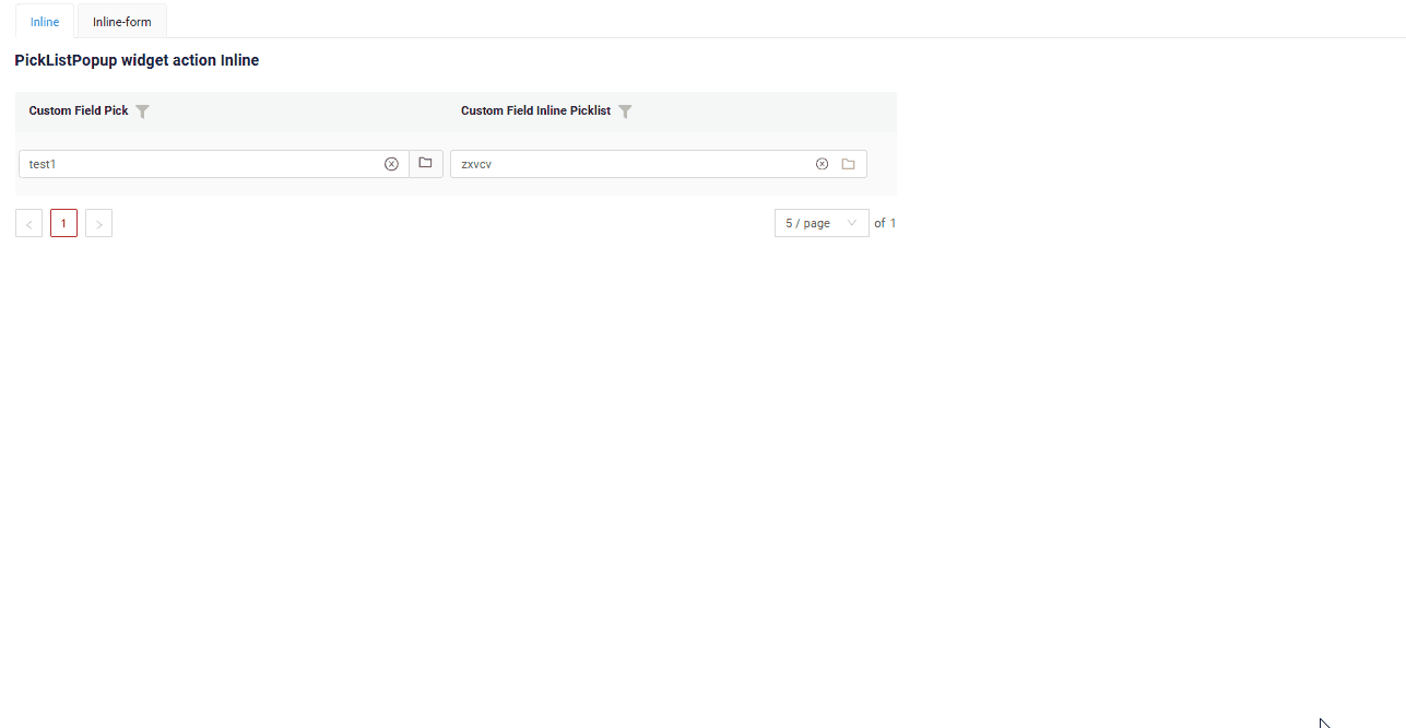
Inline
With Line Addition, a new empty row is immediately added to the top of the assoc widget when the "Add" button is clicked. This is a quick way to add rows without needing to input data beforehand.
How does it look?
How to add?
Example
Step1 Add button create to corresponding VersionAwareResponseService.
public Actions<MyEntityInlinePickPickDTO> getActions() {
return Actions.<MyEntityInlinePickPickDTO>builder()
.create(crt -> crt.text("Add"))
.save(sv -> sv.text("Save"))
.cancelCreate(ccr -> ccr.text("Cancel").available(bc -> true))
.delete(dlt -> dlt.text("Delete"))
.build();
}
Step2 Add button create to corresponding .widget.json.
{
"title": "PickListPopup create",
"name": "myEntityInlinePickPickListPopup",
"type": "PickListPopup",
"bc": "myEntityInlinePickPickListPopup",
"fields": [
{
"title": "Custom Field Pick",
"key": "customFieldPick",
"type": "input"
},
{
"title": "id",
"key": "id",
"type": "text"
}
],
"options": {
"actionGroups": {
"include": [
"create",
"delete",
"save"
]
}
}
}
Step3 Add fields.setEnabled to corresponding FieldMetaBuilder.
Inline-form
Create with widget opens an additional widget when the "Add" button is clicked. The form will appear on the same screen, allowing you to view both the assoc of entities and the form for adding a new row.
After filling the information in and clicking "Save", the new row is added to the assoc.
How does it look?

How to add?
Example
Step1 Add button create to corresponding VersionAwareResponseService.
public Actions<MyEntityInlinePickPickDTO> getActions() {
return Actions.<MyEntityInlinePickPickDTO>builder()
.create(crt -> crt.text("Add"))
.save(sv -> sv.text("Save"))
.cancelCreate(ccr -> ccr.text("Cancel").available(bc -> true))
.delete(dlt -> dlt.text("Delete"))
.build();
}
public void buildRowDependentMeta(RowDependentFieldsMeta<MyEntityInlinePickPickDTO> fields, InnerBcDescription bcDescription,
Long id, Long parentId) {
fields.setEnabled(MyEntityInlinePickPickDTO_.id);
fields.setEnabled(MyEntityInlinePickPickDTO_.customFieldPick);
}
Form that appears when you click a button
{
"title": "",
"name": "myEntityInlinePickListForm",
"type": "Form",
"bc": "myEntityInlinePickPickListPopup",
"fields": [
{
"label": "Custom Field Pick",
"key": "customFieldPick",
"type": "input"
}
],
"options": {
"layout": {
"rows": [
{
"cols": [
{
"fieldKey": "customFieldPick",
"span": 12
}
]
}
]
},
"actionGroups": {
"include": [
"save",
"cancel-create"
]
}
}
}
Step4 Add widget.json with type Form to corresponding .view.json.
{
"name": "myexamplelistinlineform",
"title": "MyExample List",
"template": "DashboardView",
"url": "/screen/myexample/view/myexamplelistinlineform",
"widgets": [
{
"widgetName": "myEntityPickPickListPopupForm",
"position": 0,
"gridWidth": 24
},
{
"widgetName": "myEntityInlinePickListForm",
"position": 0,
"gridWidth": 24
},
{
"widgetName": "myEntityPickPickListPopup",
"position": 1,
"gridWidth": 24
},
{
"widgetName": "myEntityInlinePickPickListPopup",
"position": 2,
"gridWidth": 24
},
{
"widgetName": "SecondLevelMenu",
"position": 5,
"gridWidth": 24
},
{
"widgetName": "ThirdLevelMenu",
"position": 7,
"gridWidth": 24
},
{
"widgetName": "MyExampleListInlineForm",
"position": 20,
"gridWidth": 12
}
],
"rolesAllowed": [
"CXBOX_USER"
]
}
Step5 Add button create and widget with type Form to corresponding .widget.json.
options.create: Name widget that appears when you click a button
{
"title": "PickListPopup create",
"name": "myEntityInlinePickPickListPopup",
"type": "PickListPopup",
"bc": "myEntityInlinePickPickListPopup",
"fields": [
{
"title": "Custom Field Pick",
"key": "customFieldPick",
"type": "input"
},
{
"title": "id",
"key": "id",
"type": "text"
}
],
"options": {
"create": {
"widget": "myEntityInlinePickListForm"
},
"edit": {
"widget": "myEntityInlinePickListForm"
},
"actionGroups": {
"include": [
"create",
"delete"
]
}
}
}
}
With view
not applicable
Delete
not applicable
Edit
not applicable
Save
Save to store the data entered or modified. see information on autosave
How does it look?
How to add?
Example
Step1 Add action save to corresponding VersionAwareResponseService.
@Override
public Actions<MyExampleDTO> getActions() {
return Actions.<MyExampleDTO>builder()
.create(crt -> crt.text("Add"))
.save(sv -> sv.text("Save"))
.cancelCreate(ccr -> ccr.text("Cancel").available(bc -> true))
.delete(dlt -> dlt.text("Delete"))
.build();
}
{
"name": "MyExampleForm",
"title": "PickListPopup widget action save",
"type": "Form",
"bc": "myexample",
"fields": [
{
"label": "Custom Field Pick List",
"key": "customFieldPickList",
"type": "pickList",
"popupBcName": "myEntityPickPick",
"pickMap": {
"customFieldPickList": "customField",
"customFieldPickListId": "id"
}
}
],
"options": {
"actionGroups": {
"include": [
"save"
]
},
"layout": {
"rows": [
{
"cols": [
{
"fieldKey": "customFieldPickList",
"span": 12
}
]
}
]
}
}
}
Cancel-create
Cancel-create abort the creation of a new record, discarding any input without saving
How does it look?
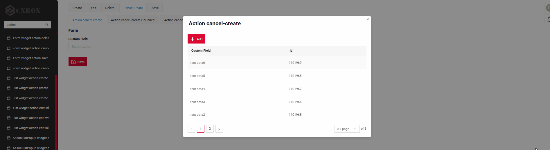

How to add?
Example
Step1 Add standart action cancelCreate to corresponding VersionAwareResponseService. The interface displays "cancelCreate" as the default option.
@Override
public Actions<MyEntityPickPickDTO> getActions() {
return Actions.<MyEntityPickPickDTO>builder()
.create(crt -> crt.text("Add"))
.save(sv -> sv.text("Save"))
.cancelCreate(ccr -> ccr.text("Cancel").available(bc -> true))
.build();
}
{
"name": "myEntityPickPickPickListPopup",
"title": "Action cancel-create",
"type": "PickListPopup",
"bc": "myEntityPickPick",
"fields": [
{
    "title": "Custom Field",
    "key": "customField",
    "type": "input"
},
{
"title": "id",
"key": "id",
"type": "text"
}
],
"options": {
"actionGroups": {
"include": [
"save",
"cancel-create",
"create"
]
}
}
}
Step1 Add action cancel to corresponding VersionAwareResponseService with postAction.
    @Override
    public Actions<MyEntityPickPostActionPickDTO> getActions() {
        return Actions.<MyEntityPickPostActionPickDTO>builder()
                .create(crt -> crt.text("Add"))
                .save(sv -> sv.text("Save"))
                .action(act -> act
                        .action("cancel", "Cancel")
                        .invoker((bc, dto) -> {
                            return new ActionResultDTO<MyEntityPickPostActionPickDTO>().setAction(
                                    PostAction.drillDown(
                                            DrillDownType.INNER,
                                            "/screen/myexample/view/myexampleinlinecreatelist"
                                    ));
                        })
                        .withoutAutoSaveBefore()
                )
                .delete(dlt -> dlt.text("Delete"))
                .build();
    }
Step2 Add button ot group button to corresponding .widget.json.
{
  "name": "myEntityPickPostActionPickPickListPopup",
  "title": "Action cancel-create PostAction",
  "type": "PickListPopup",
  "bc": "myEntityPickPostActionPick",
  "fields": [
    {
      "title": "Custom Field",
      "key": "customField",
      "type": "input"
    },
    {
      "title": "id",
      "key": "id",
      "type": "text"
    }
  ],
  "options": {
    "actionGroups": {
      "include": [
        "cancel",
        "create"
      ]
    }
  }
}
Info
Only for Inner Business Component see more Business Component
Step1 Add standart action cancelCreate to corresponding VersionAwareResponseService.
    @Override
    public Actions<MyEntityPickOnCancelPickDTO> getActions() {
        return Actions.<MyEntityPickOnCancelPickDTO>builder()
                .create(crt -> crt.text("Add"))
                .save(sv -> sv.text("Save"))
                .cancelCreate(ccr -> ccr.text("Cancel").available(bc -> true))
                .delete(dlt -> dlt.text("Delete"))
                .build();
    }
    @Override
    public ActionResultDTO onCancel(BusinessComponent bc) {
        return new ActionResultDTO<>().setAction(PostAction.drillDown(
                DrillDownType.INNER,
                "/screen/myexample/view/myexampleinlinecreatelist"
        ));
    }
{
  "name": "myEntityPickOnCancelPickPickListPopup",
  "title": "Action cancel-create OnCancel",
  "type": "PickListPopup",
  "bc": "myEntityPickOnCancelPick",
  "fields": [
    {
      "title": "Custom Field",
      "key": "customField",
      "type": "input"
    },
    {
      "title": "id",
      "key": "id",
      "type": "text"
    }
  ],
  "options": {
    "actionGroups": {
      "include": [
        "cancel-create",
        "create"
      ]
    }
  }
}
Additional properties
Customization of displayed columns
not applicable
Filtration
Basic
see more Fields
FullTextSearch
FullTextSearch - when the user types in the full text search input area, then widget filters the rows that match the search query.
see FullTextSearch
Personal filter group
not applicable
Filter group
not applicable
Pagination
Pagination is the process of dividing content into separate, discrete pages, making it easier to navigate and consume large amounts of information.
see Pagination
Export to Excel
not applicable