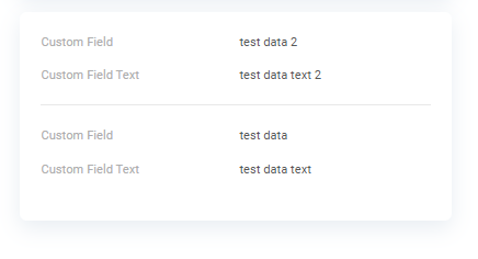
AdditionalList
AdditionalList widget is list the general information for many records. Widget is always located on the right.
The widget has two modes:
-
Main Mode: Displays records as a list, ideal for tracking the status of business process steps. Editing is not supported.
-
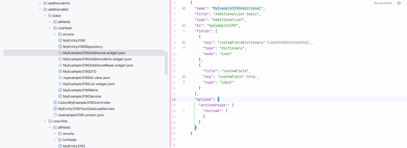
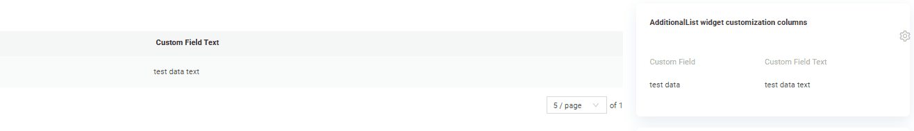
Reading Mode: Presents values in the widget's specified format for easy viewing.
Info
AdditionalList Main Mode does not dynamically expand based on its content. If the number of columns exceeds the available space, a horizontal scrollbar appears at the bottom to accommodate the overflow.
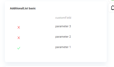
Basic
How does it look?
How to add?
Example
Step1 Create file .widget.json with type = "AdditionalList"
Add existing field to a AdditionalList widget. see more Fields
{
  "name": "MyExampleAdditional",
  "title": "AdditionalList basic",
  "type": "AdditionalList",
  "bc": "myexample",
  "fields": [
    {
      "key": "customFieldDictionary",
      "type": "dictionary",
      "mode": "icon",
      "width": 1
    },
    {
      "title": "customField",
      "key": "customField",
      "type": "input"
    }
  ],
  "options": {
    "actionGroups": {
      "include": [
      ]
    }
  }
}
Step2 Add widget to corresponding *.view.json* .
{
  "name": "myexamplelist",
  "title": "MyExample List",
  "template": "DashboardView",
  "url": "/screen/myexample/view/myexamplelist",
  "widgets": [
    {
      "widgetName": "SecondLevelMenu",
      "position": 10,
      "gridWidth": 12
    },
    {
      "widgetName": "MyExampleAdditionalInfo",
      "position": 11,
      "gridWidth": 24
    },
    {
      "widgetName": "MyExampleAdditional",
      "position": 19,
      "gridWidth": 24
    },
    {
      "widgetName": "MyExampleAdditionalRead",
      "position": 20,
      "gridWidth": 24
    },
    {
      "widgetName": "MyExampleList",
      "position": 22,
      "gridWidth": 24
    }
  ],
  "rolesAllowed": [
    "CXBOX_USER"
  ]
}
Step1 Create file .widget.json with type = "AdditionalInfo"
Add existing field to a AdditionalInfo widget. see more Fields
{
  "name": "MyExampleAdditionalInfo",
  "title": "Additional info",
  "type": "AdditionalInfo",
  "bc": "myexample",
  "fields": [
    {
      "key": "customFieldDictionary",
      "type": "dictionary",
      "mode": "icon"
    },
    {
      "label": "Custom Field",
      "key": "customField",
      "type": "input"
    }
  ],
  "options": {
    "layout": {
      "rows": [
        {
          "cols": [
            {
              "fieldKey": "customFieldDictionary",
              "span": 12
            }
          ]
        },
        {
          "cols": [
            {
              "fieldKey": "customField",
              "span": 12
            }
          ]
        }
      ]
    }
  }
}
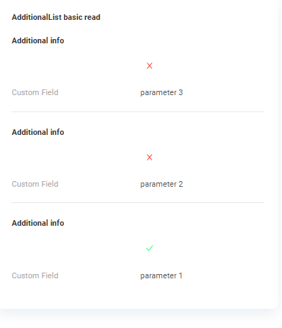
Step2 Create file .widget.json with type = "AdditionalList"
Add existing field to a AdditionalList widget. see more Fields
{
  "name": "MyExampleAdditionalRead",
  "title": "AdditionalList basic read",
  "type": "AdditionalList",
  "bc": "myexample",
  "fields": [
  ],
  "options": {
    "read": {
      "widget": "MyExampleAdditionalInfo"
    },
    "actionGroups": {
      "include": [
      ]
    }
  }
}
Step3 Add widget to corresponding *.view.json* .
{
  "name": "myexamplelist",
  "title": "MyExample List",
  "template": "DashboardView",
  "url": "/screen/myexample/view/myexamplelist",
  "widgets": [
    {
      "widgetName": "SecondLevelMenu",
      "position": 10,
      "gridWidth": 12
    },
    {
      "widgetName": "MyExampleAdditionalInfo",
      "position": 11,
      "gridWidth": 24
    },
    {
      "widgetName": "MyExampleAdditional",
      "position": 19,
      "gridWidth": 24
    },
    {
      "widgetName": "MyExampleAdditionalRead",
      "position": 20,
      "gridWidth": 24
    },
    {
      "widgetName": "MyExampleList",
      "position": 22,
      "gridWidth": 24
    }
  ],
  "rolesAllowed": [
    "CXBOX_USER"
  ]
}
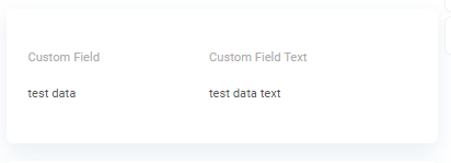
Title
Title Basic
Title for widget (optional)
There are types of:
constant title: shows constant text.constant title empty: if you want to visually connect widgets by them to be placed one under another
How does it look?
How to add?
Example
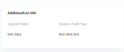
Step1 Add name for title to .widget.json.
{
  "name": "MyExampleAdditional",
  "title": "AdditionalList Main Mode",
  "type": "AdditionalList",
  "bc": "myexample",
  "fields": [
    {
      "title": "Custom Field",
      "key": "customField",
      "type": "input"
    },
    {
      "title": "Custom Field Text",
      "key": "customFieldText",
      "type": "input"
    }
  ],
  "options": {
    "actionGroups": {
      "include": []
    }
  }
}
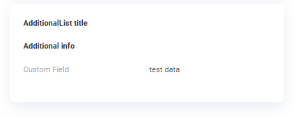
Step1 Delete parameter title to .widget.json.
Step1 Delete parameter title to .widget.json.
{
  "name": "MyExampleAdditionalInfoEmpty",
  "type": "AdditionalInfo",
  "bc": "myexample",
  "fields": [
    {
      "label": "Custom Field",
      "key": "customField",
      "type": "input"
    },
    {
      "label": "Custom Field Text",
      "key": "customFieldText",
      "type": "input"
    }
  ],
  "options": {
    "layout": {
      "rows": [
        {
          "cols": [
            {
              "fieldKey": "customField",
              "span": 12
            }
          ]
        },
        {
          "cols": [
            {
              "fieldKey": "customFieldText",
              "span": 12
            }
          ]
        }
      ]
    }
  }
}
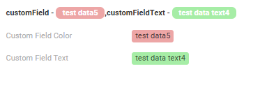
Title Color
Title Color allows you to specify a color for a title. It can be constant or calculated.
Calculated color
Calculated color can be used to change a title color dynamically. It changes depending on business logic or data in the application.
Info
Title colorization is applicable to the following fields: date, dateTime, dateTimeWithSeconds, number, money, percent, time, input, text, dictionary, radio, checkbox, multivalue, multivalueHover.
How does it look?
How to add?
Example
Step 1 Add custom field for color to corresponding DataResponseDTO. The field can contain a HEX color or be null.
@Getter
@Setter
@NoArgsConstructor
public class MyExampleDTO extends DataResponseDTO {

    private String customFieldColor;

    private String customFieldTextColor;

    @SearchParameter(name = "customField")
    private String customField;
    @SearchParameter(name = "customFieldText")
    private String customFieldText;
    @SearchParameter(name = "customFieldDictionary", provider = EnumValueProvider.class)
    private CustomFieldDictionaryEnum customFieldDictionary;

    public MyExampleDTO(MyEntity entity) {
        this.id = entity.getId().toString();
        this.customField = entity.getCustomField();
        this.customFieldText = entity.getCustomFieldText();
        this.customFieldColor = "#edaa";
        this.customFieldTextColor = "#aeda";
        this.customFieldDictionary = entity.getCustomFieldDictionary();
    }
}
Step 2 Add "bgColorKey" : custom field for color and to .widget.json.
Add in title field with ${customField}
{
  "name": "MyExampleAdditionalConstant",
  "title": "customField - ${customField},customFieldText - ${customFieldText} ",
  "type": "AdditionalInfo",
  "bc": "myexample",
  "fields": [
    {
      "label": "Custom Field Color",
      "key": "customField",
      "type": "input",
      "bgColor": "#edaa"
    },
    {
      "label": "Custom Field Text",
      "key": "customFieldText",
      "type": "input",
      "bgColor": "#aeda"
    }
  ],
  "options": {
    "actionGroups": {
    },
    "layout": {
      "rows": [
        {
          "cols": [
            {
              "fieldKey": "customField",
              "span": 12
            }
          ]
        },
        {
          "cols": [
            {
              "fieldKey": "customFieldText",
              "span": 12
            }
          ]
        }
      ]
    }
  }
}
not applicable
not applicable
Business component
This specifies the business component (BC) to which this form belongs. A business component represents a specific part of a system that handles a particular business logic or data.
see more Business component
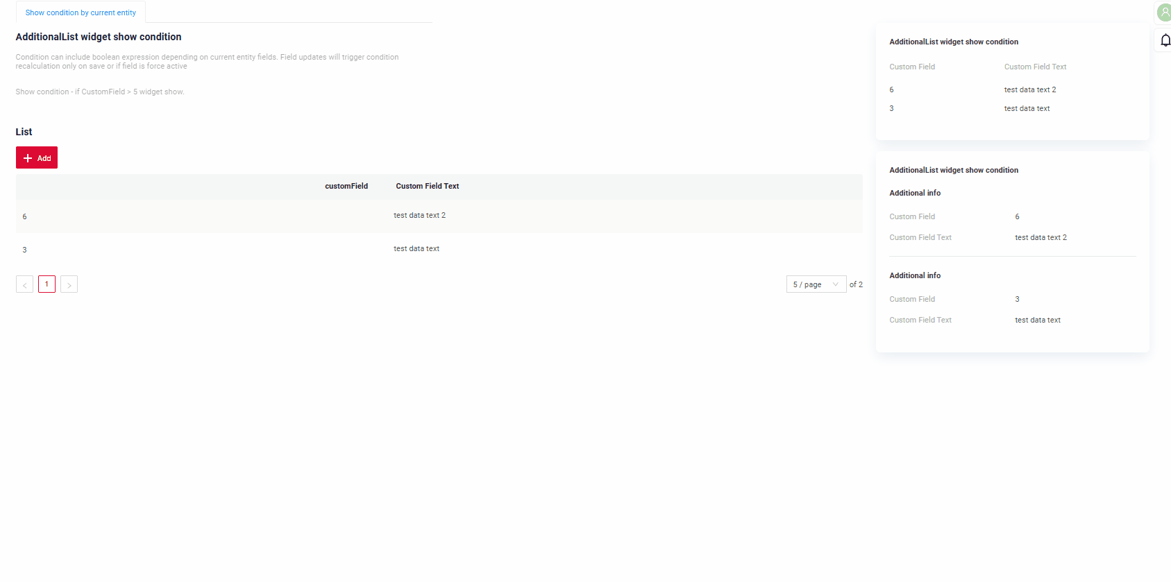
Show condition
no show condition - recommended: widget always visible
show condition by current entity: condition can include boolean expression depending on current entity fields. Field updates will trigger condition recalculation only on save or if field is force active
Tips
It is recommended not to use Show condition when possible, because wide usage of this feature makes application hard to support.
How does it look?
see Basic
How to add?
Example
see Basic
Step1 Add showCondition to .widget.json. see more showCondition
{
  "name": "MyExampleAdditional",
  "title": "AdditionalList widget show condition",
  "type": "AdditionalList",
  "bc": "myexample",
  "showCondition": {
    "bcName": "myexample",
    "params": {
      "fieldKey": "customFieldShowCond",
      "value": "true"
    }
  },
  "fields": [
    {
      "title": "Custom Field",
      "key": "customField",
      "type": "input"
    },
    {
      "title": "Custom Field Text",
      "key": "customFieldText",
      "type": "input"
    }
  ],
  "options": {
    "actionGroups": {
      "include": []
    }
  }
}
{
  "name": "MyExampleAdditionalRead",
  "title": "AdditionalList widget show condition",
  "type": "AdditionalList",
  "bc": "myexample",
  "showCondition": {
    "bcName": "myexample",
    "params": {
      "fieldKey": "customFieldShowCond",
      "value": "true"
    }
  },
  "fields": [
  ],
  "options": {
    "read": {
      "widget": "MyExampleAdditionalInfo"
    },
    "actionGroups": {
      "include": []
    }
  }
}
Fields
Fields Configuration. The fields array defines the individual fields present within the form.
- "title"
Description: Field Title.
Type: String(optional).
-
"key"
Description: Name field to corresponding DataResponseDTO.
Type: String(required).
-
"type"
Description: Field types
Type: String(required).
How to add?
Example
Step 1 Download plugin download Intellij Plugin
Step 2 Add existing field to an existing form widget
Add field to .widget.json.
{
"name": "MyExampleAdditional",
"title": "AdditionalList basic",
"type": "AdditionalList",
"bc": "myexample",
"fields": [
{
"key": "customFieldDictionary",
"type": "dictionary",
"mode": "icon",
"width": 1
},
{
"title": "customField",
"key": "customField",
"type": "input"
}
],
"options": {
"actionGroups": {
"include": [
]
}
}
}
Options layout
options.layout - no use in this type.
Actions
not applicable
Additional properties
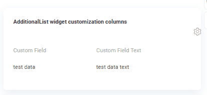
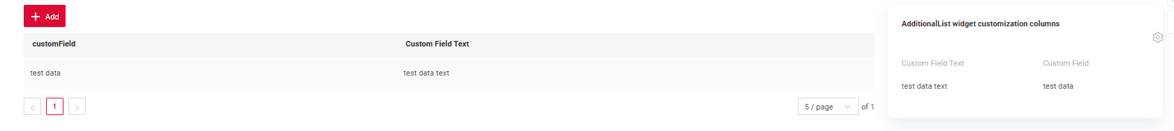
Customization of displayed columns
To customize the columns displayed on a list widget, you can perform two main actions:
- Hide columns
- Swap columns
Info
Currently, table customization data is stored within internal tables, even when microservices are used.
Basic
When customizing columns, records are inserted into the ADDITIONAL_FIELDS table. Table ADDITIONAL_FIELDS for store user-specific settings:
user_id: The user ID for which the columns are being customized.view: The name of the view where the columns are customized.widget: The name of the widget where the columns are customized.order_fields: When configuring swap columns, the field sequence will be updated, and a new comma-separated sequence of fields will be saved.added_to_additional_fields: User-hidden fields.removed_from_additional_fields: Contains a list of fields that were initially hidden for the user but were later made visible. When the user opens a widget and chooses to display fields that were previously hidden, those fields are recorded in this column.
How does it look?
How to add?
Example
Add in options parameter additional to corresponding .widget.json.
{
"name": "MyExampleAdditional",
"title": "AdditionalList widget customization columns",
"type": "AdditionalList",
"bc": "myexample",
"fields": [
{
    "title": "Custom Field",
    "key": "customField",
    "type": "input"
},
{
"title": "Custom Field Text",
"key": "customFieldText",
"type": "input"
}
],
"options": {
"additional": {
  "enabled": true
},
"actionGroups": {
"include": []
}
}
}
Сan also set columns to be pre-hidden, meaning they will be hidden when the widget opens.
Add in options parameter additional to corresponding .widget.json.
Add in options parameter fields with list of hidden fields to corresponding .widget.json.
{
  "name": "MyExampleAdditionalHidden",
  "title": "AdditionalList widget customization columns hidden",
  "type": "AdditionalList",
  "bc": "myexample",
  "fields": [
    {
      "title": "Custom Field",
      "key": "customField",
      "type": "input"
    },
    {
      "title": "Custom Field Text",
      "key": "customFieldText",
      "type": "input"
    }
  ],
  "options": {
    "additional": {
      "fields": [
        "customFieldText"
      ],
      "enabled": true
    },
    "actionGroups": {
      "include": []
    }
  }
}
Filtration
Basic
Works only for mode basic
see more Fields
FullTextSearch
not applicable
Personal filter group
A user-filled filter can be saved for each individual user. see Personal filter group
Filter group
Filter group - predefined filters settings that users can use in an application. They allow users to quickly apply specific filtering criteria without having to manually input.
see Filter group
Pagination
not applicable
Export to Excel
Works only for mode basic
Export to Excel enables users to download a .xlsx file containing the table's data.
see Excel