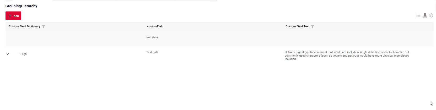
GroupingHierarchy
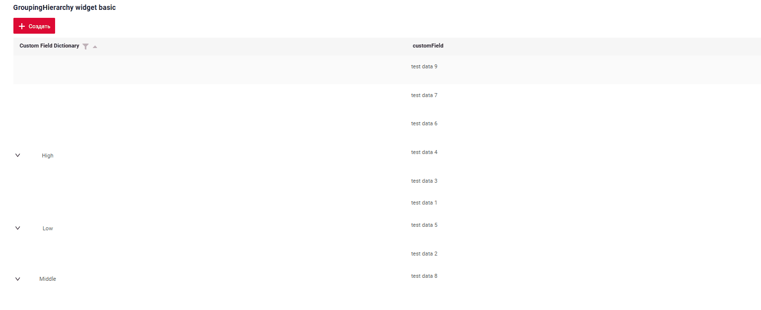
GroupingHierarchy widget presents shared information across multiple records, enabling rows to be grouped by one or more specified fields.
The availability of this function depends on the type:
This function is available for: MultivalueHover, Hint, Multivalue, MultipleSelect, Inline, PickList, Radio, Money, Number, Dictionary, DateTimeWithSeconds, Date, Checkbox, DateTime, Text, FileUpload.
See more field types
Basics
Grouping Hierarchy mode features :
-
All data should be sourced from the backend (e.g., with a backend page size set to 1000), grouping is handled in-memory on the front end.
If the backend indicates that the total line count exceeds the page size, the widget will switch to List mode, and the mode-switching icon will be highlighted in red. Hovering over the icon will display the message
Warning!Rows were fetched from backend - limit for Grouping Hierarhical mode is ...(1000). Only GroupingHierarchy mode is available.see more Default limit page -
The number of nesting levels is unlimited.
-
Fields containing either a single element or no elements are displayed in their expanded form by default.The line is expanded by default if the expanded branch occupies the same amount of space as it does when collapsed.
-
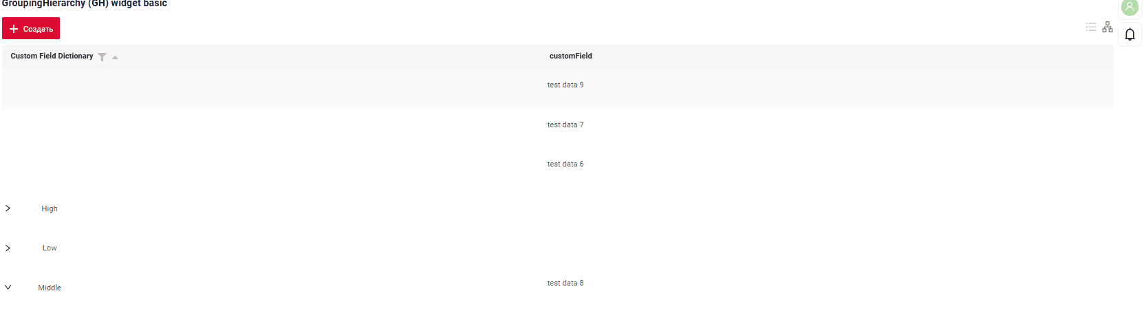
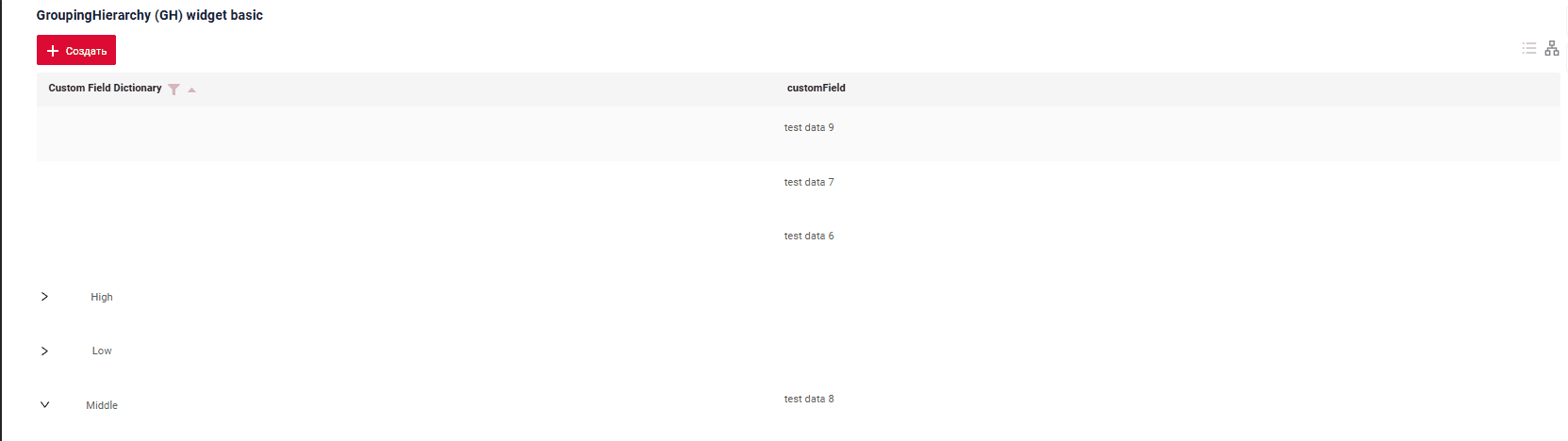
This widget is essentially a List widget with an added "grouping" feature, allowing users to toggle between a standard table view and a "grouping hierarchy" view.
How does it look?
How to add?
Example
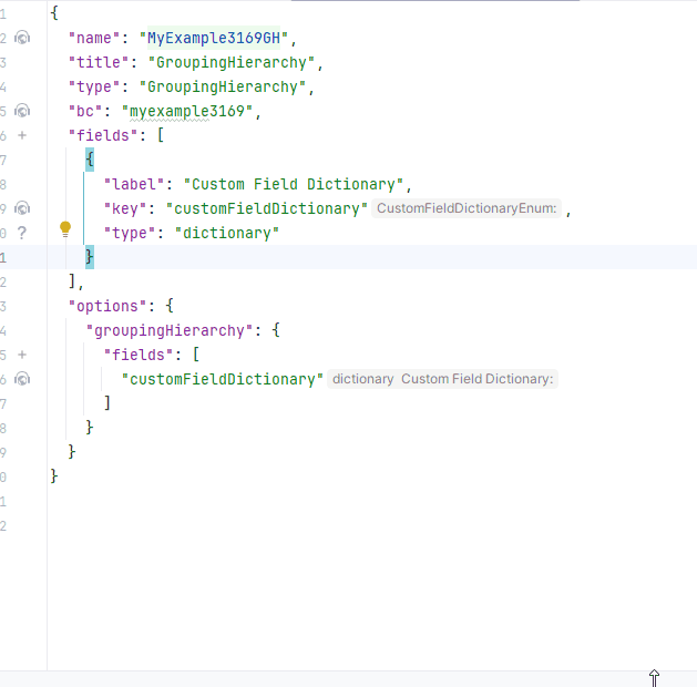
Step1 Create file .widget.json with type = "GroupingHierarchy"
Add parameter groupingHierarchy with field for grouping. Fields keys from Fields widget block separated with comma. Field order is not important and will be taken from Fields block.
Add existing field to a GroupingHierarchy widget. see more Fields
{
"name": "MyExampleGH",
"title": "GroupingHierarchy (GH) widget basic",
"type": "GroupingHierarchy",
"bc": "myexample",
"fields": [
{
"title": "Custom Field Dictionary",
"key": "customFieldDictionary",
"type": "dictionary"
},
{
"title": "customField",
"key": "customField",
"type": "input"
}
],
"options": {
 "groupingHierarchy": {
  "fields": [
    "customFieldDictionary"
  ]
}
}
}
Step2 Add widget to corresponding *.view.json* .
{
"name": "myexamplegh",
"title": "MyExample List",
"template": "DashboardView",
"url": "/screen/myexample/view/myexamplegh",
"widgets": [
{
"widgetName": "SecondLevelMenu",
"position": 19,
"gridWidth": 24
},
{
"widgetName": "MyExampleGH",
"position": 20,
"gridWidth": 24
},
{
"widgetName": "MyExampleGHTwoColumn",
"position": 29,
"gridWidth": 24
}
],
"rolesAllowed": [
"CXBOX_USER"
]
}
Step3 Add bc to BC_PROPERTIES.csv. see more Default limit page
Title
Title Basic
Title for widget (optional)
There are types of:
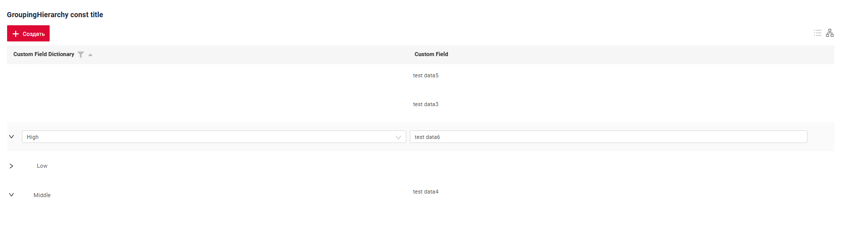
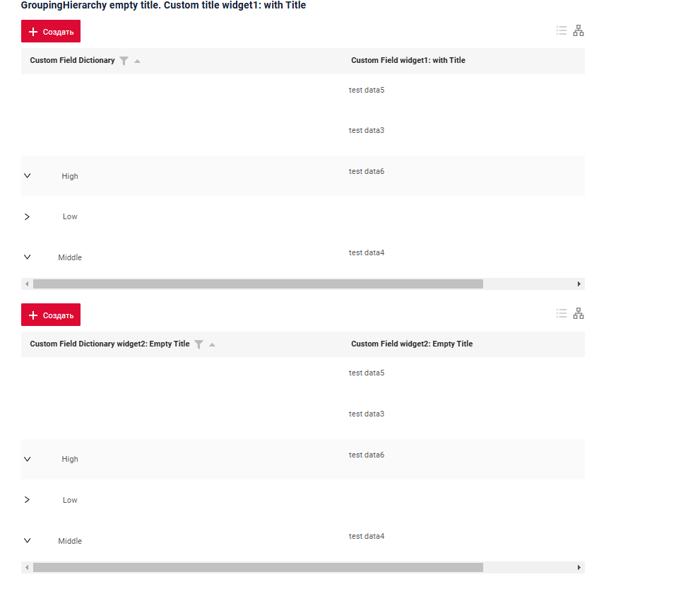
constant title: shows constant text.constant title empty: if you want to visually connect widgets by them to be placed one under another
How does it look?
How to add?
Example
Step1 Add name for title to .widget.json.
{
"name": "MyExampleGH",
"title": "GroupingHierarchy const title",
"type": "GroupingHierarchy",
"bc": "myexample",
"fields": [
{
"title": "Custom Field",
"key": "customField",
"type": "input"
},
{
"title": "Custom Field Dictionary",
"key": "customFieldDictionary",
"type": "dictionary"
}
],
"options": {
"groupingHierarchy": {
"fields": [
"customFieldDictionary"
]
}
}
}
Step1 Delete parameter title to .widget.json.
{
"name": "MyExampleEmptyTitle",
"type": "GroupingHierarchy",
"bc": "myexample",
"fields": [
{
"title": "Custom Field widget: Empty Title",
"key": "customField",
"type": "input"
},
{
"title": "Custom Field Dictionary widget: Empty Title",
"key": "customFieldDictionary",
"type": "dictionary"
}
],
"options": {
"groupingHierarchy": {
"fields": [
"customFieldDictionary"
]
}
}
}
Title Color
Title Color allows you to specify a color for a title. It can be constant or calculated.
Constant color
Constant color is a fixed color that doesn't change. It remains the same regardless of any factors in the application.
Calculated color
Calculated color can be used to change a title color dynamically. It changes depending on business logic or data in the application.
Info
Title colorization is applicable to the following fields: date, dateTime, dateTimeWithSeconds, number, money, percent, time, input, text, dictionary, radio, checkbox, multivalue, multivalueHover.
How does it look?
How to add?
Example
Step 1 Add custom field for color to corresponding DataResponseDTO. The field can contain a HEX color or be null.
@Getter
@Setter
@NoArgsConstructor
public class MyExampleDTO extends DataResponseDTO {
private String customFieldColor;
private String customFieldDictionaryColor;
private String customField;
@SearchParameter(name = "customFieldDictionary", provider = EnumValueProvider.class)
private CustomFieldDictionaryEnum customFieldDictionary;
public MyExampleDTO(MyEntity entity) {
this.id = entity.getId().toString();
this.customField = entity.getCustomField();
this.customFieldDictionary = entity.getCustomFieldDictionary();
this.customFieldDictionaryColor = entity.getCustomFieldDictionary() == CustomFieldDictionaryEnum.HIGH ? "#ec" :
(entity.getCustomFieldDictionary() == CustomFieldDictionaryEnum.LOW ? "#5af" :
(entity.getCustomFieldDictionary() == CustomFieldDictionaryEnum.MIDDLE ? "#cba" : "")
);
this.customFieldColor = entity.getCustomFieldDictionary() == CustomFieldDictionaryEnum.HIGH ? "#edaa" :
(entity.getCustomFieldDictionary() == CustomFieldDictionaryEnum.LOW ? "#beda" :
(entity.getCustomFieldDictionary() == CustomFieldDictionaryEnum.MIDDLE ? "#ffeb" : "")
);
}
}
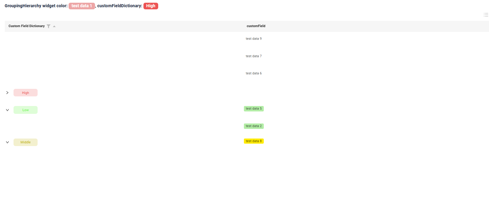
Step 2 Add "bgColorKey" : custom field for color and to .widget.json.
Add in title field with ${customField}
{
"name": "MyExampleList",
"title": "GroupingHierarchy (GH) widget color: ${customField}, customFieldDictionary: ${customFieldDictionary}",
"type": "GroupingHierarchy",
"bc": "myexample",
"fields": [
{
"title": "Custom Field Dictionary",
"key": "customFieldDictionary",
"type": "dictionary",
"bgColorKey": "customFieldDictionaryColor"
},
{
"title": "customField",
"key": "customField",
"type": "input",
"bgColorKey": "customFieldColor"
}
],
"options": {
"groupingHierarchy": {
"fields": [
"customFieldDictionary"
]
}
}
}
Add "bgColor" : HEX color to .widget.json.
Add in title field with ${customField}
{
"name": "MyExampleColorConstList",
"title": "GroupingHierarchy (GH) widget color const customField: ${customField}, customFieldDictionary: ${customFieldDictionary}",
"type": "GroupingHierarchy",
"bc": "myexample",
"fields": [
{
"title": "Custom Field Dictionary",
"key": "customFieldDictionary",
"type": "dictionary",
"bgColor": "#4480cb"
},
{
"title": "customField",
"key": "customField",
"type": "input",
"bgColor": "#edaa"
}
],
"options": {
"groupingHierarchy": {
"fields": [
"customFieldDictionary"
]
}
}
}
Business component
This specifies the business component (BC) to which this form belongs. A business component represents a specific part of a system that handles a particular business logic or data.
see more Business component
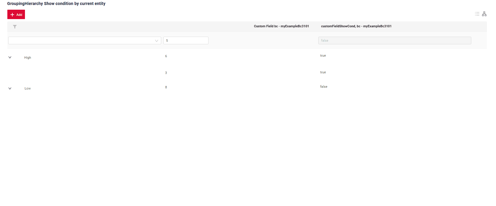
Show condition
no show condition - recommended: widget always visible
show condition by current entity: condition can include boolean expression depending on current entity fields. Field updates will trigger condition recalculation only on save or if field is force active
Tips
It is recommended not to use Show condition when possible, because wide usage of this feature makes application hard to support.
How does it look?
How to add?
Example
see Basic
Step1 Add showCondition to .widget.json. see more showCondition
{
"name": "MyExampleshowcond",
"title": "Show condition widget",
"type": "GroupingHierarchy",
"bc": "myexample",
"showCondition": {
"bcName": "myexample",
"params": {
"fieldKey": "customFieldShowCond",
"value": "true"
}
},
"fields": [
{
"label": "Custom Field Dictionary",
"key": "customFieldDictionary",
"type": "dictionary"
},
{
"title": "Custom Field, bc - myExampleBc",
"key": "customField",
"type": "number"
}
],
"options": {
"groupingHierarchy": {
"fields": [
"customFieldDictionary"
]
}
}
}
Fields
Fields Configuration. The fields array defines the individual fields present within the form.
- "label"
Description: Field Title.
Type: String(optional).
-
"key"
Description: Name field to corresponding DataResponseDTO.
Type: String(required).
-
"type"
Description: Field types
Type: String(required).
How to add?
Example
Step 1 Download plugin download Intellij Plugin
Step 2 Add existing field to an existing form widget
Add field to .widget.json.
{
  "name": "MyExampleGH",
  "title": "GroupingHierarchy (GH) widget basic",
  "type": "GroupingHierarchy",
  "bc": "myexample",
  "fields": [
    {
      "title": "Custom Field Dictionary",
      "key": "customFieldDictionary",
      "type": "dictionary"
    },
    {
      "title": "customField",
      "key": "customField",
      "type": "input"
    }
  ],
  "options": {
    "groupingHierarchy": {
      "fields": [
        "customFieldDictionary"
      ]
    }
  }
}
Options layout
options.layout - no use in this type.
Actions
Actions show available actions as separate buttons see more Actions.
As for GroupingHierarchy widget, there are several actions.
Create
Create button enables you to create a new value by clicking the Add button. This action can be performed in three different ways, feel free to choose any, depending on your logic of application:
There are three methods to create a record:
- Inline: You can add a line directly.
Info
Pagination won't function until the page is refreshed after adding records.
-
Inline-form: You can add data using a form widget without leaving your current view.
-
With view: You can create a record by navigating to a view.
Inline
With Line Addition, a new empty row is immediately added to the top of the GroupingHierarchy widget when the "Add" button is clicked. This is a quick way to add rows without needing to input data beforehand.
How does it look?
How to add?
Example
Step1 Add button create to corresponding VersionAwareResponseService.
@Override
public Actions<MyExampleDTO> getActions() {
return Actions.<MyExampleDTO>builder()
.create(crt -> crt.text("Add"))
.save(sv -> sv.text("Save"))
.cancelCreate(ccr -> ccr.text("Cancel").available(bc -> true))
.delete(dlt -> dlt.text("Delete"))
.build();
}
create to corresponding .widget.json.
{
"name": "MyExampleGH",
"title": "GroupingHierarchy (GH) widget action create basic",
"type": "GroupingHierarchy",
"bc": "myexample",
"fields": [
{
"title": "Custom Field Dictionary",
"key": "customFieldDictionary",
"type": "dictionary"
},
{
"title": "customField",
"key": "customField",
"type": "input"
}
],
"options": {
"groupingHierarchy": {
"fields": [
"customFieldDictionary"
]
}
}
}
@Override
public void buildRowDependentMeta(RowDependentFieldsMeta<MyExampleDTO> fields, InnerBcDescription bcDescription,
Long id, Long parentId) {
fields.setEnabled(MyExampleDTO_.customFieldText);
fields.setEnabled(MyExampleDTO_.customFieldDictionary);
fields.setEnabled(MyExampleDTO_.customField);
}
Inline-form
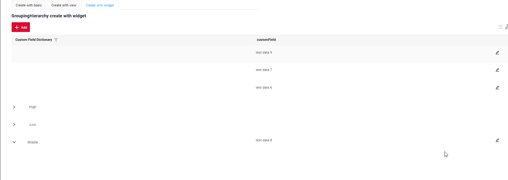
Create with widget opens an additional widget when the "Add" button is clicked. The form will appear on the same screen, allowing you to view both the GroupingHierarchy of entities and the form for adding a new row.
After filling the information in and clicking "Save", the new row is added to the GroupingHierarchy.
How does it look?
How to add?
Example
Step1 Add button create to corresponding VersionAwareResponseService.
@Override
public Actions<MyExampleDTO> getActions() {
return Actions.<MyExampleDTO>builder()
.create(crt -> crt.text("Add"))
.save(sv -> sv.text("Save"))
.cancelCreate(ccr -> ccr.text("Cancel").available(bc -> true))
.delete(dlt -> dlt.text("Delete"))
.build();
}
@Override
public void buildRowDependentMeta(RowDependentFieldsMeta<MyExampleDTO> fields, InnerBcDescription bcDescription,
Long id, Long parentId) {
fields.setEnabled(MyExampleDTO_.customFieldText);
fields.setEnabled(MyExampleDTO_.customFieldDictionary);
fields.setEnabled(MyExampleDTO_.customField);
}
Step3 Create widget.json with type Form that appears when you click a button
{
"title": "",
"name": "myEntityCreateForm",
"type": "Form",
"bc": "myexample",
"fields": [
{
"label": "Custom Field Dictionary",
"key": "customFieldDictionary",
"type": "dictionary"
},
{
    "label": "Custom Field",
    "key": "customField",
    "type": "input"
},
{
"label": "Custom Field Text",
"key": "customFieldText",
"type": "text"
}
],
"options": {
"layout": {
"rows": [
{
"cols": [
{
"fieldKey": "customFieldDictionary",
"span": 12
}
]
},
{
"cols": [
{
"fieldKey": "customFieldText",
"span": 12
}
]
},
{
"cols": [
{
"fieldKey": "customField",
"span": 12
}
]
}
]
},
"actionGroups": {
"include": [
"save",
"cancel-create"
]
}
}
}
Step4 Add widget.json with type Form to corresponding .view.json.
{
"name": "myexamplegh",
"title": "MyExample List",
"template": "DashboardView",
"url": "/screen/myexample/view/myexamplegh",
"widgets": [
{
"widgetName": "myEntityCreateForm",
"position": 0,
"gridWidth": 24
},
{
"widgetName": "SecondLevelMenu",
"position": 10,
"gridWidth": 12
},
{
"widgetName": "MyExampleGH",
"position": 20,
"gridWidth": 24
}
],
"rolesAllowed": [
"CXBOX_USER"
]
}
Step5 Add button create and widget with type Form to corresponding .widget.json.
options.create: Name widget that appears when you click a button
{
"name": "MyExampleGH",
"title": "GroupingHierarchy сreate with widget",
"type": "GroupingHierarchy",
"bc": "myexample",
"fields": [
{
"title": "Custom Field Dictionary",
"key": "customFieldDictionary",
"type": "dictionary"
},
{
"title": "customField",
"key": "customField",
"type": "input"
}
],
"options": {
"create": {
"widget": "myEntityCreateForm"
},
"edit": {
"widget": "myEntityCreateForm"
},
"actionGroups": {
"include": [
"create",
"delete"
]
},
"groupingHierarchy": {
"fields": [
"customFieldDictionary"
]
}
}
}
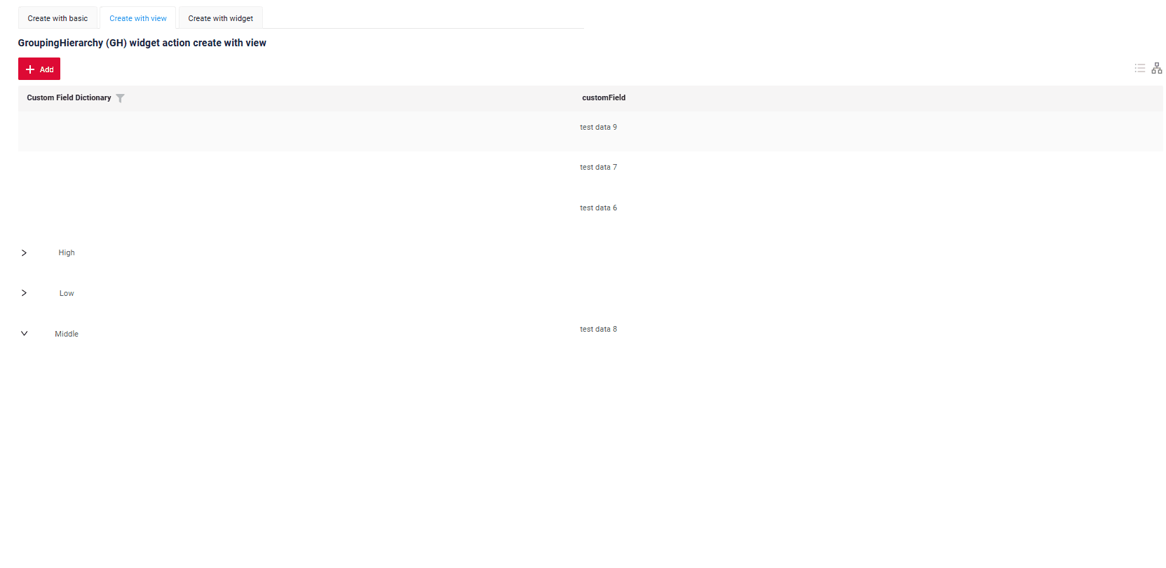
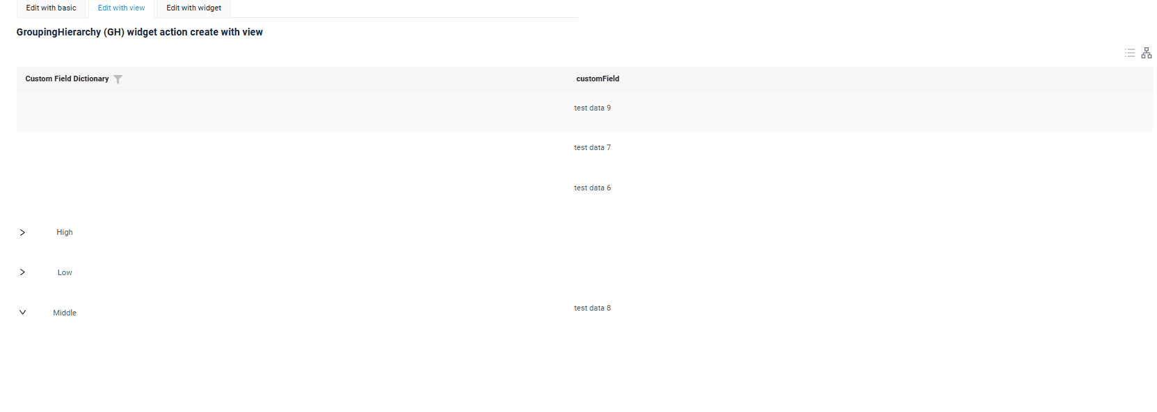
With view
With Create with view, clicking the "Add" button opens a separate view that displays only the data entry form. After completing the form and saving, the system returns to the GroupingHierarchy of entities with the new row added.
How does it look?
How to add?
Example
Step1 Add button create to corresponding VersionAwareResponseService.
@Override
public Actions<MyExampleDTO> getActions() {
return Actions.<MyExampleDTO>builder()
.create(crt -> crt.text("Add"))
.action(act -> act
.action("finish", "Save and Close")
.invoker((bc, dto) -> {
MyEntity myEntity = repository.getReferenceById(bc.getIdAsLong());
repository.save(myEntity);
return new ActionResultDTO<MyExampleDTO>().setAction(
PostAction.drillDown(
DrillDownType.INNER,
"/screen/myexample/view/myexamplegh"
));
})
)
.build();
}
@Override
protected CreateResult<MyExampleDTO> doCreateEntity(MyEntity entity, BusinessComponent bc) {
repository.save(entity);
return new CreateResult<>(entityToDto(bc, entity))
.setAction(PostAction.drillDown(
DrillDownType.INNER,
"/screen/myexample/view/myexampleform/"
+ CxboxMyExampleController.myexample + "/"
+ entity.getId()));
}
create to corresponding .widget.json.
{
"name": "MyExampleGH",
"title": "GroupingHierarchy (GH) widget action create with view",
"type": "GroupingHierarchy",
"bc": "myexample",
"fields": [
{
"title": "Custom Field Dictionary",
"key": "customFieldDictionary",
"type": "dictionary"
},
{
"title": "customField",
"key": "customField",
"type": "input"
}
],
"options": {
"groupingHierarchy": {
"fields": [
"customFieldDictionary"
]
}
}
}
Edit
Edit enables you to change the field value. Just like with Create button, there are three ways of implementing this Action.
There are three methods to create a record:
-
Inline edit: You can edit a line directly.
-
Inline-form: You can edit data using a form widget without leaving your current view.
-
With view: You can edit a record by navigating to a view.
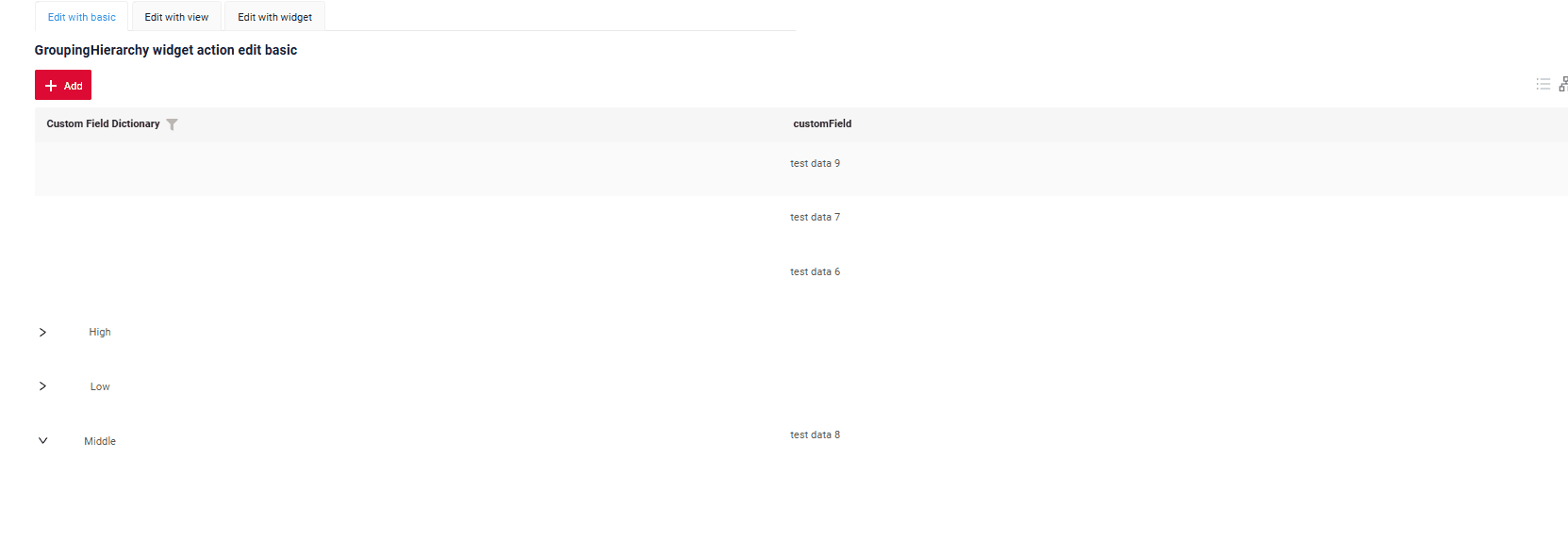
Inline edit
Edit Inline implies inline-edit. Click twice on the value you want to change.
How does it look?
How to add?
Example
Step1 Add fields.setEnabled to corresponding FieldMetaBuilder.
Inline-form
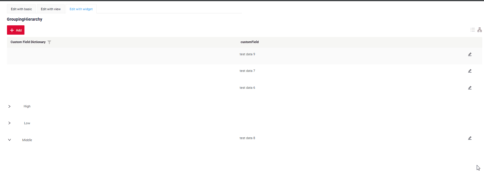
Edit with widget opens an additional widget when clicking on the Edit option from a three-dot menu.
How does it look?
How to add?
Example
Step1 Add button edit to corresponding VersionAwareResponseService.
    @Override
    public Actions<MyExampleDTO> getActions() {
        return Actions.<MyExampleDTO>builder()
                .create(crt -> crt.text("Add"))
                .save(sv -> sv.text("Save"))
                .cancelCreate(ccr -> ccr.text("Cancel").available(bc -> true))
                .delete(dlt -> dlt.text("Delete"))
                .build();
    }
Step2 Add fields.setEnabled to corresponding FieldMetaBuilder.
@Override
public void buildRowDependentMeta(RowDependentFieldsMeta<MyExampleDTO> fields, InnerBcDescription bcDescription,
Long id, Long parentId) {
fields.setEnabled(MyExampleDTO_.customFieldDictionary);
fields.setEnabled(MyExampleDTO_.customField);
}
Step2 Create widget.json with type Form that appears when you click a button
{
"title": "",
"name": "myEntityEditForm",
"type": "Form",
"bc": "myexample",
"fields": [
{
"label": "Custom Field Dictionary",
"key": "customFieldDictionary",
"type": "dictionary"
},
{
"label": "Custom Field",
"key": "customField",
"type": "input"
}
],
"options": {
"layout": {
"rows": [
{
"cols": [
{
"fieldKey": "customFieldDictionary",
"span": 12
}
]
},
{
"cols": [
{
"fieldKey": "customField",
"span": 12
}
]
}
]
},
"actionGroups": {
"include": [
"save",
"cancel-create"
]
}
}
}
Step4 Add widget.json with type Form to corresponding .view.json.
{
"name": "myexamplegh",
"title": "MyExample List",
"template": "DashboardView",
"url": "/screen/myexample/view/myexamplegh",
"widgets": [
{
"widgetName": "myEntityEditForm",
"position": 9,
"gridWidth": 24
},
{
"widgetName": "SecondLevelMenu",
"position": 10,
"gridWidth": 12
},
{
"widgetName": "MyExampleGH",
"position": 20,
"gridWidth": 24
}
],
"rolesAllowed": [
"CXBOX_USER"
]
}
Step5 Add button edit and widget with type Form to corresponding .widget.json.
options.edit: Name widget that appears when you click a button
{
"name": "MyExampleGH",
"title": "GroupingHierarchy",
"type": "GroupingHierarchy",
"bc": "myexample",
"fields": [
{
"title": "Custom Field Dictionary",
"key": "customFieldDictionary",
"type": "dictionary"
},
{
"title": "customField",
"key": "customField",
"type": "input"
}
],
"options": {
"create": {
"widget": "myEntityEditForm"
},
"edit": {
"widget": "myEntityEditForm"
},
"actionGroups": {
"include": [
"create",
"delete"
]
},
"groupingHierarchy": {
"fields": [
"customFieldDictionary"
]
}
}
}
With view
With Edit with view, you can edit the entity from a separate view that displays only the data entry form. Click on the "Edit" option in the three-dot menu.
How does it look?
How to add?
Example
Step1 Add action edit to corresponding VersionAwareResponseService.
Add PostAction.drillDown to method edit
    @Override
    public Actions<MyExampleDTO> getActions() {
        return Actions.<MyExampleDTO>builder()
                .create(crt -> crt.text("Add"))
                .action(act -> act
                        .action("finish", "Save and Close")
                        .invoker((bc, dto) -> {
                            MyEntity myEntity = repository.getReferenceById(bc.getIdAsLong());
                            repository.save(myEntity);
                            return new ActionResultDTO<MyExampleDTO>().setAction(
                                    PostAction.drillDown(
                                            DrillDownType.INNER,
                                            "/screen/myexample/view/myexamplegh"
                                    ));
                        })
                )
                .build();
    }
{
  "name": "MyExampleGH",
  "title": "GroupingHierarchy",
  "type": "GroupingHierarchy",
  "bc": "myexample",
  "fields": [
    {
      "title": "Custom Field Dictionary",
      "key": "customFieldDictionary",
      "type": "dictionary"
    },
    {
      "title": "customField",
      "key": "customField",
      "type": "input"
    }
  ],
  "options": {
    "create": {
      "widget": "myEntityEditForm"
    },
    "edit": {
      "widget": "myEntityEditForm"
    },
    "actionGroups": {
      "include": [
        "create",
        "delete"
      ]
    },
    "groupingHierarchy": {
      "fields": [
        "customFieldDictionary"
      ]
    }
  }
}
Additional properties
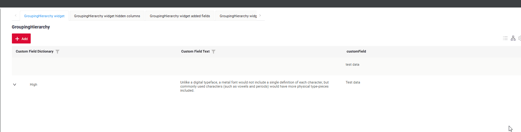
Customization of displayed columns
To customize the columns displayed on a list widget, you can perform two main actions:
- Hide columns
- Swap columns
Info
Currently, table customization data is stored within internal tables, even when microservices are used.
Basic
When customizing columns, records are inserted into the ADDITIONAL_FIELDS table. Table ADDITIONAL_FIELDS for store user-specific settings:
user_id: The user ID for which the columns are being customized.view: The name of the view where the columns are customized.widget: The name of the widget where the columns are customized.order_fields: When configuring swap columns, the field sequence will be updated, and a new comma-separated sequence of fields will be saved.added_to_additional_fields: User-hidden fields.removed_from_additional_fields: Contains a list of fields that were initially hidden for the user but were later made visible. When the user opens a widget and chooses to display fields that were previously hidden, those fields are recorded in this column.
Info
The columns used for grouping cannot be hidden or rearranged. They are always displayed at the start of the widget, following the order defined in the main Fields section. This restriction also applies when switching to "Table" mode, ensuring the grouping columns remain prominently displayed.
How does it look?
How to add?
Example
Add in options parameter additional to corresponding .widget.json.
{
"name": "MyExampleGH",
"title": "GroupingHierarchy",
"type": "GroupingHierarchy",
"bc": "myexample",
"fields": [
{
"title": "Custom Field Dictionary",
"key": "customFieldDictionary",
"type": "dictionary"
},
{
"title": "customField",
"key": "customField",
"type": "input"
},
{
"title": "Custom Field Text",
"key": "customFieldText",
"type": "text"
}
],
"options": {
"additional": {
  "enabled": true
},
"groupingHierarchy": {
"fields": [
"customFieldDictionary"
]
}
}
}
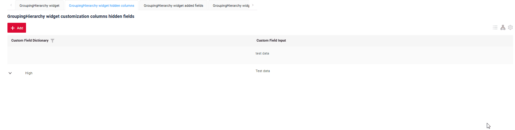
Сan also set columns to be pre-hidden, meaning they will be hidden when the widget opens.
Add in options parameter additional to corresponding .widget.json.
Add in options parameter fields with list of hidden fields to corresponding .widget.json.
{
  "name": "MyExampleGHHiddenFields",
  "title": "GroupingHierarchy widget customization columns hidden fields",
  "type": "GroupingHierarchy",
  "bc": "myexample",
  "fields": [
    {
      "title": "Custom Field Dictionary",
      "key": "customFieldDictionary",
      "type": "dictionary"
    },
    {
      "title": "Custom Field Input",
      "key": "customField",
      "type": "input"
    },
    {
      "title": "Custom Field Percent",
      "key": "customFieldPercent",
      "type": "percent"
    },
    {
      "title": "Custom Field Radio",
      "key": "customFieldRadio",
      "type": "radio"
    }
  ],
  "options": {
    "additional": {
      "fields": [
        "customFieldPercent",
        "customFieldRadio"
      ],
      "enabled": true
    },
    "groupingHierarchy": {
      "fields": [
        "customFieldDictionary"
      ]
    }
  }
}
Handling Old Records
Delete fields with widget
When fields stored in the additional settings table are deleted from the widget, the functionality will continue to work correctly by ignoring these old fields.
FullTextSearch
FullTextSearch - when the user types in the full text search input area, then widget filters the rows that match the search query.
see FullTextSearch
Pagination
Pagination in the "Grouping Hierarchy" mode is not functioning. It only works when switched to "Table" mode.
see Pagination
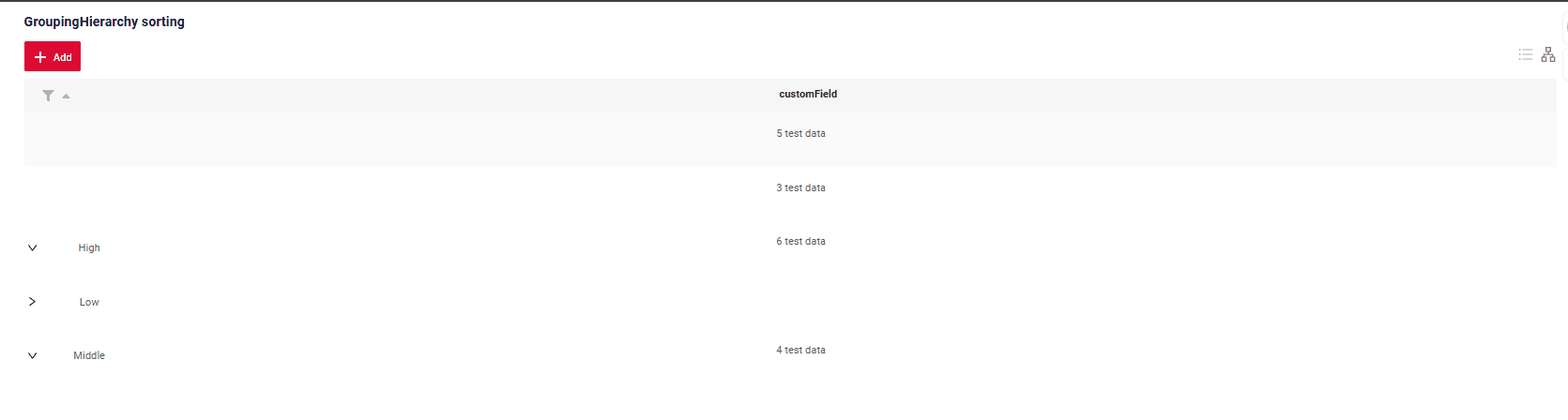
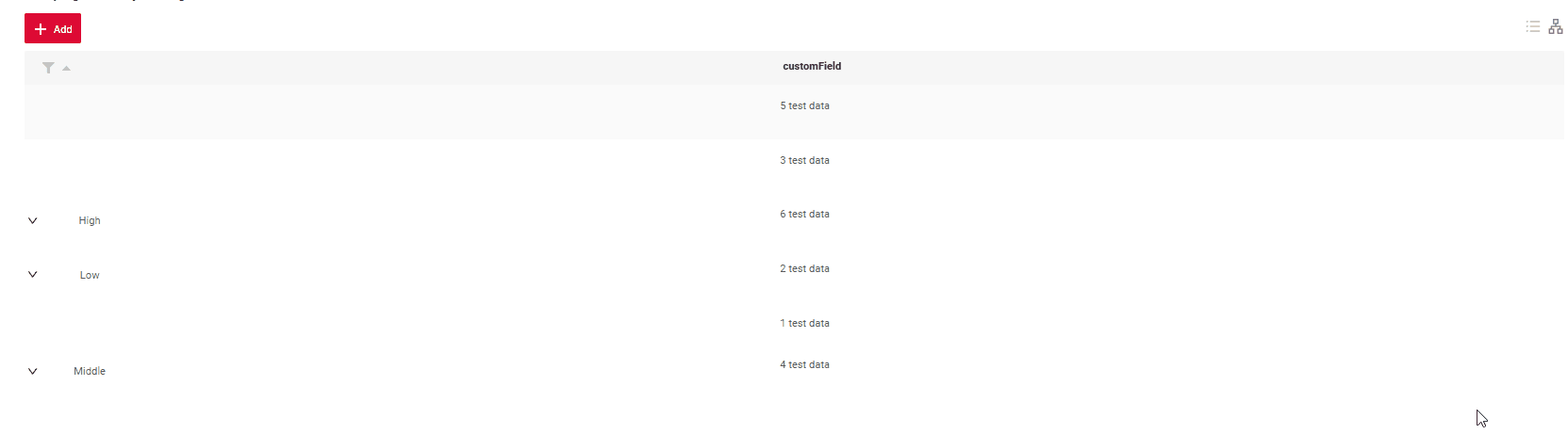
Sorting
All queries always start with sorting by grouping columns, followed by user-specified sorting
How does it look?
Collapse all button
Added a button with the ability to collapse all
How does it look?
How to add?
By default
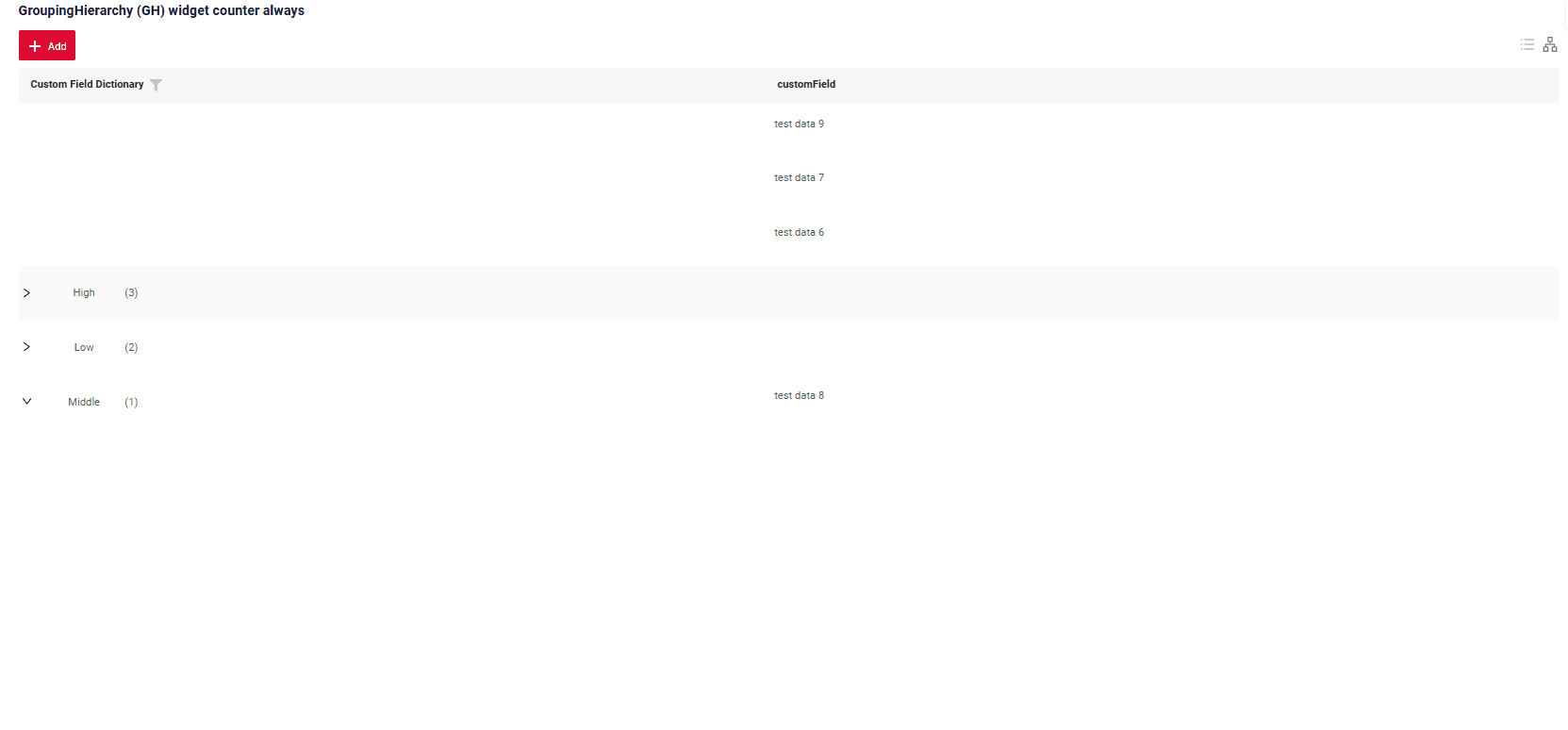
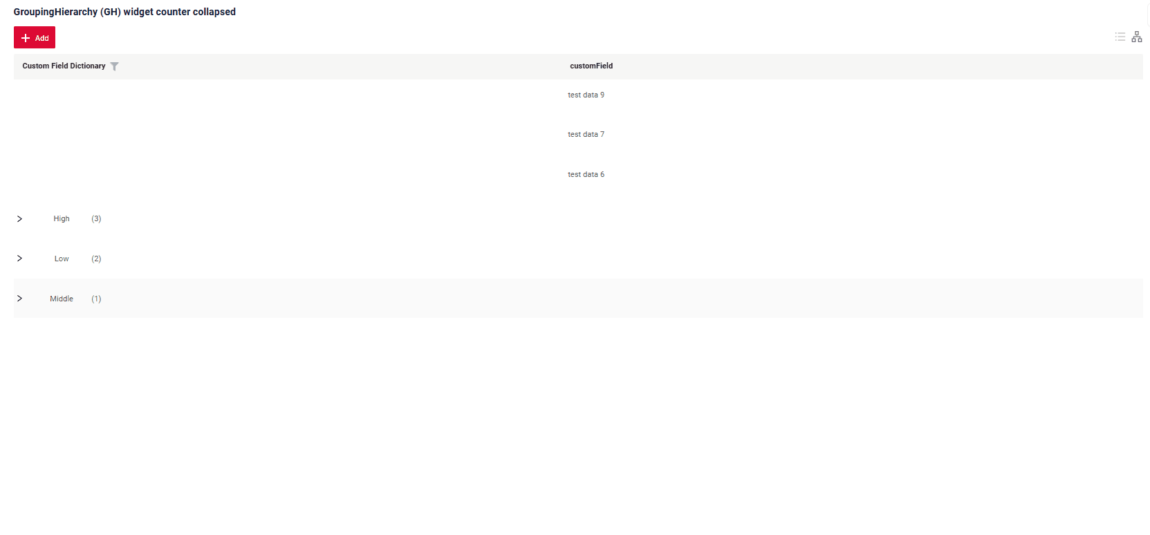
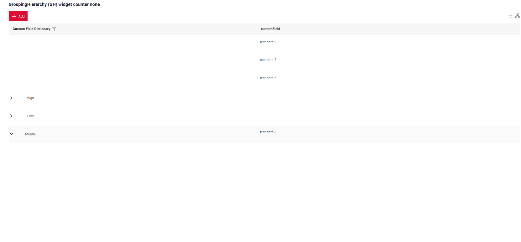
Counter
Counter tracks the number of nested elements at each level of a tree.
It operates in three modes:
- none (default): The counter is not displayed.
- collapsed: The counter appears only for grouping fields in their collapsed state. It disappears when the grouping field is expanded.
- always: The counter is shown regardless of the grouping field's state, both when collapsed and expanded.
How does it look?
How to add?
Example
Add in groupingHierarchy counterMode to corresponding .widget.json.
{
  "name": "MyExampleGHAlways",
  "title": "GroupingHierarchy (GH) widget counter always",
  "type": "GroupingHierarchy",
  "bc": "myexample",
  "fields": [
    {
      "title": "Custom Field Dictionary",
      "key": "customFieldDictionary",
      "type": "dictionary"
    },
    {
      "title": "customField",
      "key": "customField",
      "type": "input"
    }
  ],
  "options": {
    "groupingHierarchy": {
      "counterMode": "always",
      "fields": [
        "customFieldDictionary"
      ]
    }
  }
}
Add in groupingHierarchy counterMode to corresponding .widget.json.
{
  "name": "MyExampleGHCollapsed",
  "title": "GroupingHierarchy (GH) widget counter collapsed",
  "type": "GroupingHierarchy",
  "bc": "myexample",
  "fields": [
    {
      "title": "Custom Field Dictionary",
      "key": "customFieldDictionary",
      "type": "dictionary"
    },
    {
      "title": "customField",
      "key": "customField",
      "type": "input"
    }
  ],
  "options": {
    "groupingHierarchy": {
      "counterMode": "collapsed",
      "fields": [
        "customFieldDictionary"
      ]
    }
  }
}
On default or add in groupingHierarchy counterMode to corresponding .widget.json.
{
  "name": "MyExampleGH",
  "title": "GroupingHierarchy (GH) widget counter none",
  "type": "GroupingHierarchy",
  "bc": "myexample",
  "fields": [
    {
      "title": "Custom Field Dictionary",
      "key": "customFieldDictionary",
      "type": "dictionary"
    },
    {
      "title": "customField",
      "key": "customField",
      "type": "input"
    }
  ],
  "options": {
    "groupingHierarchy": {
      "counterMode": "none",
      "fields": [
        "customFieldDictionary"
      ]
    }
  }
}
Quick Transition to "Unallocated Rows"
After mass loading, grouping columns are populated by editing individual rows. Once a row is updated, the user is automatically "transferred" to the same row within the hierarchy.
To enable quick navigation back to unallocated records, a "floating" icon is displayed above the table on the right. Clicking this icon takes the user directly to the unallocated rows. If no unallocated rows are present, the icon remains hidden.
How does it look?
How to add?
By default
Default GroupingHierarchy
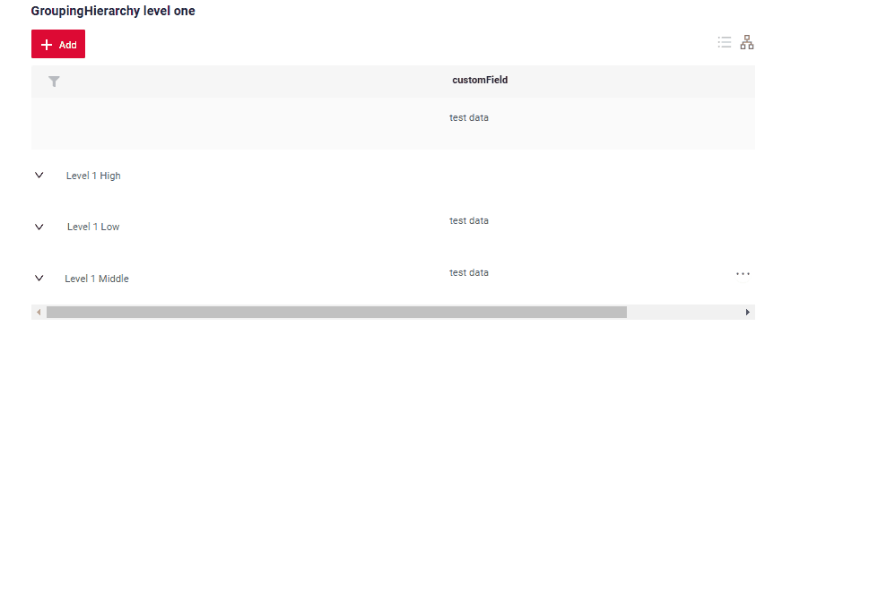
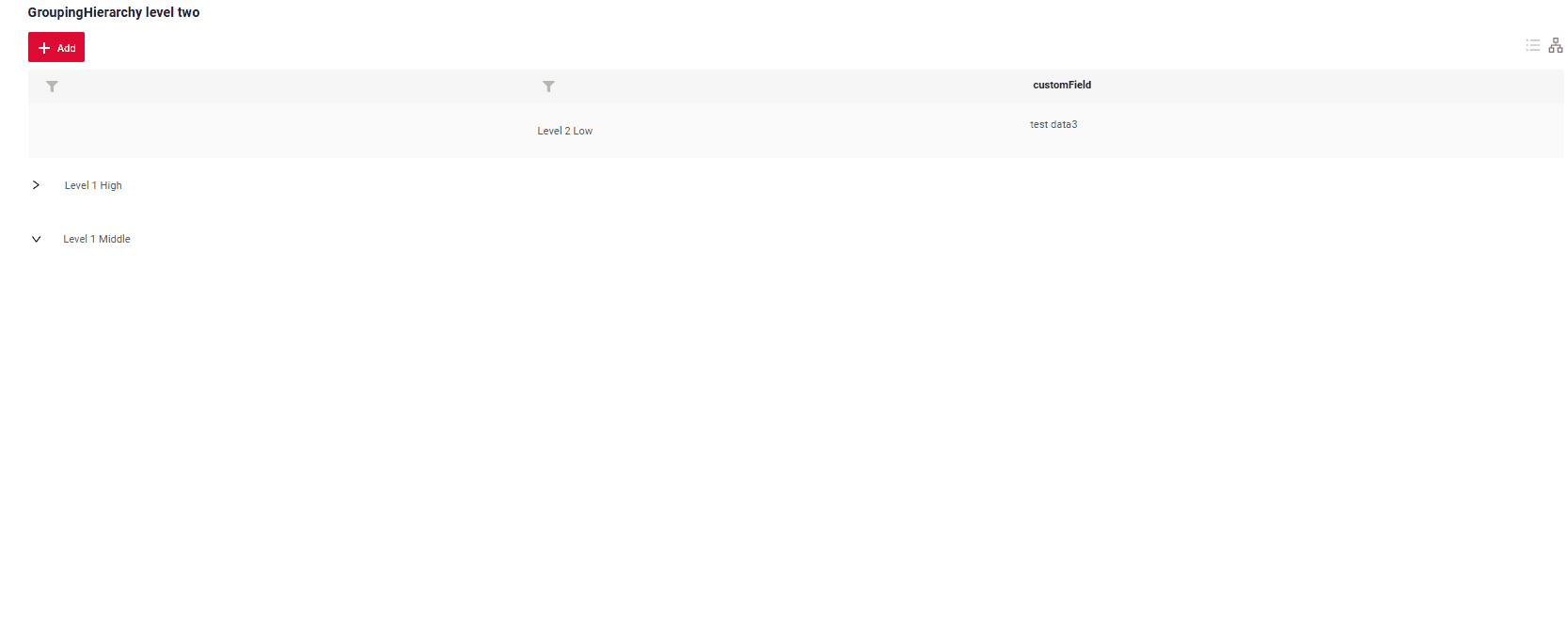
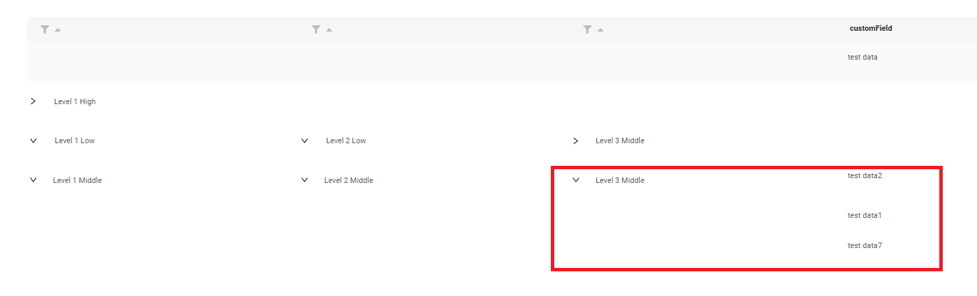
This function can be used to display the grouping structure in advance, even when no data is available. The number of nesting levels is unlimited.
Level 1
Live Sample ·
GitHub
Level 2
Live Sample ·
GitHub
Level 3
Live Sample ·
GitHub
Level 4
Live Sample ·
GitHub
Level 5
Live Sample ·
GitHub
How does it look?


How to add?
Example
Step 1 Add groupingHierarchy to corresponding .widget.json.
{
  "name": "MyExampleGH",
  "title": "GroupingHierarchy level four",
  "type": "GroupingHierarchy",
  "bc": "myexample",
  "fields": [
    {
      "label": "Level 1",
      "key": "customFieldDictionary",
      "type": "dictionary"
    },
    {
      "label": "Level 2",
      "key": "customFieldDictionaryLevelTwo",
      "type": "dictionary"
    },
    {
      "label": "Level 3",
      "key": "customFieldDictionaryLevelThree",
      "type": "dictionary"
    },
    {
      "label": "Level 4",
      "key": "customFieldDictionaryLevelFour",
      "type": "dictionary"
    },
    {
      "title": "customField",
      "key": "customField",
      "type": "input"
    }
  ],
  "options": {
    "groupingHierarchy": {
      "fields": [
        "customFieldDictionary",
        "customFieldDictionaryLevelTwo",
        "customFieldDictionaryLevelThree",
        "customFieldDictionaryLevelFour"
      ]
    }
  }
}
Step 2 Add defaultGroupingHierarchy to corresponding buildIndependentMeta FieldMetaBuilder.
    @Override
    public void buildIndependentMeta(FieldsMeta<MyExampleDTO> fields, InnerBcDescription bcDescription,
                                     Long parentId) {
        fields.setEnumFilterValues(
                fields,
                MyExampleDTO_.customFieldDictionaryLevelFour,
                CustomFieldDictionaryLevelFourEnum.values()
        );
        fields.enableFilter(MyExampleDTO_.customFieldDictionaryLevelFour);
        fields.setEnumFilterValues(
                fields,
                MyExampleDTO_.customFieldDictionaryLevelThree,
                CustomFieldDictionaryLevelThreeEnum.values()
        );
        fields.enableFilter(MyExampleDTO_.customFieldDictionaryLevelThree);
        fields.setEnumFilterValues(
                fields,
                MyExampleDTO_.customFieldDictionaryLevelTwo,
                CustomFieldDictionaryLevelTwoEnum.values()
        );
        fields.enableFilter(MyExampleDTO_.customFieldDictionaryLevelTwo);
        fields.setEnumFilterValues(fields, MyExampleDTO_.customFieldDictionary, CustomFieldDictionaryEnum.values());
        fields.enableFilter(MyExampleDTO_.customFieldDictionary);
        fields.defaultGroupingHierarchy(
                MyExampleDTO_.customFieldDictionary,
                MyExampleDTO_.customFieldDictionaryLevelTwo,
                MyExampleDTO_.customFieldDictionaryLevelThree,
                MyExampleDTO_.customFieldDictionaryLevelFour,
                lvl -> lvl
                        .add(
                                CustomFieldDictionaryEnum.LEVEL_1_HIGH,
                                lvl -> lvl
                                        .add(
                                                CustomFieldDictionaryLevelTwoEnum.LEVEL_2_MIDDLE,
                                                lvl -> lvl
                                                        .add(
                                                                CustomFieldDictionaryLevelThreeEnum.LEVEL_3_MIDDLE,
                                                                lvl -> lvl.add(CustomFieldDictionaryLevelFourEnum.LEVEL_4_HIGH)
                                                        )
                                        )
                        )
                        .add(
                                CustomFieldDictionaryEnum.LEVEL_1_MIDDLE,
                                lvl -> lvl
                                        .add(
                                                CustomFieldDictionaryLevelTwoEnum.LEVEL_2_MIDDLE,
                                                lvl -> lvl
                                                        .add(CustomFieldDictionaryLevelThreeEnum.LEVEL_3_MIDDLE)
                                        )
                        )
        );

    }
Level 1
Live Sample ·
GitHub
Level 2
Live Sample ·
GitHub
Level 3
Live Sample ·
GitHub
Level 4
Live Sample ·
GitHub
Step 1 Add groupingHierarchy to corresponding .widget.json.
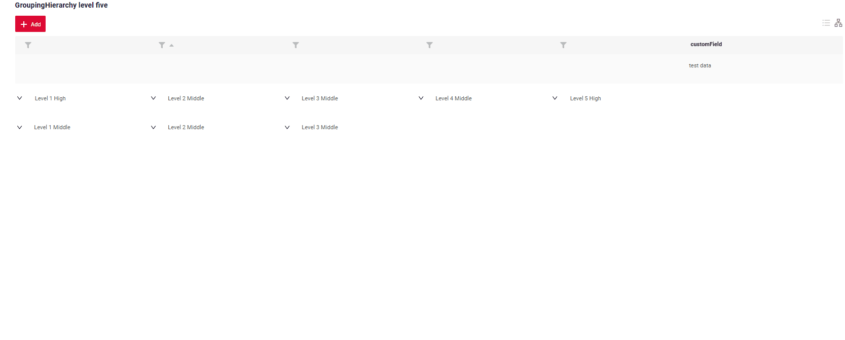
{
  "name": "MyExampleGH",
  "title": "GroupingHierarchy level five",
  "type": "GroupingHierarchy",
  "bc": "myexample",
  "fields": [
    {
      "label": "Level 1",
      "key": "customFieldDictionary",
      "type": "dictionary"
    },
    {
      "label": "Level 2",
      "key": "customFieldDictionaryLevelTwo",
      "type": "dictionary"
    },
    {
      "label": "Level 3",
      "key": "customFieldDictionaryLevelThree",
      "type": "dictionary"
    },
    {
      "label": "Level 4",
      "key": "customFieldDictionaryLevelFour",
      "type": "dictionary"
    },
    {
      "label": "Level 5",
      "key": "customFieldDictionaryLevelFive",
      "type": "dictionary"
    },
    {
      "title": "customField",
      "key": "customField",
      "type": "input"
    }
  ],
  "options": {
    "groupingHierarchy": {
      "fields": [
        "customFieldDictionary",
        "customFieldDictionaryLevelTwo",
        "customFieldDictionaryLevelThree",
        "customFieldDictionaryLevelFour",
        "customFieldDictionaryLevelFive"
      ]
    }
  }
}
Step 2 Add defaultGroupingHierarchy to corresponding buildIndependentMeta FieldMetaBuilder.
    @Override
    public void buildIndependentMeta(FieldsMeta<MyExampleDTO> fields, InnerBcDescription bcDescription,
                                     Long parentId) {
        fields.setEnumFilterValues(
                fields,
                MyExampleDTO_.customFieldDictionaryLevelFive,
                CustomFieldDictionaryLevelFiveEnum.values()
        );
        fields.enableFilter(MyExampleDTO_.customFieldDictionaryLevelFive);
        fields.setEnumFilterValues(
                fields,
                MyExampleDTO_.customFieldDictionaryLevelFour,
                CustomFieldDictionaryLevelFourEnum.values()
        );
        fields.enableFilter(MyExampleDTO_.customFieldDictionaryLevelFour);
        fields.setEnumFilterValues(
                fields,
                MyExampleDTO_.customFieldDictionaryLevelThree,
                CustomFieldDictionaryLevelThreeEnum.values()
        );
        fields.enableFilter(MyExampleDTO_.customFieldDictionaryLevelThree);
        fields.setEnumFilterValues(
                fields,
                MyExampleDTO_.customFieldDictionaryLevelTwo,
                CustomFieldDictionaryLevelTwoEnum.values()
        );
        fields.enableFilter(MyExampleDTO_.customFieldDictionaryLevelTwo);
        fields.setEnumFilterValues(fields, MyExampleDTO_.customFieldDictionary, CustomFieldDictionaryEnum.values());
        fields.enableFilter(MyExampleDTO_.customFieldDictionary);
        fields.enableSort(MyExampleDTO_.customFieldDictionaryLevelTwo);

        fields.defaultGroupingHierarchy(
                List.of(
                        MyExampleDTO_.customFieldDictionary,
                        MyExampleDTO_.customFieldDictionaryLevelTwo,
                        MyExampleDTO_.customFieldDictionaryLevelThree,
                        MyExampleDTO_.customFieldDictionaryLevelFour,
                        MyExampleDTO_.customFieldDictionaryLevelFive
                ),
                new Hierarchy<Object, Hierarchy<Object, Hierarchy<Object, Hierarchy<Object, Hierarchy<Object, ?>>>>>()
                        .add(
                                CustomFieldDictionaryEnum.LEVEL_1_HIGH,
                                lvl -> lvl.add(
                                        CustomFieldDictionaryLevelTwoEnum.LEVEL_2_MIDDLE,
                                        lvl -> lvl.add(
                                                CustomFieldDictionaryLevelThreeEnum.LEVEL_3_MIDDLE,
                                                lvl -> lvl.add(
                                                        CustomFieldDictionaryLevelFourEnum.LEVEL_4_MIDDLE,
                                                        lvl -> lvl.add(
                                                                CustomFieldDictionaryLevelFiveEnum.LEVEL_5_HIGH)))
                                )
                        )
                        .add(
                                CustomFieldDictionaryEnum.LEVEL_1_MIDDLE,
                                lvl -> lvl.add(
                                        CustomFieldDictionaryLevelTwoEnum.LEVEL_2_MIDDLE,
                                        lvl -> lvl.add(CustomFieldDictionaryLevelThreeEnum.LEVEL_3_MIDDLE)
                                )
                        )
        );
    }
Level 5
Live Sample ·
GitHub
Default GroupingHierarchy. Default Expanded
only Default GroupingHierarchy
The defaultExpanded parameter determines whether a group in the hierarchy is expanded or collapsed by default.
- true: The group is expanded by default, regardless of the number of elements nested in it. All levels are fully visible immediately.
- false: Collapsed when the group contains more than one element.
- null or missing: Default (same as false)
How does it look?
How to add?
Example
Add in groupingHierarchy addWithCfg to corresponding FieldMetaBuilder.
Add defaultExpanded to corresponding addWithCfg.
{
  "name": "MyExampleGH",
  "title": "GroupingHierarchy default GH",
  "type": "GroupingHierarchy",
  "bc": "myexample",
  "fields": [
    {
      "label": "Level 1",
      "key": "customFieldDictionary",
      "type": "dictionary"
    },
    {
      "label": "Level 2",
      "key": "customFieldDictionaryLevelTwo",
      "type": "dictionary"
    },
    {
      "label": "Level 3",
      "key": "customFieldDictionaryLevelThree",
      "type": "dictionary"
    },
    {
      "title": "customField",
      "key": "customField",
      "type": "input"
    }
  ],
  "options": {
    "groupingHierarchy": {
      "fields": [
        "customFieldDictionary",
        "customFieldDictionaryLevelTwo",
        "customFieldDictionaryLevelThree"
      ]
    }
  }
}
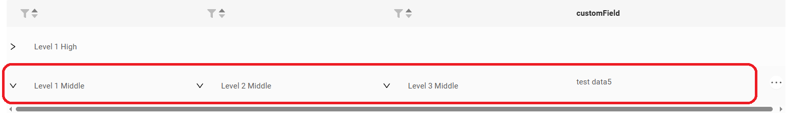
Group Display Mode
The groupMode setting ("aggregate" / "compact") is not explicitly defined in the metadata.
If either the aggFields or aggLevels parameter is specified, the value of groupMode is automatically set to "aggregate".
By default, the value of groupMode is "compact".
How does it look?
compact
By default, the compact mode is used. If the groupMode parameter is not specified, this mode is applied automatically.
In this mode, the contents of a group (e.g., rows within a “folder”) are displayed on the same row as the group header.
This layout provides a clean and compact visual structure.
Inline Editing
Inline editing of rows is supported.
When enabled, clicking on a row will activate edit mode for the entire row, including group header rows.
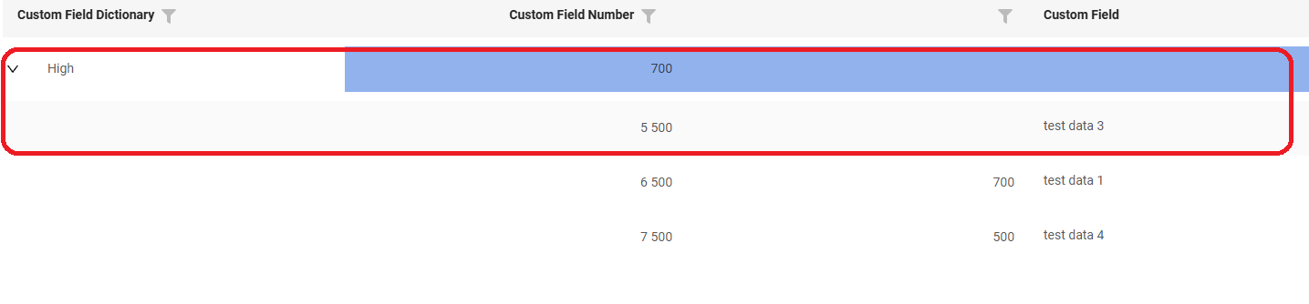
aggregate
This mode is used when aggregated values (e.g., sum, max, min) need to be displayed at the group level.
Compact display is not possible in this mode because the group header row is used to show aggregate values.
- The aggregate row is shown directly at the grouping field level, regardless of whether the group is expanded or collapsed.
- If a group does not contain any data rows, no aggregate values are displayed.
- The contents of the group start from the next row
- A grand total row for the entire table is displayed at the very bottom.
Inline Editing
Inline editing is not available for group headers in aggregate mode.
This is because those rows are dedicated to displaying aggregate information.
Data Aggregation
You can enable aggregation mode to calculate summary values for groups and for the entire table.
Supports 4 standard functions:
sum — calculates the total sum of the values in the column.
min — finds the minimum value in the column.
max — finds the maximum value in the column.
avg — calculates the average value of the column.
UI behavior
The table has some special display behavior. See Group Mode = aggregate for details.
Appearance customization
You can adjust the color and transparency of aggregate rows in the settings.
..\src\components\widgets\Table\groupingHierarchy\constants\index.ts
Info
All fields used for aggregation must be present in the interface. They can be either visible or hidden.
Attention
Field cannot be both a grouping field and an aggregated field
How does it look?


How to add?
Example
aggFields (array of objects)
Description: Defines which columns will be aggregated and how their values will be calculated.
Each aggFields object contains:
-
fieldKey — the column whose values will be aggregated.
-
func — the aggregation function. Supported values:
sum — calculates the total sum,
min — the minimum value,
max — the maximum value,
avg — the average value.
-
description (optional) — a text description of the aggregation, displayed in the UI.
"options": {
    "groupingHierarchy": {
      "fields": [
        "customFieldDictionary"
      ],
      "aggFields": [ // array of aggFields objects
        {
          "fieldKey": "customField", //  the column whose values will be aggregated and displayed above it.
          "func": "sum", // aggregation function: sum/min/max/avg
          "description": "My sum" // OPTIONAL. Description for UI
        }
      ]
    }
}
{
  "name": "MyExampleSumGH",
  "title": "GroupingHierarchy (GH) widget aggregate `sum`, Sum above the same column",
  "type": "GroupingHierarchy",
  "bc": "myexample",
  "fields": [
    {
      "title": "Type of property",
      "key": "customFieldDictionary",
      "type": "dictionary"
    },
    {
      "title": "Insurance amount",
      "key": "customFieldNumber",
      "type": "number"
    },
    {
      "title": "Description",
      "key": "customField",
      "type": "input"
    }
  ],
  "options": {
    "groupingHierarchy": {
      "fields": [
        "customFieldDictionary"
      ],
      "aggFields": [
        {
          "fieldKey": "customFieldNumber",
          "func": "sum"
        }
      ]
    }
  }
}
{
  "name": "MyExampleMinGH",
  "title": "GroupingHierarchy (GH) widget aggregate `min`",
  "type": "GroupingHierarchy",
  "bc": "myexample",
  "fields": [
    {
      "title": "Type of property",
      "key": "customFieldDictionary",
      "type": "dictionary"
    },
    {
      "title": "Insurance amount",
      "key": "customFieldNumber",
      "type": "number"
    },
    {
      "title": "Description",
      "key": "customField",
      "type": "input"
    }
  ],
  "options": {
    "groupingHierarchy": {
      "fields": [
        "customFieldDictionary"
      ],
      "aggFields": [
        {
          "fieldKey": "customFieldNumber",
          "func": "min"
        }
      ]
    }
  }
}
{
  "name": "MyExampleMaxGH",
  "title": "GroupingHierarchy (GH) widget aggregate `max`",
  "type": "GroupingHierarchy",
  "bc": "myexample",
  "fields": [
    {
      "title": "Type of property",
      "key": "customFieldDictionary",
      "type": "dictionary"
    },
    {
      "title": "Insurance amount",
      "key": "customFieldNumber",
      "type": "number"
    },
    {
      "title": "Description",
      "key": "customField",
      "type": "input"
    }
  ],
  "options": {
    "groupingHierarchy": {
      "fields": [
        "customFieldDictionary"
      ],
      "aggFields": [
        {
          "fieldKey": "customFieldNumber",
          "func": "max"
        }
      ]
    }
  }
}
{
  "name": "MyExampleAvgGH",
  "title": "GroupingHierarchy (GH) widget aggregate `avg`",
  "type": "GroupingHierarchy",
  "bc": "myexample",
  "fields": [
    {
      "title": "Type of property",
      "key": "customFieldDictionary",
      "type": "dictionary"
    },
    {
      "title": "Insurance amount",
      "key": "customFieldNumber",
      "type": "number"
    },
    {
      "title": "Description",
      "key": "customField",
      "type": "input"
    }
  ],
  "options": {
    "groupingHierarchy": {
      "fields": [
        "customFieldDictionary"
      ],
      "aggFields": [
        {
          "fieldKey": "customFieldNumber",
          "func": "avg"
        }
      ]
    }
  }
}
Options
Aggregated values in different columns
Options for displaying aggregated values:
- Above the same column — show the aggregated value directly above the column that is being aggregated.
- Above another column — show the aggregated value above a different column of your choice.
💡 You can also display aggregations for multiple fields either above the same column or above another column.
How does it look?


You can also define custom aggregation functions (see Custom).
How to add?
Example
aggFields (array of objects)
Description: Defines which columns will be aggregated and how their values will be calculated.
Each aggFields object contains:
-
fieldKey — the column whose values will be aggregated.
-
func — the aggregation function. Supported values:
sum — calculates the total sum,
min — the minimum value,
max — the maximum value,
avg — the average value.
"options": {
    "groupingHierarchy": {
      "fields": [
        "customFieldDictionary"
      ],
      "aggFields": [ // array of aggFields objects
        {
          "fieldKey": "customField", //  the column whose values will be aggregated and displayed above it.
          "func": "sum" // aggregation function: sum/min/max/avg
        }
      ]
    }
}
Added aggFields to corresponding widget.json.
{
  "name": "MyExampleSumGH",
  "title": "GroupingHierarchy (GH) widget aggregate `sum`, Sum above the same column",
  "type": "GroupingHierarchy",
  "bc": "myexample",
  "fields": [
    {
      "title": "Type of property",
      "key": "customFieldDictionary",
      "type": "dictionary"
    },
    {
      "title": "Insurance amount",
      "key": "customFieldNumber",
      "type": "number"
    },
    {
      "title": "Description",
      "key": "customField",
      "type": "input"
    }
  ],
  "options": {
    "groupingHierarchy": {
      "fields": [
        "customFieldDictionary"
      ],
      "aggFields": [
        {
          "fieldKey": "customFieldNumber",
          "func": "sum"
        }
      ]
    }
  }
}
aggFields (array of objects)
Description: Defines which columns will be aggregated and how their values will be calculated.
Each aggFields object contains:
-
fieldKey — the column whose values will be aggregated.
-
func — the aggregation function. Supported values:
sum — calculates the total sum,
min — the minimum value,
max — the maximum value,
avg — the average value.
-
argFieldKeys (optional) — list of column names whose values will be aggregated.You can also aggregate multiple fields at once by listing them here.
-
description (optional) — a text description of the aggregation, displayed in the UI.
"options": {
    "groupingHierarchy": {
      "fields": [
        "customFieldDictionary"
      ],
      "aggFields": [ // array of aggFields objects
        {
          "fieldKey": "customField", // the column above which the aggregated value will be displayed.
          "func": "sum", // aggregation function: sum/min/max/avg
          "argFieldKeys": ["customFieldNumber"], // OPTIONAL. If you need to display an aggregated value not above the column being aggregated,or if you need to aggregate multiple fields at once, list the column names separated by commas.
          "description": "Sum field customFieldNumber" // OPTIONAL. Description for UI
        }
      ]
    }
}
Added aggFields to corresponding widget.json.
{
  "name": "MyExampleSumGHForOptionalParameter",
  "title": "GroupingHierarchy (GH) widget aggregate `sum`. Sum above the other column",
  "type": "GroupingHierarchy",
  "bc": "myexample",
  "fields": [
    {
      "title": "Type of property",
      "key": "customFieldDictionary",
      "type": "dictionary"
    },
    {
      "title": "Insurance amount",
      "key": "customFieldNumber",
      "type": "number"
    },
    {
      "title": "Description",
      "key": "customField",
      "type": "input"
    }
  ],
  "options": {
    "groupingHierarchy": {
      "fields": [
        "customFieldDictionary"
      ],
      "aggFields": [
        {
          "fieldKey": "customField",
          "func": "sum",
          "argFieldKeys": [
            "customFieldNumber"
          ],
          "description": "Sum field customFieldNumber"
        }
      ]
    }
  }
}
Aggregated Total
You can enable or hide the grand total row (aggregation).
By default, if aggregation is enabled, the Total row is displayed automatically.
Grand Total Row Rule
If the table contains no data rows, the grand total row is not displayed. As soon as at least one data row appears, the grand total row becomes visible.
How does it look?


How to add?
Example
To remove the Total row, use the aggLevels parameter.
It defines which fields are aggregated at each grouping level using the aggFields tag.
- The level number is specified with the level parameter.
- Levels are numbered starting from 1 and match the order of fields in groupingHierarchy.fields.
- If you set level = 0, aggregated values will be shown in a separate Total row.
-
If level 0 is not defined, the Total row will not appear.
 "options": {
    "groupingHierarchy": {
      "fields": [
        "location",
        "object"
      ],
      "aggLevels": [
        {
          "level": 1,
          "aggFields": [
            {
              "fieldKey": "insuranceValue",
              "func": "sum",
              "argFieldKeys": [
                "annualPremium"
              ],
              "description": "sum fields `Annual Premium`"
            }
          ]
        },
        {
          "level": 2,
          "aggFields": [
            {
              "fieldKey": "insuranceAmount",
              "func": "sum",
              "argFieldKeys": [
                "insuranceAmount"
              ]
            }
          ]
        }
      ]
    }
{ "name": "MyExampleAggLevelsWithoutCountGH", "title": "GroupingHierarchy (GH) widget aggregate level", "type": "GroupingHierarchy", "bc": "myexample", "fields": [ { "title": "Location", "key": "location", "type": "input" }, { "title": "Object", "key": "object", "type": "input" }, { "title": "Insurance value", "key": "insuranceValue", "type": "number" }, { "title": "Insured amount", "key": "insuranceAmount", "digits": 2, "type": "number" }, { "title": "Net annual rate", "key": "netAnnualRate", "digits": 2, "type": "number" }, { "title": "Acquisition", "key": "acquisition", "digits": 2, "type": "number" }, { "title": "Gross annual rate", "key": "grossAnnualRate", "type": "number" }, { "title": "Annual premium", "key": "annualPremium", "type": "number" }, { "title": "Underinsurance percentage", "key": "underinsurancePercentage", "type": "number" } ], "options": { "groupingHierarchy": { "fields": [ "location", "object" ], "aggLevels": [ { "level": 1, "aggFields": [ { "fieldKey": "insuranceValue", "func": "sum", "argFieldKeys": [ "annualPremium" ], "description": "sum fields `Annual Premium`" } ] }, { "level": 2, "aggFields": [ { "fieldKey": "insuranceAmount", "func": "sum", "argFieldKeys": [ "insuranceAmount" ] } ] } ] } } }
Aggregated values in different levels
Apply different aggregation standard functions at grouping levels and total level.
How does it look?

How to add?
Example
The aggLevels parameter defines which fields are aggregated at each grouping level using the aggFields tag.
level — specifies the level number.
Levels are numbered starting from 1 and correspond to the order of fields in groupingHierarchy.fields.
You can specify the level where aggregation is required, and the aggregated data will be displayed at that level.
- aggFields (array of objects)
Description: Defines which columns will be aggregated and how their values will be calculated.
Each aggFields object contains:
-
fieldKey — the column whose values will be aggregated.
-
func — the aggregation function. Supported values:
sum — calculates the total sum,
min — the minimum value,
max — the maximum value,
avg — the average value.
-
argFieldKeys (optional) — list of column names whose values will be aggregated.You can also aggregate multiple fields at once by listing them here.
-
description (optional) — a text description of the aggregation, displayed in the UI.
 "options": {
    "groupingHierarchy": {
      "fields": [
        "location",
        "object"
      ],
      "aggLevels": [
        {
          "level": 0,
          "aggFields": [
            {
              "fieldKey": "insuranceValue",
              "func": "sum",
              "argFieldKeys": [
                "insuranceValue"
              ],
              "description": "sum fields `Insured amount`"
            }
          ]
        },
        {
          "level": 1,
          "aggFields": [
            {
              "fieldKey": "insuranceValue", // the column above which the aggregated value will be displayed.
              "func": "sum",  // aggregation function: sum/min/max/avg
              "argFieldKeys": [ // OPTIONAL. If you need to display an aggregated value not above the column being aggregated,or if you need to aggregate multiple fields at once, list the column names separated by commas.
                "annualPremium"
              ],
              "description": "sum fields `Annual Premium`" // OPTIONAL. Description for UI
            }
          ]
        },
        {
          "level": 2,
          "aggFields": [
            {
              "fieldKey": "insuranceAmount",
              "func": "sum",
              "argFieldKeys": [
                "insuranceAmount"
              ]
            }
          ]
        }
      ]
    }
{ "name": "MyExampleAggLevelsGH", "title": "GroupingHierarchy (GH) widget aggregate level", "type": "GroupingHierarchy", "bc": "myexample", "fields": [ { "title": "Location", "key": "location", "type": "input" }, { "title": "Object", "key": "object", "type": "input" }, { "title": "Insurance value", "key": "insuranceValue", "type": "number" }, { "title": "Insured amount", "key": "insuranceAmount", "digits": 2, "type": "number" }, { "title": "Net annual rate", "key": "netAnnualRate", "digits": 2, "type": "number" }, { "title": "Acquisition", "key": "acquisition", "digits": 2, "type": "number" }, { "title": "Gross annual rate", "key": "grossAnnualRate", "type": "number" }, { "title": "Annual premium", "key": "annualPremium", "type": "number" }, { "title": "Underinsurance percentage", "key": "underinsurancePercentage", "type": "number" } ], "options": { "groupingHierarchy": { "fields": [ "location", "object" ], "aggLevels": [ { "level": 0, "aggFields": [ { "fieldKey": "insuranceValue", "func": "sum", "argFieldKeys": [ "insuranceValue" ], "description": "sum fields `Insured amount`" } ] }, { "level": 1, "aggFields": [ { "fieldKey": "insuranceValue", "func": "sum", "argFieldKeys": [ "annualPremium" ], "description": "sum fields `Annual Premium`" } ] }, { "level": 2, "aggFields": [ { "fieldKey": "insuranceAmount", "func": "sum", "argFieldKeys": [ "insuranceAmount" ] } ] } ] } } }
Custom functions
Custom functions — define your own aggregation rules when standard ones are not enough.
How does it look?

How to add?
Example
The aggLevels parameter defines which fields are aggregated at each grouping level using the aggFields tag.
level — specifies the level number.
Levels are numbered starting from 1 and correspond to the order of fields in groupingHierarchy.fields.
You can specify the level where aggregation is required, and the aggregated data will be displayed at that level.
- aggFields (array of objects)
Description: Defines which columns will be aggregated and how their values will be calculated.
Each aggFields object contains:
-
fieldKey — the column whose values will be aggregated.
-
func — min
-
argFieldKeys (optional) — list of column names whose values will be aggregated.You can also aggregate multiple fields at once by listing them here.
-
description (optional) — a text description of the aggregation, displayed in the UI.
"options": { "groupingHierarchy": { "fields": [ "location", "object" ], "aggLevels": [ { "level": 0, "aggFields": [ { "fieldKey": "insuranceValue", "func": "sum", "argFieldKeys": [ "insuranceValue" ], "description": "sum fields `Insured amount`" } ] }, { "level": 1, "aggFields": [ { "fieldKey": "insuranceValue", // the column above which the aggregated value will be displayed. "func": "sum", // aggregation function: sum/min/max/avg "argFieldKeys": [ // OPTIONAL. If you need to display an aggregated value not above the column being aggregated,or if you need to aggregate multiple fields at once, list the column names separated by commas. "annualPremium" ], "description": "sum fields `Annual Premium`" // OPTIONAL. Description for UI } ] }, { "level": 2, "aggFields": [ { "fieldKey": "insuranceAmount", "func": "sum", "argFieldKeys": [ "insuranceAmount" ] } ] } ] }Live Sample · GitHub{ "name": "MyExampleGH", "title": "GroupingHierarchy (GH) widget custom functional", "type": "GroupingHierarchy", "bc": "myexample", "fields": [ { "title": "Location", "key": "location", "type": "input" }, { "title": "Object", "key": "object", "type": "input" }, { "title": "Insurance value", "key": "insuranceValue", "type": "number" }, { "title": "Insured amount", "key": "insuranceAmount", "digits": 2, "type": "number" }, { "title": "Percent Insurance Amount", "key": "percentInsuranceAmount", "digits": 2, "type": "hidden" } ], "options": { "groupingHierarchy": { "fields": [ "object" ], "aggLevels": [ { "level": 0, "aggFields": [ { "fieldKey": "insuranceAmount", "func": "sum" } ] }, { "level": 1, "aggFields": [ { "fieldKey": "insuranceAmount", "func": "min", "argFieldKeys": [ "percentInsuranceAmount" ], "description": "%" } ] } ] } } }
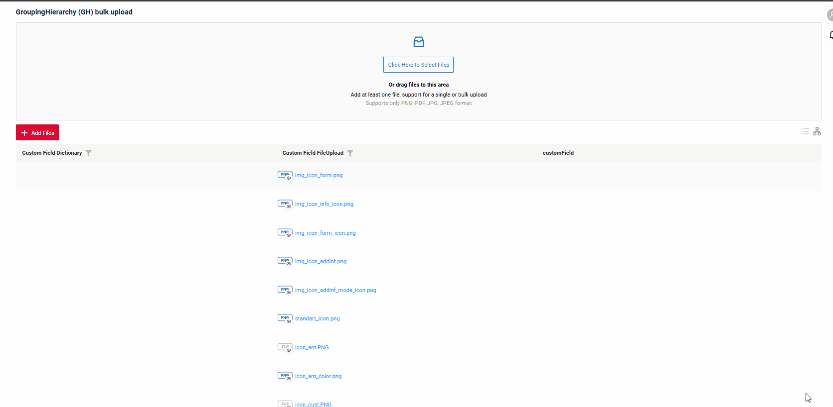
Multi-upload files
We have implemented multi-file upload. You can use a dedicated drag-and-drop zone or a standard button to select your files.
see more Multi-upload files