AdditionalInfo
AdditionalInfo widget is a component only for data viewing. Widget is always located on the right.
Basics
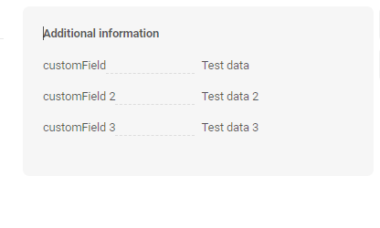
How does it look?
How to add?
Example
Step1 Create file .widget.json with type AdditionalInfo.
- name - static (unique within the project)
- title - (optional)
- type = "AdditionalInfo" (required)
- bc - (required)
- fields- (required) see field types
- options
{
  "name": "MyExampleAdditional",
  "title": "Additional information",
  "type": "AdditionalInfo",
  "bc": "myExampleBc",
  "fields": [
    {
      "label": "Custom Field Date",
      "key": "customFieldDate",
      "type": "date"
    },
    {
      "label": "Custom Field MultivalueHover",
      "key": "customFieldMultivalueHover",
      "assocValueKey": "customField",
      "popupBcName": "myEntityMultiAssocListPopup",
      "type": "multivalueHover",
      "displayedKey": "customFieldMultivalueHoverDisplayedKey"
    },
    {
      "label": "Custom Field Hint",
      "key": "customFieldHint",
      "type": "hint"
    },
    {
      "label": "Custom Field Multivalue",
      "key": "customFieldMultivalue",
      "type": "multivalue",
      "displayedKey": "customFieldMultivalueDisplayedKey",
      "popupBcName": "myEntityPickAssocListPopup",
      "assocValueKey": "customField"
    },
    {
      "label": "Custom Field Multiple Select",
      "key": "customFieldMultipleSelect",
      "type": "multipleSelect"
    },
    {
      "label": "Custom multifield style 'List'",
      "key": "customFieldMultiField",
      "type": "multifield",
      "style": "list",
      "fields": [
        {
          "label": "Custom Field Multi",
          "key": "customField",
          "type": "input"
        },
        {
          "label": "Custom Field Percent Multi",
          "key": "customFieldPercent",
          "type": "input"
        }
      ]
    },
    {
      "label": "Custom Field Pick List",
      "key": "customFieldPickList",
      "type": "pickList",
      "popupBcName": "myEntityPickPickListPopup",
      "pickMap": {
        "customFieldPickListId": "id",
        "customFieldPickList": "customField"
      }
    },
    {
      "label": "Custom Field Inline Pick List",
      "key": "customFieldInlinePickList",
      "type": "inline-pickList",
      "popupBcName": "myEntityPickPickListPopup",
      "pickMap": {
        "customFieldInlinePickList": "customField",
        "customFieldInlinePickListId": "id"
      }
    },
    {
      "label": "Custom Field DateTimeWithSeconds",
      "key": "customFieldDateTimeWithSeconds",
      "type": "dateTimeWithSeconds"
    },
    {
      "label": "Custom Field Radio",
      "key": "customFieldRadio",
      "type": "radio"
    },
    {
      "label": "Custom Field Money",
      "key": "customFieldMoney",
      "digits": 2,
      "type": "money"
    },
    {
      "label": "Custom Field Percent",
      "key": "customFieldPercent",
      "type": "percent"
    },
    {
      "label": "Custom Field Num",
      "key": "customFieldNum",
      "type": "number"
    },
    {
      "label": "Custom Field Dictionary",
      "key": "customFieldDictionary",
      "type": "dictionary"
    },
    {
      "label": "Custom Field Checkbox",
      "key": "customFieldCheckbox",
      "type": "checkbox"
    },
    {
      "label": "Custom Field DateTime",
      "key": "customFieldDateTime",
      "type": "dateTime"
    },
    {
      "label": "Custom FieldText",
      "key": "customFieldText",
      "type": "text"
    },
    {
      "label": "customField",
      "key": "customField",
      "type": "input"
    }
  ],
  "options": {
    "layout": {
      "rows": [
        {
          "cols": [
            {
              "fieldKey": "customFieldDate",
              "span": 12
            }
          ]
        },
        {
          "cols": [
            {
              "fieldKey": "customFieldMultivalueHover",
              "span": 12
            }
          ]
        },
        {
          "cols": [
            {
              "fieldKey": "customFieldHint",
              "span": 12
            }
          ]
        },
        {
          "cols": [
            {
              "fieldKey": "customFieldMultivalue",
              "span": 12
            }
          ]
        },
        {
          "cols": [
            {
              "fieldKey": "customFieldMultipleSelect",
              "span": 12
            }
          ]
        },
        {
          "cols": [
            {
              "fieldKey": "customFieldMultiField",
              "span": 12
            }
          ]
        },
        {
          "cols": [
            {
              "fieldKey": "customFieldPickList",
              "span": 12
            }
          ]
        },
        {
          "cols": [
            {
              "fieldKey": "customFieldInlinePickList",
              "span": 12
            }
          ]
        },
        {
          "cols": [
            {
              "fieldKey": "customFieldDateTimeWithSeconds",
              "span": 12
            }
          ]
        },
        {
          "cols": [
            {
              "fieldKey": "customFieldText",
              "span": 12
            }
          ]
        },
        {
          "cols": [
            {
              "fieldKey": "customFieldDateTime",
              "span": 12
            }
          ]
        },
        {
          "cols": [
            {
              "fieldKey": "customFieldCheckbox",
              "span": 12
            }
          ]
        },
        {
          "cols": [
            {
              "fieldKey": "customFieldDictionary",
              "span": 12
            }
          ]
        },
        {
          "cols": [
            {
              "fieldKey": "customFieldNum",
              "span": 12
            }
          ]
        },
        {
          "cols": [
            {
              "fieldKey": "customFieldPercent",
              "span": 12
            }
          ]
        },
        {
          "cols": [
            {
              "fieldKey": "customFieldMoney",
              "span": 12
            }
          ]
        },
        {
          "cols": [
            {
              "fieldKey": "customFieldRadio",
              "span": 12
            }
          ]
        },
        {
          "cols": [
            {
              "fieldKey": "customField",
              "span": 12
            }
          ]
        }
      ]
    }
  }
}
{
  "name": "MyExampleList",
  "title": "List title",
  "type": "List",
  "bc": "myExampleBc",
  "fields": [
    {
      "title": "Custom Field Date",
      "key": "customFieldDate",
      "type": "date"
    },
    {
      "title": "Custom Field MultivalueHover",
      "key": "customFieldMultivalueHover",
      "assocValueKey": "customField",
      "popupBcName": "myEntityMultiAssocListPopup",
      "type": "multivalueHover",
      "displayedKey": "customFieldMultivalueHoverDisplayedKey"
    },
    {
      "title": "Custom Field Hint",
      "key": "customFieldHint",
      "type": "hint"
    },
    {
      "title": "Custom Field Multivalue",
      "key": "customFieldMultivalue",
      "type": "multivalue",
      "displayedKey": "customFieldMultivalueDisplayedKey",
      "popupBcName": "myEntityPickAssocListPopup",
      "assocValueKey": "customField"
    },
    {
      "title": "Custom Field Multiple Select",
      "key": "customFieldMultipleSelect",
      "type": "multipleSelect"
    },
    {
      "title": "Custom multifield style 'List'",
      "key": "customFieldMultiField",
      "type": "multifield",
      "style": "list",
      "fields": [
        {
          "title": "Custom Field Multi",
          "key": "customField",
          "type": "input"
        },
        {
          "title": "Custom Field Percent Multi",
          "key": "customFieldPercent",
          "type": "percent"
        }
      ]
    },
    {
      "title": "Custom Field Pick List",
      "key": "customFieldPickList",
      "type": "pickList",
      "popupBcName": "myEntityPickPickListPopup",
      "pickMap": {
        "customFieldPickListId": "id",
        "customFieldPickList": "customField"
      }
    },
    {
      "title": "Custom Field Inline Pick List",
      "key": "customFieldInlinePickList",
      "type": "inline-pickList",
      "popupBcName": "myEntityPickPickListPopup",
      "pickMap": {
        "customFieldInlinePickList": "customField",
        "customFieldInlinePickListId": "id"
      }
    },
    {
      "title": "Custom Field DateTimeWithSeconds",
      "key": "customFieldDateTimeWithSeconds",
      "type": "dateTimeWithSeconds"
    },
    {
      "title": "Custom Field Radio",
      "key": "customFieldRadio",
      "type": "radio"
    },
    {
      "title": "Custom Field Money",
      "key": "customFieldMoney",
      "digits": 2,
      "type": "money"
    },
    {
      "title": "Custom Field Percent",
      "key": "customFieldPercent",
      "type": "percent"
    },
    {
      "title": "Custom Field Num",
      "key": "customFieldNum",
      "type": "number"
    },
    {
      "title": "Custom Field Dictionary",
      "key": "customFieldDictionary",
      "type": "dictionary"
    },
    {
      "title": "Custom Field Checkbox",
      "key": "customFieldCheckbox",
      "type": "checkbox"
    },
    {
      "title": "Custom Field DateTime",
      "key": "customFieldDateTime",
      "type": "dateTime"
    },
    {
      "title": "Custom FieldText",
      "key": "customFieldText",
      "type": "text"
    },
    {
      "title": "customField",
      "key": "customField",
      "type": "input"
    }
  ]
}
Title
Title Basic
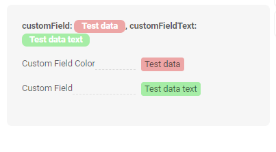
Title Color
Title Color allows you to specify a color for a title. It can be constant or calculated.
Constant color
Constant color is a fixed color that doesn't change. It remains the same regardless of any factors in the application. Calculated color
Calculated color can be used to change a title color dynamically. It changes depending on business logic or data in the application.
Info
Title colorization is applicable to the following fields: date, dateTime, dateTimeWithSeconds, number, money, percent, time, input, text, dictionary, radio, checkbox, multivalue, multivalueHover.
How does it look?
How to add?
Example
Step 1 Add custom field for color to corresponding DataResponseDTO. The field can contain a HEX color or be null.
    public MyExampleDTO(MyEntity entity) {
        this.id = entity.getId().toString();
        this.customFieldColor = "#edaa";
        this.customFieldTextColor = "#aeda";
        this.customFieldText = entity.getCustomFieldText();
        this.customField = entity.getCustomField();
Step 2 Add "bgColorKey" : custom field for color and to .widget.json.
Add in title field with ${customField}
{
  "name": "MyExample",
  "title": "customField: ${customField},  customFieldText: ${customFieldText}",
  "type": "AdditionalInfo",
  "bc": "myexample",
  "fields": [
    {
      "label": "Custom Field Color",
      "key": "customField",
      "type": "input",
      "bgColorKey": "customFieldColor"
    },
    {
      "label": "Custom Field",
      "key": "customFieldText",
      "type": "input",
      "bgColorKey": "customFieldTextColor"
    }
  ],
  "options": {
    "layout": {
      "rows": [
        {
          "cols": [
            {
              "fieldKey": "customField",
              "span": 12
            }
          ]
        },
        {
          "cols": [
            {
              "fieldKey": "customFieldText",
              "span": 12
            }
          ]
        }
      ]
    }
  }
}
Add "bgColor" : HEX color to .widget.json.
Add in title field with ${customField}
{
  "name": "MyExampleColorConst",
  "title": "customField: ${customField},  customFieldText: ${customFieldText}",
  "type": "AdditionalInfo",
  "bc": "myexample",
  "fields": [
    {
      "label": "Custom Field Color",
      "key": "customField",
      "type": "input",
      "bgColor": "#edaa"
    },
    {
      "label": "Custom Field",
      "key": "customFieldText",
      "type": "input",
      "bgColor": "#aeda"
    }
  ],
  "options": {
    "layout": {
      "rows": [
        {
          "cols": [
            {
              "fieldKey": "customField",
              "span": 12
            }
          ]
        },
        {
          "cols": [
            {
              "fieldKey": "customFieldText",
              "span": 12
            }
          ]
        }
      ]
    }
  }
}
Business component
This specifies the business component (BC) to which this form belongs. A business component represents a specific part of a system that handles a particular business logic or data.
see more Business component
Show condition
not applicable
Fields
Options layout
not applicable
Actions
Actions show available actions as separate buttons
see Actions