FormPopup
FormPopup widget is a component for additional field checks in popup and the ability to add information inside the popup.
Basics
How does it look?
How to add?
Example
Add type "FormPopup" to BaseFieldExtractor.
@Override
public List<String> getSupportedTypes() {
    return Lists.newArrayList(
            "Funnel",
            "RingProgress",
            "DashboardList",
            "FormPopup"
    );
}
Add file "ActionsExt".
@UtilityClass
public class ActionsExt {

    public static PreAction confirmWithCustomWidget(@Nullable String message, @Nullable String widget, @Nullable String yesButton, @Nullable String noButton) {
        Map<String, String> customParameters = new HashMap<>();
        customParameters.put("subtype", "confirmWithCustomWidget");
        if (widget != null) {
            customParameters.put("widget", widget);
        }
        if (yesButton != null) {
            customParameters.put("yesText", yesButton);
        }
        if (noButton != null) {
            customParameters.put("noText", noButton);
        }
        return PreAction.custom(message, customParameters);
    }

}
Step1 Add a button "save-send" that raises the widget Popup
{
  "name": "MyExampleFormButton",
  "title": "",
  "type": "Form",
  "bc": "myExampleBc",
  "fields": [
    {
      "label": "Custom Field Required",
      "key": "customFieldRequired",
      "type": "input"
    },
    {
      "label": "Custom Field",
      "key": "customField",
      "type": "input"
    }
  ],
  "options": {
    "layout": {
      "rows": [
        {
          "cols": [
            {
              "fieldKey": "customFieldRequired",
              "span": 12
            }
          ]
        },
        {
          "cols": [
            {
              "fieldKey": "customField",
              "span": 12
            }
          ]
        }
      ]
    },
    "actionGroups": {
      "include": [
        "save-send"
      ]
    }
  }
}
{
  "name": "MyExampleFormpopup",
  "title": "Form widget",
  "type": "FormPopup",
  "bc": "myExampleBc",
  "fields": [
    {
      "label": "Custom Field Required",
      "key": "customFieldRequired",
      "type": "input"
    },
    {
      "label": "Сustom Field",
      "key": "customField",
      "type": "hint"
    },
    {
      "label": "Сustom Field FA",
      "key": "customField",
      "type": "input"
    },
    {
      "label": "Custom Field InlinePicklist",
      "key": "customFieldInlinePicklist",
      "type": "inline-pickList",
      "popupBcName": "myEntityInlinePicklistPick",
      "pickMap": {
        "customFieldInlinePicklist": "customField",
        "customFieldInlinePicklistId": "id"
      }
    },
    {
      "label": "Custom Field InlinePicklist FA",
      "key": "customFieldInlinePicklistFA",
      "type": "inline-pickList",
      "popupBcName": "myEntityInlinePicklistFAPick",
      "pickMap": {
        "customFieldInlinePicklistFA": "customField",
        "customFieldInlinePicklistFAId": "id"
      }
    }
  ],
  "options": {
    "layout": {
      "rows": [
        {
          "cols": [
            {
              "fieldKey": "customFieldRequired",
              "span": 12
            }
          ]
        },
        {
          "cols": [
            {
              "fieldKey": "customFieldInlinePicklist",
              "span": 12
            }
          ]
        },
        {
          "cols": [
            {
              "fieldKey": "customField",
              "span": 12
            }
          ]
        },
        {
          "cols": [
            {
              "fieldKey": "customField",
              "span": 12
            }
          ]
        },
        {
          "cols": [
            {
              "fieldKey": "customFieldInlinePicklistFA",
              "span": 12
            }
          ]
        }
      ]
    }
  }
}
{
  "name": "myexampleformpopup",
  "title": "My Example Form",
  "template": "DashboardView",
  "url": "/screen/myexample/view/myexampleformpopup",
  "widgets": [
    {
      "widgetName": "myEntityInlinePicklistFAPickPickListPopup",
      "position": 2,
      "gridWidth": 24
    },
    {
      "widgetName": "myEntityInlinePicklistPickPickListPopup",
      "position": 2,
      "gridWidth": 24
    },
    {
      "widgetName": "MyExampleFormPopupInfoText",
      "position": 20,
      "gridWidth": 12
    },
    {
      "widgetName": "MyExampleFormpopup",
      "position": 40,
      "gridWidth": 12
    },
    {
      "widgetName": "MyExampleFormButton",
      "position": 50,
      "gridWidth": 12
    }
  ],
  "rolesAllowed": [
    "CXBOX_USER"
  ]
}
Params:
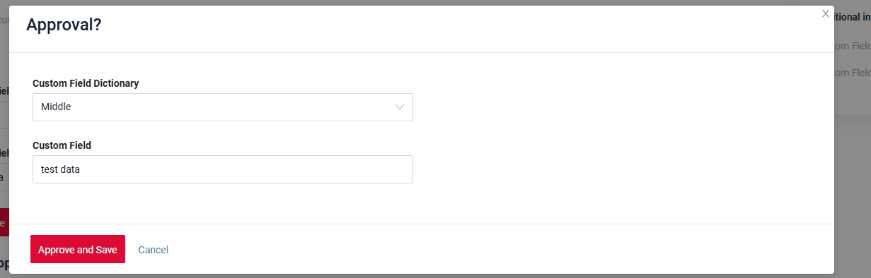
PreAction.confirmWithWidget("myWidget", cf -> cf
.title("Approve?") //or withoutTitle()
.yesText("Yes")
.noText("Cancel"))
myWidget – widget name FormPopup.widget.json on current bc
@SuppressWarnings("java:S")
@RequiredArgsConstructor
@Service
public class MyExampleService extends VersionAwareResponseService<MyExampleDTO, MyEntity> {
private final MyEntityRepository repository;
@Getter(onMethod_ = @Override)
private final Class<MyExampleMeta> meta = MyExampleMeta.class;
@Autowired
private EntityManager entityManager;
@Override
protected CreateResult<MyExampleDTO> doCreateEntity(MyEntity entity, BusinessComponent bc) {
repository.save(entity);
return new CreateResult<>(entityToDto(bc, entity));
}
@Override
protected ActionResultDTO<MyExampleDTO> doUpdateEntity(MyEntity entity, MyExampleDTO data, BusinessComponent bc) {
if (data.isFieldChanged(MyExampleDTO_.customFieldInlinePicklistFAId)) {
entity.setCustomFieldInlinePicklistFAEntity(data.getCustomFieldInlinePicklistFAId() != null
? entityManager.getReference(MyEntityInlinePicklistFA.class, data.getCustomFieldInlinePicklistFAId())
: null);
}
setIfChanged(data, MyExampleDTO_.customFieldRequired, entity::setCustomFieldRequired);
setIfChanged(data, MyExampleDTO_.customFieldRequired, entity::setCustomFieldRequired);
if (data.isFieldChanged(MyExampleDTO_.customFieldInlinePicklistId)) {
entity.setCustomFieldInlinePicklistEntity(data.getCustomFieldInlinePicklistId() != null
? entityManager.getReference(MyEntityInlinePicklist.class, data.getCustomFieldInlinePicklistId())
: null);
}
if (data.isFieldChanged(MyExampleDTO_.customField)) {
entity.setCustomField(data.getCustomField());
}
if (data.isFieldChanged(MyExampleDTO_.customField)) {
entity.setCustomField(data.getCustomField());
}
return new ActionResultDTO<>(entityToDto(bc, entity));
}
@Override
public Actions<MyExampleDTO> getActions() {
return Actions.<MyExampleDTO>builder()
.action(act -> act
.scope(ActionScope.RECORD)
.withAutoSaveBefore()
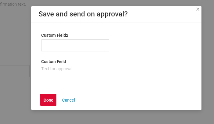
.action("save-send", "Save and send on approval")
.withPreAction(PreAction.confirmWithWidget(
"MyExampleFormpopup", cfw -> cfw
.title("Approve?")
.yesText("Approve and Save")
.noText("Cancel")))
.invoker((bc, dto) -> new ActionResultDTO<MyExampleDTO>()))
.create(crt -> crt.text("Create"))
.build();
}
}
Title
Title Color
Title Color allows you to specify a color for a title. It can be constant or calculated.
Constant color
Constant color is a fixed color that doesn't change. It remains the same regardless of any factors in the application.
Calculated color
Calculated color can be used to change a title color dynamically. It changes depending on business logic or data in the application.
Info
Title colorization is applicable to the following fields: date, dateTime, dateTimeWithSeconds, number, money, percent, time, input, text, dictionary, radio, checkbox, multivalue, multivalueHover.
How does it look?

How to add?
Example
Step 1 Add custom field for color to corresponding DataResponseDTO. The field can contain a HEX color or be null.
    public MyExampleDTO(MyEntity entity) {
        this.id = entity.getId().toString();
        this.customFieldColor = "#edaa";
        this.customFieldTextColor = "#aeda";
        this.customFieldText = entity.getCustomFieldText();
        this.customField = entity.getCustomField();
Step 2 Add "bgColorKey" : custom field for color and to .widget.json.
Add in title field with ${customField}
{
  "name": "MyExampleFormPopup",
  "title": "customField: ${customField},  customFieldText: ${customFieldText}",
  "type": "FormPopup",
  "bc": "myexample",
  "fields": [
    {
      "label": "Custom Field Color",
      "key": "customField",
      "type": "input",
      "bgColorKey": "customFieldColor"
    },
    {
      "label": "Custom Field Text",
      "key": "customFieldText",
      "type": "input",
      "bgColorKey": "customFieldTextColor"
    }
  ],
  "options": {
    "layout": {
      "rows": [
        {
          "cols": [
            {
              "fieldKey": "customFieldText",
              "span": 12
            }
          ]
        },
        {
          "cols": [
            {
              "fieldKey": "customField",
              "span": 12
            }
          ]
        }
      ]
    }
  }
}
Add "bgColor" : HEX color to .widget.json.
Add in title field with ${customField}
{
  "name": "MyExampleFormPopupColorConst",
  "title": "customField: ${customField},  customFieldText: ${customFieldText}",
  "type": "FormPopup",
  "bc": "myexample",
  "fields": [
    {
      "label": "Custom Field Color",
      "key": "customField",
      "type": "input",
      "bgColor": "#edaa"
    },
    {
      "label": "Custom Field Text",
      "key": "customFieldText",
      "type": "input",
      "bgColor": "#aeda"
    }
  ],
  "options": {
    "layout": {
      "rows": [
        {
          "cols": [
            {
              "fieldKey": "customFieldText",
              "span": 12
            }
          ]
        },
        {
          "cols": [
            {
              "fieldKey": "customField",
              "span": 12
            }
          ]
        }
      ]
    }
  }
}
Show condition
not applicable
Business component
This specifies the business component (BC) to which this form belongs. A business component represents a specific part of a system that handles a particular business logic or data.
see more Business component
Fields
Fields Configuration. The fields array defines the individual fields present within the form.
- "label"
Description: Field Title.
Type: String(optional).
- "key"
Description: Name field to corresponding DataResponseDTO.
Type: String(required).
- "type"
Description: Field types
Type: String(required).
How to add?
Example
Step 1 Download plugin download Intellij Plugin
Step 2 Add existing field to an existing form widget

Add field to .widget.json.
   {
     "name": "MyExampleFormpopup",
     "title": "Form widget",
     "type": "FormPopup",
     "bc": "myExampleBc",
     "fields": [
       {
         "label": "Custom Field Required",
         "key": "customFieldRequired",
         "type": "input"
       },
       {
         "label": "Сustom Field",
         "key": "customField",
         "type": "hint"
       },
       {
         "label": "Сustom Field FA",
         "key": "customField",
         "type": "input"
       },
       {
         "label": "Custom Field InlinePicklist",
         "key": "customFieldInlinePicklist",
         "type": "inline-pickList",
         "popupBcName": "myEntityInlinePicklistPick",
         "pickMap": {
           "customFieldInlinePicklist": "customField",
           "customFieldInlinePicklistId": "id"
         }
       },
       {
         "label": "Custom Field InlinePicklist FA",
         "key": "customFieldInlinePicklistFA",
         "type": "inline-pickList",
         "popupBcName": "myEntityInlinePicklistFAPick",
         "pickMap": {
           "customFieldInlinePicklistFA": "customField",
           "customFieldInlinePicklistFAId": "id"
         }
       }
     ],
     "options": {
       "layout": {
         "rows": [
           {
             "cols": [
               {
                 "fieldKey": "customFieldRequired",
                 "span": 12
               }
             ]
           },
           {
             "cols": [
               {
                 "fieldKey": "customFieldInlinePicklist",
                 "span": 12
               }
             ]
           },
           {
             "cols": [
               {
                 "fieldKey": "customField",
                 "span": 12
               }
             ]
           },
           {
             "cols": [
               {
                 "fieldKey": "customField",
                 "span": 12
               }
             ]
           },
           {
             "cols": [
               {
                 "fieldKey": "customFieldInlinePicklistFA",
                 "span": 12
               }
             ]
           }
         ]
       }
     }
   }
Options layout
not applicable
Actions
Actions show available actions as separate buttons
see Actions
Additional properties
Widget size
Widget size features:
-
The parameter determines the width of the pop-up based on the visible area (viewport) rather than the full screen width.
-
If the view includes additional widgets, the area allocated to these widgets is set to 24.
-
If the view lacks additional widgets, the area without them is also set to 24.
-
-
The pop-up's width cannot extend across the entire screen.
-
The pop-up is always centered on the screen.
How does it look?

How to add?
Example
Change gridWidth = 24 to corresponding view
{
  "name": "myexampleform",
  "title": "MyExample Form",
  "template": "DashboardView",
  "url": "/screen/myexample/view/myexampleform",
  "widgets": [
    {
      "widgetName": "MyExampleFormpopup",
      "position": 7,
      "gridWidth": 24
    },
    {
      "widgetName": "MyExampleFormpopup",
      "position": 8,
      "gridWidth": 12
    },
    {
      "widgetName": "MyExampleFormpopup",
      "position": 9,
      "gridWidth": 6
    },
    {
      "widgetName": "MyExampleForm",
      "position": 20,
      "gridWidth": 12
    }
  ],
  "rolesAllowed": [
    "CXBOX_USER"
  ]
}
Change gridWidth = 12 to corresponding view
{
  "name": "myexampleform",
  "title": "MyExample Form",
  "template": "DashboardView",
  "url": "/screen/myexample/view/myexampleform",
  "widgets": [
    {
      "widgetName": "MyExampleFormpopup",
      "position": 7,
      "gridWidth": 24
    },
    {
      "widgetName": "MyExampleFormpopup",
      "position": 8,
      "gridWidth": 12
    },
    {
      "widgetName": "MyExampleFormpopup",
      "position": 9,
      "gridWidth": 6
    },
    {
      "widgetName": "MyExampleForm",
      "position": 20,
      "gridWidth": 12
    }
  ],
  "rolesAllowed": [
    "CXBOX_USER"
  ]
}
Change gridWidth = 6 to corresponding view
{
  "name": "myexampleform",
  "title": "MyExample Form",
  "template": "DashboardView",
  "url": "/screen/myexample/view/myexampleform",
  "widgets": [
    {
      "widgetName": "MyExampleFormpopup",
      "position": 7,
      "gridWidth": 24
    },
    {
      "widgetName": "MyExampleFormpopup",
      "position": 8,
      "gridWidth": 12
    },
    {
      "widgetName": "MyExampleFormpopup",
      "position": 9,
      "gridWidth": 6
    },
    {
      "widgetName": "MyExampleForm",
      "position": 20,
      "gridWidth": 12
    }
  ],
  "rolesAllowed": [
    "CXBOX_USER"
  ]
}
Additional properties
Field hidden
If you need to hide certain fields based on the values of other fields, you can use the hidden and forceActive properties.
When the value of a related field changes, the current field will automatically:
- hide and become unavailable, or
- show and become visible,
depending on the configured logic.
How does it look?