3.0.1
Key updates August 2026
CXBOX (Demo)
Added: Tree - NEW widget type!
We’ve added a new Tree widget for displaying data in a tree-like structure.
The widget is designed for working with large data sets and supports any number of nesting levels. Data is loaded on demand using lazy loading, so the entire data set does not need to be loaded at once. Initially, only the root-level rows are loaded. Upon expanding the nodes, child rows are loaded. The More option allows the user to load the next page of rows.
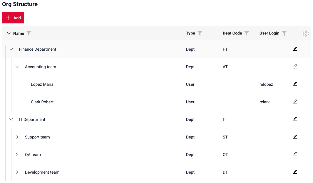
The Tree widget supports the main functionality available in the List widget, including:
- actions
- filtering
- pagination
- parent-child relation
- search
Search and filtering results can be displayed in two modes:
- Collapse - only matching rows are highlighted and displayed, while the user can still navigate through the tree, expand nodes.
- Hide - only matching rows are highlighted and displayed, navigation through the tree is not supported.
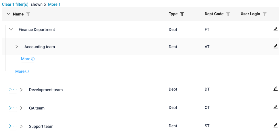
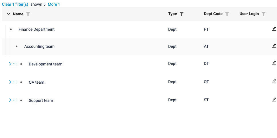
When matching rows are located deep in the tree, the path can be not fully displayed (for compact display reasons). The number of displayed parent nodes can be configured, and upper nodes can be loaded when needed to view the whole path.
Info
See the Tree widget documentation.
Added: pickTree - NEW field type!
We have added a new pickTree field type for selecting a single value from tree-like data. The new field type triggers the new PickTreePopup widget.
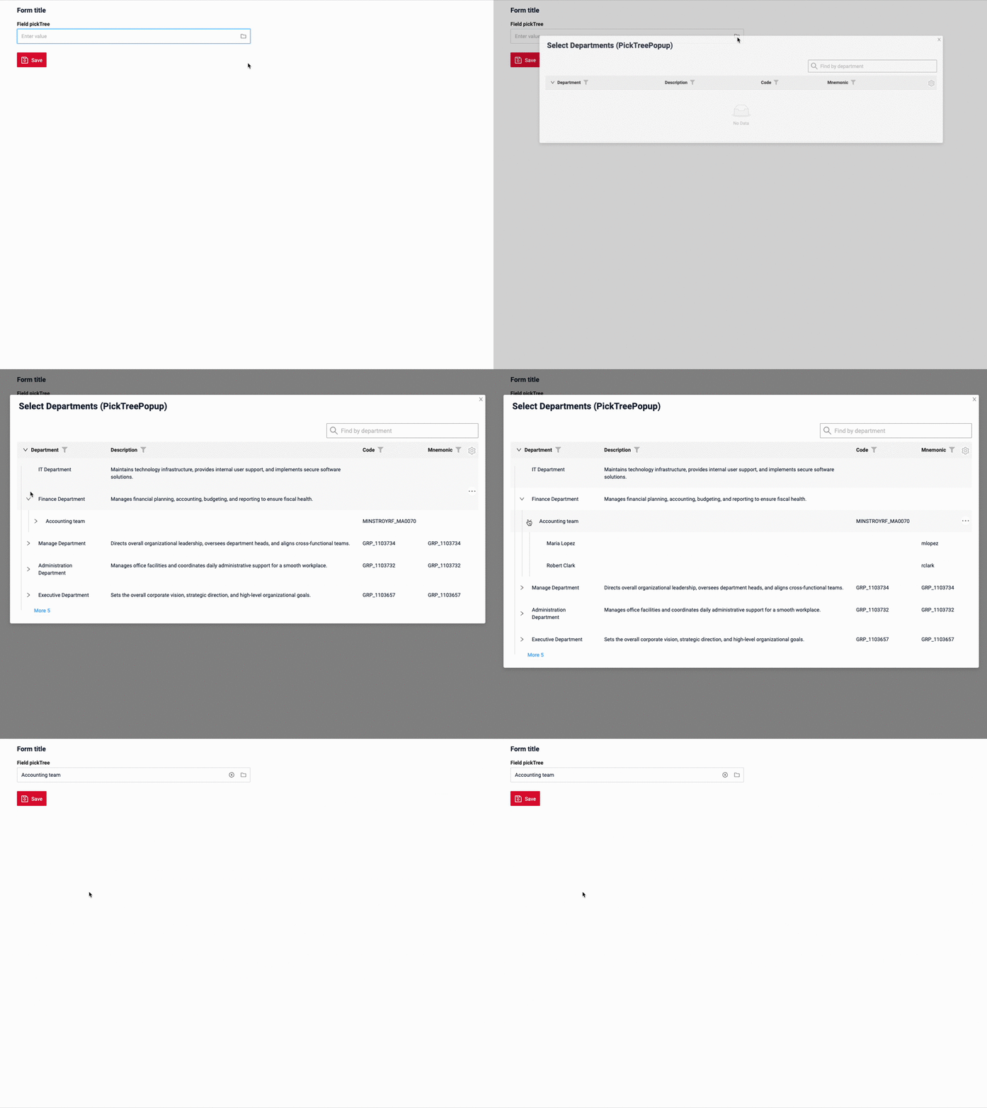
For more information about the PickTreePopup widget, see PickTreePopup widget.
Info
See the pickTree field documentation.
Added: PickTreePopup - NEW widget type!
We’ve added a new PickTreePopup widget for selecting a single value from data displayed in a tree-like structure.
PickTreePopup is a tree-based alternative to the existing PickListPopup.
PickTreePopup supports any number of nesting levels and lazy loading, making it suitable for working with large data sets. Just like with the new Tree widget, the root-level rows are loaded first, while child rows are loaded when the user expands a node. Next pages of data can be loaded using the More option.
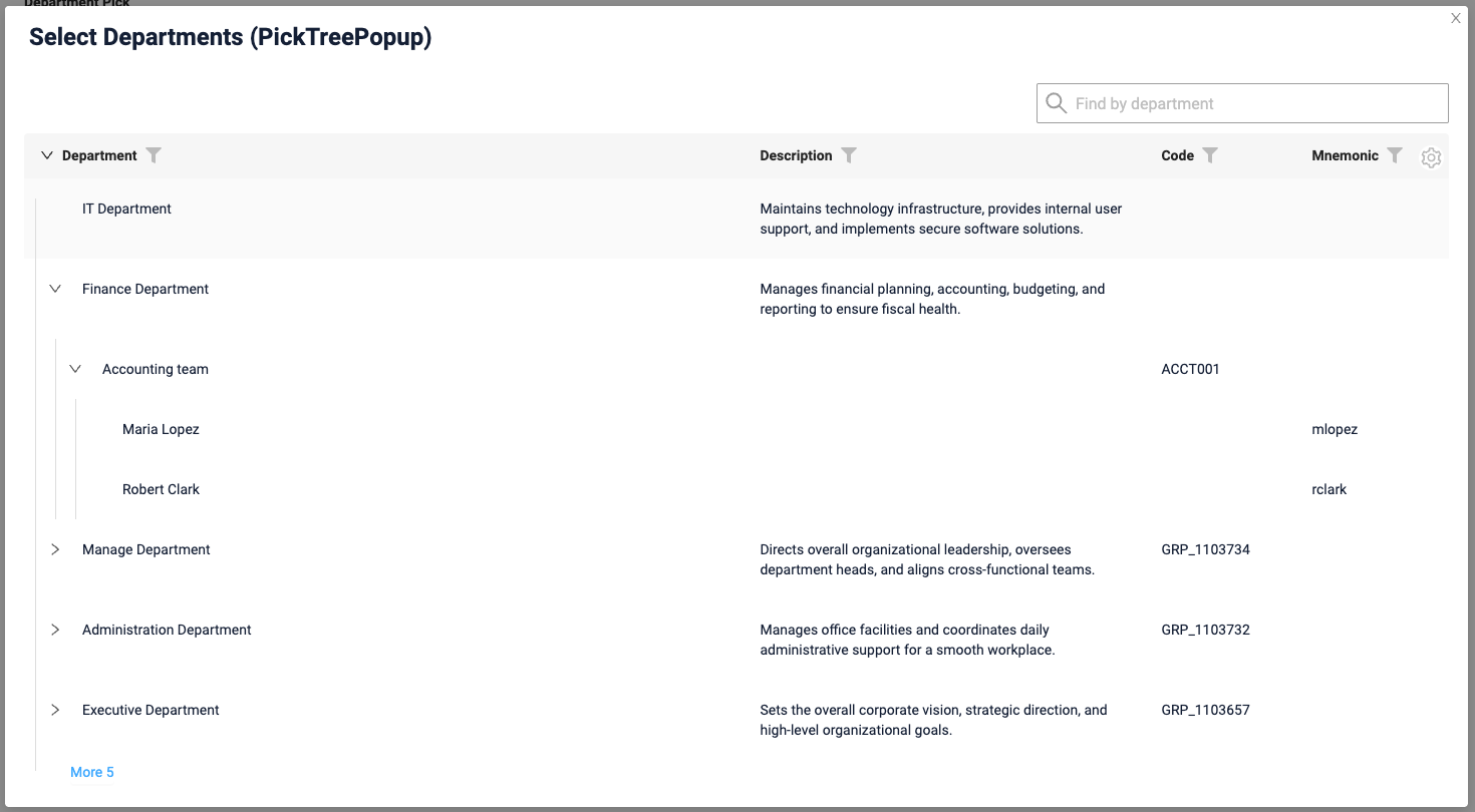
The widget supports:
- single-row selection
- actions
- filtering
- search
- pagination
- parent-child relations
- lazy loading
The selection behavior can be configured depending on the use case. The user can be allowed to select:
- nodes only
- leaf rows only
- both nodes and leaf rows
Just like in Tree widget, search and filtering results can be displayed in two modes: collapse and hide.
The PickTreePopup widget is opened from the new pickTree field.
Info
See the PickTreePopup widget documentation.
Added: multivalueTree - NEW field type!
We have added a new multivalueTree field for selecting multiple values from tree-like data.
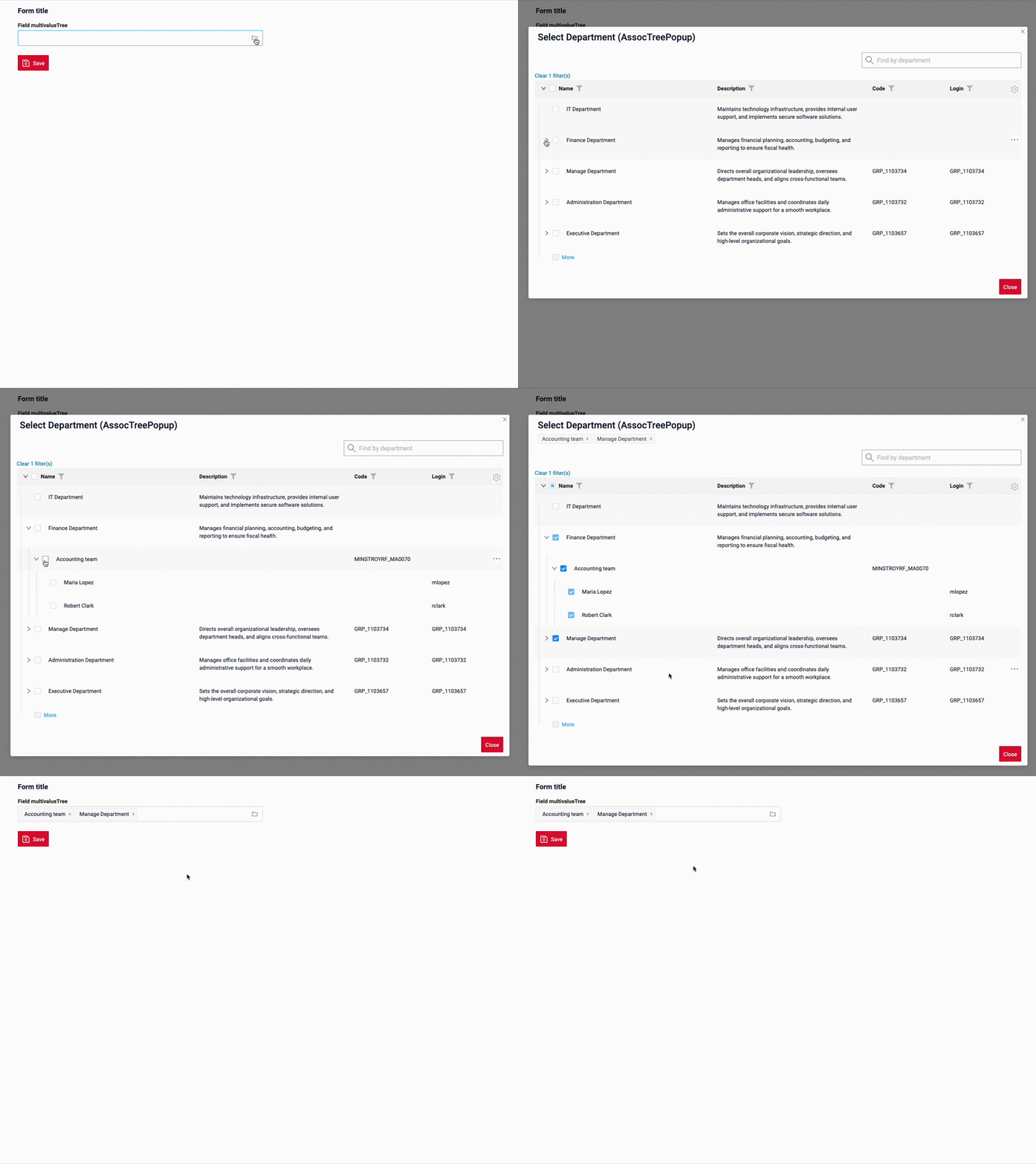
It works similarly to the existing multivalue field, but opens the new AssocTreePopup widget, where users navigate the tree and select multiple values using checkboxes.
Info
See the multivalueTree field documentation.
Added: AssocTreePopup - NEW widget type!
We’ve added a new AssocTreePopup widget for selecting multiple values from data displayed in a tree-like structure.
AssocTreePopup is a tree-based alternative to the existing AssocListPopup. It allows users to select multiple rows using checkboxes while keeping the tree structure visible.
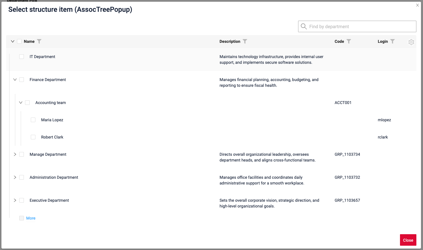
The widget supports:
- multiple selection using checkboxes
- actions
- filtering and sorting
- search
- pagination
- parent-child relationships
- lazy loading
- nodes/leaf rows/both nodes and leaf rows selection
Selected values are displayed at the top of the popup.
Search and filtering results can be displayed in two modes: collapse and hide.
The AssocTreePopup widget is opened from the new multivalueTree field.
Info
See the AssocTreePopup widget documentation.
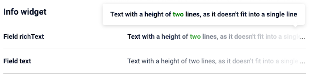
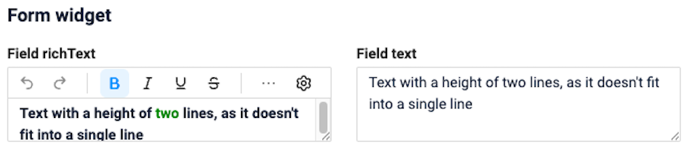
Added: text and richText fields - configurable height
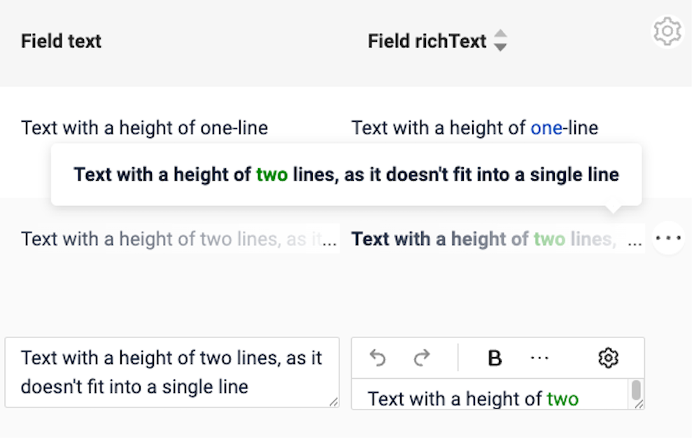
We've added support for configuring the height of text and richText fields on widgets.
The minimum and maximum number of rows can now be set separately for viewing and editing, making it easier to adjust the fields to the content and screen layout.
Added: Filter group - NEW ability to make it default
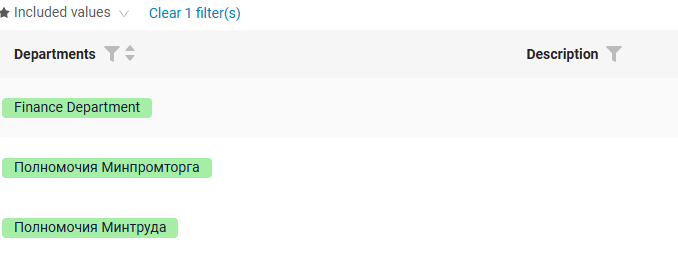
A default filter can now be configured for a saved group (filter group).
The configured filter is automatically applied when the page is initialized and refreshed.
The default filter is marked with a star ★.
Added: Filtration - NEW button 'to default filters(s)'
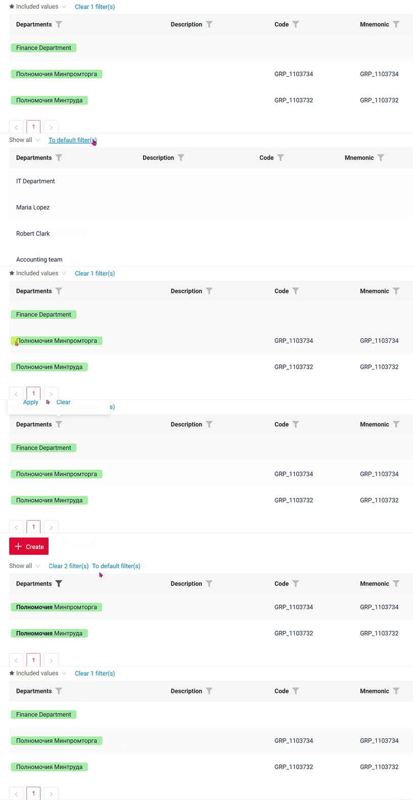
The To default filter(s) button has been added next to the Clear N filter(s) button.
The To default filter(s) button allows users to restore the filters to the default values defined by the developer.
When resetting filters, the following priority is applied:
bc_property— filters defined usingbc_property;default filter group— filters defined in the default filter group.
The To default filter(s) button is displayed only default filters are configured for the page.
Fixed: richText - formatting is preserved in the most common cases
The richText field stores content in Markdown, the same format that Yandex Wiki uses. Markdown cannot express some formatting combinations, and market leaders such as Yandex Wiki fail in these cases too. That is why we do not build our own editor. Instead, we add small patches to the underlying library and fix the most common cases, bringing the editor closer to market leaders.
Summary of supported formatting: ✅ supported, ⚠️ supported with a caveat, ❌ not supported, — not checked.
Basics
| # | Feature | Before | After | Yandex Wiki | Markdown example |
|---|---|---|---|---|---|
| 1 | Bold | ✅ | ✅ | ✅ | **bold** |
| 2 | Italic | ✅ | ✅ | ✅ | *italic* |
| 3 | Underline | ✅ | ✅ | ✅ | ++under++ |
| 4 | Strikethrough | ✅ | ✅ | ✅ | ~~strike~~ |
| 5 | Inline code | ✅ | ✅ | ✅ | `code` |
| 6 | Text color | ✅ | ✅ | ✅ | {red}(text) |
| 7 | Link | ✅ | ✅ | ✅ | [text](url) |
| 8 | Heading H1–H6 | ✅ | ✅ | ✅ | # Head … ###### Head |
| 9 | Bullet / ordered list | ✅ | ✅ | ✅ | - item / 1. item |
| 10 | Blockquote | ✅ | ✅ | ✅ | > quote |
| 11 | Code block | ✅ | ✅ | ✅ | ```\ncode\n``` |
| 12 | Paragraph (Enter) / line break (Shift+Enter) | ✅ | ✅ | ✅ | a\n\nb / a \nb |
| 13 | Text starting with 4 spaces or a tab stays plain text | ❌ | ✅ | — | text was a code block |
Combinations & overlaps
| # | Feature | Before | After | Yandex Wiki | Markdown example |
|---|---|---|---|---|---|
| 14 | Two+ styles combined | ✅ | ✅ | ✅ | ***x***, {red}(**x**) |
| 15 | Styles inside heading / list / quote | ✅ | ✅ | ✅ | # **b** head, - {red}(c) item |
| 16 | Three+ styles overlapping in a staircase | ❌ | ✅ | ✅ | ++abc**def**++**gh~~ij~~**~~kl~~ |
| 17 | Style across a line break (Shift+Enter) | ❌ | ✅ | ✅ | **a** \n**b** |
| 18 | Bold and italic overlapping each other | ❌ | ⚠️ | — | an invisible separator is inserted where they meet |
| 19 | Bold or italic touching a parenthesis | ❌ | ❌ | ❌ | abc*def)*ghi - cannot be written in Markdown; the toolbar disables such formatting |
Text color
| # | Feature | Before | After | Yandex Wiki | Markdown example |
|---|---|---|---|---|---|
| 20 | Color over text with parentheses | ❌ | ✅ | ✅ | {red}(Hello \(world\)) |
| 21 | Color across line breaks (Shift+Enter) | ❌ | ✅ | ✅ | {red}(a) \n{red}(b) |
| 22 | Color on inline code | ⚠️ | ⚠️ | — | impossible - inline code excludes other styles |
The cases below were fixed in this release.
Text color on text with parentheses (20)
In the editor: Hello (world) and more colored red.

After saving: the color is preserved.

Stored Markdown - the parentheses are escaped, so the color span is closed in the right place:


Overlapping formatting (16)
In the editor: underline on abcdefgh, bold on ghijkl, strikethrough on klmnop.

After saving: all formatting is preserved.

Stored Markdown - every style is closed and reopened with Markdown tags:


Text starting with spaces (13)




Bold or italic touching a parenthesis (19)
The toolbar disables bold, italic, underline, strikethrough and inline code when the selection starts or ends at a parenthesis, the same way Yandex Wiki does. Text color stays available.



We have also added autotests for richText to cxbox/code-samples: a RichText basic sample and a regression suite that checks every case from the table after user input, after saving and after reopening the record. Known limitations are fixed in the tests as well, so any change in their behavior is caught.
Info
Technical details for each case are available in README_RICHTEXT.md.
Fixed: encryptAndSign for detached signatures
Fixed an issue with the encryptAndSign operation when creating a detached signature.
Additional Base64 encoding has been removed for detached signatures. Previously, signatures created using encryptAndSign in detached mode could not be successfully verified by the Gosuslugi signature verification service.
Detached signatures can now be successfully verified on Gosuslugi.
Other Changes
CXBOX 5.0.2 (Core)
We have released a new 5.0.2 CORE version.
Fixed: uniqueness check when saving a filter name
Fixed an issue where the uniqueness constraint could not be correctly identified when using the ru_RU.UTF-8 locale.
The uniqueness check is now handled correctly regardless of the system locale.
Fixed: CIB seven migration compatibility
If you are planning to migrate from Camunda 7 Community Edition to CIB seven because the final Camunda 7 Community Edition 7.24 release does not support Spring Boot 4, the core has been updated to simplify and streamline the migration process.
Previously, using @EnableWebMvc caused Spring to create WebMvcConfigurationSupport, which prevented WebMvcAutoConfiguration from being applied. This could lead to additional configuration requirements during migration.
The core has been updated to eliminate this issue, making migration to CIB seven more straightforward.
CXBOX documentation
Added: Description Tree widget
We have provided a description of the Tree widget: the data contract (parentId, isLeaf, options.tree), lazy load, actions with the node refresh, search modes and pagination with the More button.
Added: Description PickTreePopup and AssocTreePopup widgets
We have provided descriptions of the PickTreePopup and AssocTreePopup widgets. The articles follow the structure of PickListPopup and AssocListPopup and add the tree specifics: options.tree, lazy load, search modes, selection modes.
Added: Description pickTree and multivalueTree fields
We have provided descriptions of the pickTree and multivalueTree fields on the List, Form and Info widgets, structured the same way as pickList and multivalue.
Updated: Description PickListPopup widget
The PickListPopup article has been aligned with PickTreePopup: the same Create, Edit, Delete, Save and Cancel-create sections, each with its own sample.
All pictures and GIFs of these articles are produced by the autotests of cxbox/code-samples (packages application.Samples.Tree and application.Samples.Popup), so they always match the current behavior.